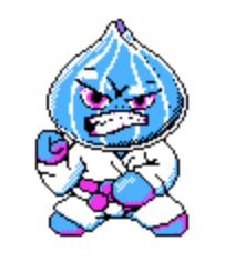
So I am the artist of a somewhat long formed team called BitDecayGames based out of Denver. I wanted to make this post based on some feedback we have had on our game, as well as to my own revelation when presenting the idea to the team, to give a little information about the art style used in our GMTK 2019 submission "Ka-bob" You can try it out by clicking on the image below, or at this link. https://bitdecaygames.itch.io/ka-bob
We have been doing Jams for a number of years now and have been involved in LudumDare and Global Game Jam events almost exclusively. But given the recent reduced cadence of the LDJams, we decided to fill our our schedule with our first Game Makers Tool Kit jam. Here is a little bit of content around the decision, and execution of our artistic approach.
A bit of history about myself real quick to set the story... I've been dabbling in digital art ever since elementary school in the 80's. My first experience (aside from Logo), was on the 'Apple II e' using software I cant recall, and really getting the hang of it with NeoChrome on an 'Atari ST' . Discovering Paintshop and Photoshop in the years to come changed my world, not counting 3dStudio Max, Maya, and Blender even later. Needless to say, I came up through the ranks of the ever changing landscape of computer capabilities and the art software available. Just as an FYI, for bit graphics today, my preference is Pyxel Edit. If you havent heard of it, you really should go check them out. I especially like its animation component.
Anyways, back to the Jam.. So with all of us being in the US and have careers, starting the jam at 1:00 PM was just not going to work for most of us. We accepted that we weren't going to realistically be able to start until 5 or 6 PM on Friday so we were already behind the curve. So after getting the theme, I announced to the team that I wanted to restrict myself to the CGA palette for the jam. Now, even though I'm 10 years older than most of the rest of the team, I was still quite surprised to find that most of them had absolutely no idea what I was talking about. For anyone reading this that doesn't know, there are a few CGA color variations that all use only 4 highly contrasting colors, but the most recognizable is the White, Black, Magenta, and Cyan variation. After a GIS session and talking about my own history with games in this palette, I ignorantly stated "Given that we realistically only have about 40 hours for the Jam, restricting myself to 4 colors should to allow me to churn out the art more quickly"....

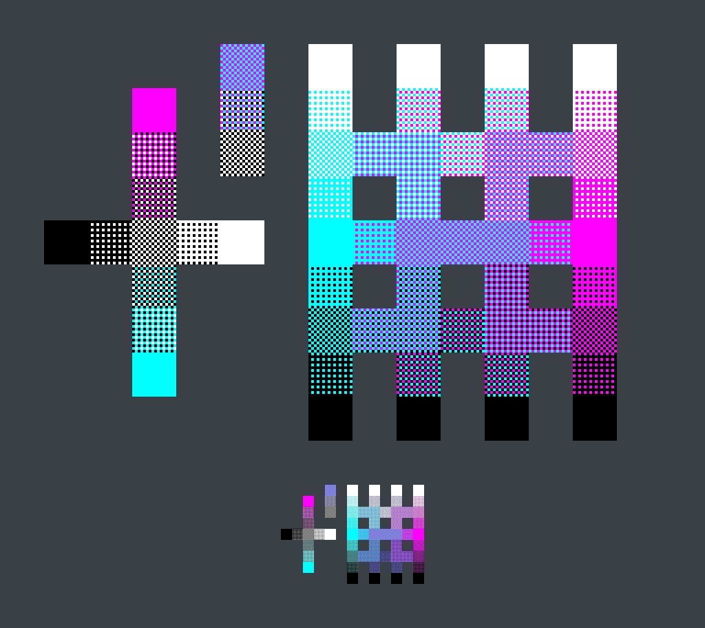
The majority of our sprite sizes were 80x80px in terms of art, though characters were in a 160x160 bounding box to account for alignment and animation frames that extend beyond the 80x80px frame. This is particularly true for the main player and to account for the skewer. Again , for anyone not familiar with CGA graphics, using large(ish) sprite or image sizes and getting creative with dithering, you can actually get a pretty wide variety of shades and tones out of just 4 colors. Attached is an example.

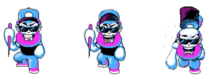
While end results can be very rewarding, the process of manually dithering sprites is about as far from "fast" as you can get. Maybe there are bit graphic tools out there that automate this process, but not Pyxel Edit. Oh well.. I had already started so I was in for the long haul. Here is the main character from the game.


Now I suspect many of you can guess, let me tell you... staring at a screen for hours and hours on end, nearly exclusively at a window with only 4 very highly contracting colors on it, can seriously mess with your eyes. At about 2 AM on Saturday when I stood up to finally hit the hay, that slight dizzy feeling (which is sometime normal in jams) was in FULL effect that night.
Now I can usually go through a 48 or 72 hour jam without my eyes screaming at me too badly, but this jam I had to take breaks fairly consistently so as to not emulate the slow insertion of red hot pokers into my ocular skull sockets. It was literally painful at times. I really don't know how they did it back in the day. But overall I would say that I'm very pleased at the self restriction, and this is something we do often try to impose on ourselves in some way shape or form when developing (theme willing). It allows me as an artist specifically to get out of my comfort zone and try things that I wouldn't normally, and as such, I thank Game Jams for the individual growth that I take away from each and every one as a result.
Verdict:: If you have never tried it, give the CGA color palette some love! just, know what you're getting yourself into, and keep asprin, and eye drops on deck.
I'm sure that many of you have similar stories and would love to hear about ways that you and your teams have restricted yourselves in some way.


