Play game
Together, far apart's itch.io pageResults
| Criteria | Rank | Score* | Raw Score |
| Presentation | #3042 | 2.538 | 2.538 |
| Originality | #3981 | 2.269 | 2.269 |
| Overall | #4018 | 2.154 | 2.154 |
| Fun | #4829 | 1.654 | 1.654 |
Ranked from 26 ratings. Score is adjusted from raw score by the median number of ratings per game in the jam.
How does your game fit the theme?
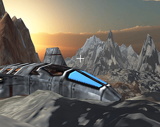
The setting for the game is the result of all the planets joined together. The singular enemy and space ship is also merged into the enviorment.
Did your team create the vast majority of the art during the 48 hours?
No
We used pre-existing art
Did your team create the vast majority of the music during the 48 hours?
Yes
We created the vast majority of the music during the game jam
Leave a comment
Log in with itch.io to leave a comment.


Comments
Really interesting environment; too bad about running out of ideas, but I think there is some potential here if there was more to do and see.
Good presentation, I went the back way through the mountains to the ship to save a little time lol. Music is kind of light and comical compared to bleak surroundings. 'Join together' with your ship that has landed 'far apart' *clears throat*
:) i made it in chrome music lab lol
interesting idea, plus it was fun to play! good work :)
I was very impressed by the look and feel of the game, but had similar issues with actually trying to play the game. A good job within rushed time, but sadly not a great game *just* yet!
thanks, i really appreciate it. i put all of my effort towards the earlier half of the game, but i began hating it midway so i found a shitty way to end it without even giving an indication.
Not sure what I'm doing, I've been exploring but nothing other than collecting rocks seems to happen. Fell through the world once, got stuck in a pit another time, got shunted back to the main menu a few times without any indication why. Probably starved, as I only noticed a hunger indicator after a few tries. The UI is tiny.
The game has larger dimensions than the space it gets on the site, so it needs to be in fullscreen to see everything (and interact with the menu at all), but then it's both pillar- and letterboxed such that black bars take up 60% or so of the screen.
Barely playable, so I can't tell how well the idea behind it plays out eventually.
sorry i started making this really late in the jam and spent most of the time making the terrain. i couldn't make the gravity work properly and im at the end of it i just got really bored and ended it badly. (you had to go to the coordinates on the insects). I started hating what i'd done midway so i lost inspiration too.
Its not really playable or am I missing everything? :D I just keep on dying
But the presentation is really cool!!
i think you were stepping on the insects. thats the only way i programmed in dying. sorry i didn't make the objective clearer. (you had to throw rocks at the insects to kill them) and you get food.