Play game
One Track Mind's itch.io pageResults
Criteria | Rank | Score* | Raw Score |
Presentation | #2575 | 3.094 | 4.375 |
Enjoyment | #3604 | 2.475 | 3.500 |
Overall | #3697 | 2.652 | 3.750 |
Creativity | #4746 | 2.386 | 3.375 |
Ranked from 8 ratings. Score is adjusted from raw score by the median number of ratings per game in the jam.
How does your game fit the theme?
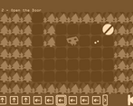
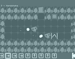
You do not control the player, instead you build the level.
Did your team create the vast majority of the art during the 48 hours?
Yes
We created the vast majority of the art during the game jam
Did your team create the vast majority of the music during the 48 hours?
Yes
We created the vast majority of the music during the game jam
Leave a comment
Log in with itch.io to leave a comment.
Comments
I like the art and sepia style a lot! I also thought the puzzle design here was really solid, and it’s impressive just how many you managed to get done in 48 hours. If I had any advice, it would be to shrink the number of moves per level, or at least make them all visible at once, because it was often difficult to keep track of. Great work!
The presentation here is fantastic, and it's impressive that you've managed to make 20 levels for one small jam game, and they all seem to be good quality puzzles as well. The speedup button is also an incredibly nice touch that makes solving levels a lot less of a slog.
I only have 2 small bits of feedback - I'd make the movement display a lot more compact, as scrolling back and forth to view the upcoming moves can be incredibly tedious, I'd rather always know what my character is about to do - and I'd also add a tiny bit of feedback to the movable blocks when I hover them - the fact that I could grab them was a bit unclear on my first playthrough.
Overall great game, I hope you expand this into a full release soon!
This looks great & has good puzzles. Unfortunately I am dumb & did not get past Autumn 1. Something I'd suggest is to maybe shrink the robot's movements at the bottom so all can fit on the screen at once. It was a bit inconvenient to scroll through them & lose track of where it was going.
Love the art style and presentation, and there were some creative ideas with the level design so far.
Unfortunately, I got stuck on Autumn 1. I don't know if I'm misunderstanding the rules, but I cannot see how the little guy will press the button on the far left and then manage to reach the exit one tile to the right, because they do not move right at all except at the start. Any hints?
Lovely game with an adorable art style.I must confess I got stuck at level 4 unfortunately 😅
very enjoyable experience! also love clever level design
nicely done!
Great entry! I'm really enjoying the game so far. The art style, concept, and idea are all super creative. The level design is also really smart. One thing I noticed is that when I'm trying to solve the puzzles, I often find myself pressing play to see the trajectory instead of relying on the arrows in the interface. It might be helpful to have the arrows displayed where the player is going to move to avoid this habit. Overall, it's a really well-executed game. Congrats on the submission!