Play game
Whats Wrong's itch.io pageResults
| Criteria | Rank | Score* | Raw Score |
| Enjoyment | #5061 | 1.939 | 3.167 |
| Creativity | #5133 | 2.245 | 3.667 |
| Overall | #5245 | 2.041 | 3.333 |
| Presentation | #5421 | 1.939 | 3.167 |
Ranked from 6 ratings. Score is adjusted from raw score by the median number of ratings per game in the jam.
How does your game fit the theme?
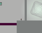
normal platformer mechanics are reversed and you don't know what.
Did your team create the vast majority of the art during the 48 hours?
Yes
We created the vast majority of the art during the game jam
Did your team create the vast majority of the music during the 48 hours?
Yes
We created the vast majority of the music during the game jam
Leave a comment
Log in with itch.io to leave a comment.


Comments
cool idea, just add more levels and you are all good :)
It's quite polished, style and controls feel nice
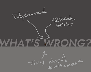
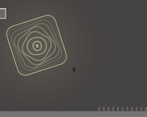
Hey, played and left a rating and wanted to leave some extra thoughts. Loved the little animations on running/falling/idle, camera doing a little spin on entering the level, and the tutorial got the mechanics across really clearly.
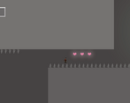
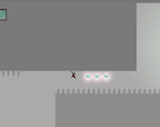
I made it all the way to the end, but I think some of the solutions are really difficult. It requires you to kind of make a checklist of all the things that could be reversed and have to test them all. I didn't realize the entry portal could be reversed as well so I spent a bunch of time running around the level trying to figure out what I could even interact with.
My last recommendation would be for some onscreen indicator (beyond color) that tells you if you are reversed or not. Color is good, but I forgot very quickly which color was supposed to be the reversed color.
Interesting feedback, thank you very much! And I appreciate the compliments.
Not to make excuses but the two actual levels were just maps I threw together to test the mechanics while programming, there is no real design. What I want to do is slowly introduce the player to the mechanics before starting to mix reversed elements, over many levels with ramping difficulty! The only part I actually planned was the tutorial :)
Also the feedback on if it's reversed or not is also interesting, will come up with something.
I like the minimalist style of the art, looks really cool with the text being integrated into the level. Unfortunately I wasn't able to figure out lvl 2 so I was stuck :( (or is that because there is nothing after lvl 2?)
Thank you for playing and posting your feedback too! Glad you liked the text, it was sort of an easy way out because I had all the mechanics for the game functional but no menu, clicking and inverting of buttons. So it felt quicker to implement the menu as a level. haha! I already worked on an improved version of the menu which I find is prettier, if you feel like playing again next week.
The level you were stuck (I don't remember which one is 2) is NOT the one with the gravity stuff, right? If yes, what was inverted was the portals.
After you finish that one it'll take you to another room that only has a thank you note with a very ugly typo (I was very late lol) and a quit button/restart portal. So you haven't missed anything important. :)
Also I'll play yours and leave some feedback later!