Play game
Terra4Me's itch.io pageResults
Criteria | Rank | Score* | Raw Score |
Audio | #10 | 3.079 | 3.556 |
Graphics | #11 | 3.560 | 4.111 |
Originality | #16 | 3.368 | 3.889 |
Controls | #25 | 2.406 | 2.778 |
Overall | #27 | 2.667 | 3.079 |
Fun | #30 | 2.406 | 2.778 |
Accessibility | #34 | 2.117 | 2.444 |
Theme | #50 | 1.732 | 2.000 |
Ranked from 9 ratings. Score is adjusted from raw score by the median number of ratings per game in the jam.
Godot Version
4.1.1
Wildcards Used
Naturalist, Diplomatic, CSharp
Game Description
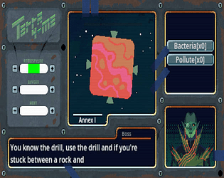
Terraform planets, sell them for the Big Man's profit, what could go wrong?
How does your game tie into the theme?
Nearly ever element has some form of it. From the climbing of the music, to the evolution or ascension of society, both through terraforming, and culturally, through the radio.
Source(s)
N/A
Discord Username(s)
N/A
Participation Level (GWJ Only)
2
Leave a comment
Log in with itch.io to leave a comment.
Comments
Great idea! The art was top notch.
Interesting game. I got a bit scared by the News sound effect, like a smack.
I'm not sure what I did wrong, but I managed to have all meters inside their green areas, but still not win... Do they have to stay there for some time?
One thing I though of, instead of having text, it would have been cool with a visual hint of the effects of the different actions. Maybe a red or green overlay on the bars?
I love the Axel F comment. I have listened to that song in the car waaaaay more than I'd have liked to :D
Cool entry, might give it another shot!
Def. one of the better games! I was very pleased by the visuals and the audio in this game. I had no control or accessibility issues and the gameplay was pretty clear to me. The increase of difficulty for each planet was well balanced. I like the chatting characters even I was not really able to read anything because I was looking on the bars! Good job on this and great team effort!
Cool puzzle, I enjoyed balancing resources gain.
First time I see licenses list in a game, not even in a jam one :)
Graphics look great, overall climate is nice, spacey :)
Texts are a nice touch, although sometimes they might be hard to read when you are balancing resources. Maybe have the text appear after each level, so that players have time to read it? There would be one message at the start, from boss, then some extra after. One time I got the same text twice in a row (council meeting one). Are they random, or do they come in order?
Last level was a spike in difficulty, but I managed after some time - a nice test to what player learned before, and a slight change in rules with two planets at the same time. Great idea.
Some slight UX issues, improvements:
- progress bars for resources are not visible if at full - in last level I "lost" 2 sliders, because they got full when I was looking at 2nd planet. I wasn't sure if that was a bug and they disappeared, or where they were
- with game relying on timing, i would be good to have some quick visible indication to what option changes what by how much. you could add icons to each resource and each action would have affected resource icons next to it, maybe colored by if it increases or decreases and '+' symbols added depending on how much it changes
I have heard about flat circle planets, but never about rectangular ones (or is it a cube?) :)
Cheers!
Great idea for a game, and nice and polished - the sound effects and music were beautifully ambient, clicky and perfect which matches the gameplay well, and I loved the pixel art.
One thought - it would be nice to have a little arrow indicator of which way you've gone off the scale (too high or too low) as I found myself losing the little marker off the end a couple of times on the last planets when switching between them.
Congrats on a fab game!
nice effort!