A while ago I found this Game Jam Edition video from Jonas Tyroller in which he talks about the Top 5 Game Jam Dev Mistakes.
https://www.youtube.com/watch?v=Z1jzwI3q-I0
Today I was crosschecking your feedback for my games submission with the facts mentioned in this video. By applying Jonas’ advices to the so identified weak spots, I was drawing some conclusions of how I can do better next time. In this article I want to share the results with you - any thoughts and advices from your side are very welcome.
All the italic formatted texts are based on the content provided by Jonas, the bold parts are my own conclusions. The green feedback is positive, the red feedback is constructive criticism.
I was picking only those fragments of your feedback, which apply to the corresponding topic – as a whole, each of them was encouraging, positive and supportive. I highly value every single one of them, thank you for taking the time to express your thoughts.
Here we go – the Top 5 Game Jam Dev mistakes according to Jonas:
5 - NO INTRODUCTION
Games do not have a proper tutorial or introduction.
- Let players try out everything
- Teach them one thing after another
- Place the instruction text directly into the level
- Split up text in smaller chunks

I was implementing a tutorial which matches all the 4 advices Jonas gives. I think I did pretty well with this one - and will apply the pattern as it is also to my next project.
4 - NO PROPER BALANCING
You can get a lot more out of your game, when you make conscious decisions about things like:
- Map Size
- Speed
- Difficulty curve
- Shaping colliders and hitboxes to the advantage of the players
Every variable in your game matters. Balancing can make or break your game.

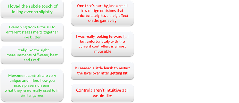
For this topic your feedback is 50:50. At least one critique is standing out (also for some of the other topics below) - the unintuitive/sluggish/unresponsive Controls. My intention was to create a non-stressing, seamless and slow-pacing experience - but the way I was trying to reflect this intention via the Controls turns out to feel wrong. One of you gave the hint to change the Controls towards the Helicopter game pattern, but the one I found and play-tested feels way to stressful and hectic to me. Is this the way Icarus should fly? I am curious about your oppinion for this one - I am somehow lost and have no good idea or reference of how to change Controls for the better.
3 - NO PROPER COLOR SCHEME
Find a pleasant to look at color combination. Picking nice colors might require a bit of practice, but same time it is such an effective way to make your game look beautiful.
Colors can be a low-effort, high-impact factor to work on – there are tools (e.g. https://coolors.co/) which can help you finding the right scheme.

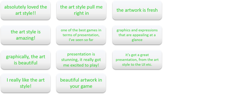
This is just amazing. I still can't believe how well my creations are recieved. I started drawing and painting only 2 years ago - before that I was "just" a developer, unable even to draw a straight line on paper. Well, it seems I got some decent progress here - thanks again for your kind and encouraging words :-)
2 – PACING ISSUES
Movement speed is too fast or too slow, levels are too big or too small, checkpoints are misplaced – all of this is getting players out of their flow state. Pacing is not as game-breaking as some other balancing issues – but done right, it provides the optimal experience which players find in the sweet spot between frustration and boredom.
The downside: Optimizing pacing takes a lot of time for testing and tweaking. Time is this thing we usually don’t have in a Game Jam.

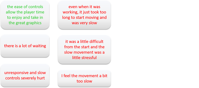
Okay, I have to speed up things - at least a bit. This whole movement/animation topic is so huge and full of details. I admire the dedication and knowledge these guys put into their game. To me it feels like I haven't even started to understand even the surface of the whole movement and timing complex, definitely something I have to work on and keep in mind for the next project.
1 – NO PROPER PLAYER FEEDBACK
Let players know When&Why:
- They get hurt
- They lost
- They did something right
- They did something wrong
Delay the game-over screen to give players time to realize what happened. Give visual/audio feedback for literally everything that happens as a result of a player’s action – all of this makes it a lot easier for players to learn and understand your game.
Giving proper feedback makes your game a lot more satisfying to play.

Same conclusions I mentioned in the topic before also apply for this last topic and feedback. There seem to be a lot of "feelings" involved, when it comes to judging speed, timing and responsiveness - maybe it is just my lack of experience that leaves me with so many question marks regarding this. Again, any thoughts or hints from your side - also game references, tutorials or other sources - are highly welcome.


