Play game
Flowers of Sultana's itch.io pageResults
| Criteria | Rank | Score* | Raw Score |
| People's Choice | #93 | 2.502 | 2.889 |
Ranked from 9 ratings. Score is adjusted from raw score by the median number of ratings per game in the jam.
Leave a comment
Log in with itch.io to leave a comment.


Comments
Flowers of Sultana
by 2BitsGames
Hey there 2BitsGames, thanks for submitting a project to the 2022 IGMC. I was asked to judge your game in round three of the IGMC 2022 game jam. Here's some feedback about your project.
I like how the game jumps straight into the action. It reminds me a little bit of the beginning in the SNES title Lufia. Not story-wise, just design-wise. Good start.
Your skills are missing descriptions.
Making tutorial-based key-items was good thinking. It provides help for people who need it and it doesn't annoy the ones that don't by forcing through a long series of show text.
Good job with customizing the sound effects, animations and menus.
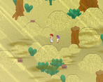
The graphics are a little grainy and weird, but personally I kind of like them. At the very least they stand out and look different.
I appreciate the tall-sprites. It's hard to make tall sprites look natural when moving, which is probably why so many games opt for chibi-sprites. Another good design choice here by using tall ones as they look decent enough.
Getting items from chests is a pleasant experience because you get that audio-visual feedback with animations and SFX. Not to mention the loot you get as a reward for exploration.
Showing the name of the location text pop-up upon entering a new location sometimes obscures the show text for the event that's currently running. It only persists for a couple of seconds, so it's not a big issue, but you could probably move that so that you don't have an overlap of text in one spot.
While it's not exactly clear what you're supposed to do at times, one case in particular I thought that it had something to do with the hero's bed. I think it's a good idea to allow the player to pass upward through the pillars that are at the bottom of the hero's bed (or remove them). I wandered around a bit longer than I should have because I originally thought that the bed wasn't interactable. However it was just because I couldn't get to it from beneath it. My fault really, but you could help other people to avoid that by allowing them to access the bed from the bottom.
Customizing the basic hit animations and sound effects could of gone a long way. Think about how many games have the same ones that you used here... Think about how many times your players have already heard and saw them.
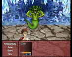
While I feel like the encounter rate is a little high, the battles are fast and that really helps to not be stuck in long grindy battles for too long.
I like that you removed MP and decided to make all moves use TP. It made for a situation that the player had one less number to balance and manage. It also made up for the slightly high encounter rate by not 'exhausting' a player.
It seems to me that you put a lot of extra effort into making events that are scattered around the maps. (Like the wax apple events etc.) These have extra dialog and sequences. I just wanna say that your extra effort here is noticed.
I enjoyed the soul grid system. I liked how it adds skills and stats, making multiples of the same item useful. It was refreshing to see some unique customization like this.
When you exit the capital city it puts you directly on the move event tile. This makes it so you have to walk left and right again to actually exit the city. Small fix, just extend the map one more tile down and adjust a few transfer events.
Not sure if I did something wrong, but I'm stuck outside the door waiting for the orphan's mom to come out. Originally when it said please wait, I just stood around for a couple of minutes, then I realized that's probably a railroading mechanic and I have to go flip some other switch somewhere to proceed. I ended up re-talking to everyone in town, and even backtracking into the desert. I have no idea how to proceed and it's a shame, because I just got all these new soul shard upgrades and I'm itching for a boss fight.
I think that you have something special here, but it needs some help with user guidance. It's often unclear on where you're supposed to go and I think that if you did a little bit more hand holding with arrows or some kind of signaling system it could of made the game a lot more fun. You should also consider a mini-map system.
Overall I really enjoyed this game and kind of got frustrated that I was unable to continue. Congratulations on making it to the third round of the IGMC 2022 and I look forward to seeing your future works.
-Drifty
Thank you for the thorough feedback, Drifty!
I share your pain with the tile outside the second city--it was a time issue and remaking the map at that point wasn't possible on my end due to some fumbles on my part, so I left as-is. I made this game over two weeks and quite a few things were changed/cut for time.
I'm unclear on where you are stuck, but sounds like the palace. There is a room on the right side of the hall you must go to before the guard opens the door (perhaps the doors weren't clearly marked--again, agree there should have been arrows or something in this case)
I will say overall I'm very old school. I worry about too much hand-holding and would rather the player explore more on where to go. However, it seems in this case it was more a visual issue rather than a direction issue.
I'll take all your compliments and critique to heart. Thank you again! It means a lot!
I enjoyed this one a lot -- it's in a setting that you don't often see and I thought you had a lot of polish with your gameplay. I also enjoyed the story and found your character voice to be very distinctive -- there were a few places where some basic proofreading for minor syntax fixes / typos would be helpful, but nothing that really took away from the narrative at all.
Thanks for sharing and good luck with IGMC! :)
Nice to see all the custom art. I liked the implementation of the soul grid system. I was glad to find those hidden chests with powerful soul gems :D. The battles are fairly easy and straight foward. I think this is a fairly solid entry. Good work!
Sound design was decent and I appreciate a lot the effort into the custom art. Some polish and editing needed in the dialogue, I felt! But otherwise a good entry for a jam.
I liked the premise a lot and some of the custom artwork was very well-done. I felt that the dialogue was a bit stilted and the game was mostly super easy. The elemental magic didn't seem to be all that useful, and I never ran out of power for it or the special attacks, so there wasn't a whole lot of strategy to it. I liked the music a lot. Overall a pretty decent game, but nothing really blew me away.