Play game
Phoenix Crystal's itch.io pageResults
| Criteria | Rank | Score* | Raw Score |
| People's Choice | #110 | 1.925 | 2.222 |
Ranked from 9 ratings. Score is adjusted from raw score by the median number of ratings per game in the jam.
Leave a comment
Log in with itch.io to leave a comment.


Comments
Unfortunately, the game crashed on attempted load (character.isEnemy is not a function), so I was unable to finish this one. :(
I can tell a lot of your attention during the jam went into the 3D engine / elements, but I think the other pieces have suffered a bit because of that. The controls are clunky with the same button being mapped to perform multiple actions, the character is very floaty, which makes the "platforming" bits even more challenging than they would be otherwise.
The battle system seems like it could be really cool, but could use a quick tutorial so the player knows how to act without having to guess at first.
Very cool that you've developed the 3D system on your own, and I hope that the feedback you're getting from this will help you push it even further and fine-tune some of the things that still need some attention!
I can definitely see the effort with the 3D stuff, but it just doesn't quite land due to the very floaty jumping system - it left me feeling quite frustrated, unfortunately.
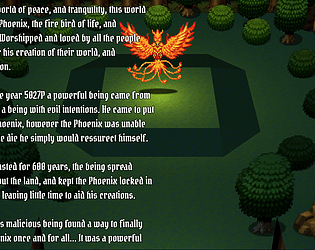
The font is a tricky one to read and I'd go with a more common, easy-to-read text, especially if you have lots of words on the screen at once. Some of the artwork seems to have been scaled up but without using 'nearest neighbour' and it leaves the pixels being quite blurry.
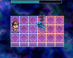
The combat looks inspired by other grid-based 16-bit era games and I appreciate you may be a fan of those types of battle systems, so are hoping to emulate that. For me, I just needed a bit more explanation as to what I was doing and some help with controls and what to do etc.
It's impressive you've gone the 3D route and tried something a bit different. I hope you continue making projects and maybe even polish this one up more, if you still have the interest!
The game did nothing for me, and a lot of my complaints were already covered by Drifty, but here I go:
Overall, even considering that from your response to Drifty this is meant to be a custom, kind of prototype, it doesn't look good as a game on its own in its current state. As a player, I have no real interest on HOW the 3D/combat works (even if they're cool and new as a dev), it's just wonky and feels incomplete.
thanks for the feedback, I'll take this all into consideration for future development of both my plugins, and my games!~ :)
Phoenix Crystal
by chaucer
Hey there chaucer, thanks for submitting a project to the 2022 IGMC. I'm Drifty and I was asked to judge your game in round one of the IGMC 2022 game jam. Here's some feedback about your project.
The scrolling text... Being self-aware of the extremely fast scrolling text doesn't change the fact that you still used it, multiple times, lol. XD
It's cool to see the use of scenematics in MV/Z3D.
Making the action button the same button to jump is a mistake. It's so frustrating to try to interact with an object, like the treasure chest. I keep trying to open it, but instead the controls have me jumping all over the map.
Jumping feels is way too floaty.
How is someone without a controller supposed to play this game? I'm unable to find the controls for moving the character and camera in the 3D sections of this game. It's a good thing I just happen to have a controller I guess.
I like that you tried to make a custom battle system, but it feels very incomplete.
The game kind of feels all over the place. Instead of doing something specific really well, this game tries to do a ton of things, but unfortunately they mostly feel clunky and unpolished.
As a personal opinion I'm not a fan of all the fourth wall breaking. Immersion is very important.
The battle system is really weird and it's hard to understand the correct way to do things.
I encountered a TypeError crash when trying to use skills in combat. (Cannot read property 'start' of undefined)
I think that you'd have made a better experience for the player if you would have really focused on one of the systems instead of trying to make so many half baked systems.
Is this a 3D platformer? Is this a card game battle system? Is this a traditional RPG? Is this a fourth-wall breaking trope-filled parody?
The answer is "Yes". It's too bad that it fails to achieve a good gameplay experience on all accounts.
I hope that you continue to make games and have fun with the process. Maybe narrow the scope of your next project and really nail down the mechanics of one system. Keep up the good work and congrats on submitting a project! :)
-Drifty
I only have one thing to say to this! D: It's not MV/Z3D, it's using the rose engine, my own personal 3D renderer( available on my itch.io page ), which was built from scratch! It's quite a bit more flexible than MV/Z3D :D The 3D platformer bit is just a preview of what's coming for the rose engine soon enough, like you said though it's incomplete, there's quite a bit of work that still needs to be done.
Thanks for the rest of the review though! It was fair the game was rushed, i spent the only the last two weeks of the jam working on this game lol. The battle system was shoehorned in from cyanima, but as I was so short on time I didn't have time to fix all the errors that occured migrating the engine from MV to MZ, also I didn't have time to flesh out the battle system either ^^; Im sure the game could have been better if i focused on one aspect lol, but this was just for fun, and advertisement for my 3D renderer honestly.
A 3D-platform-isekai-deckbuilder-battlenetwork RPG Maker game. What am I even playing? XD
This game brings some fresh air in the contest, with those genres not so often seen in games of this kind.
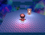
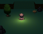
The battle system is really fun, and the plot seems interesting too. And surely it's awesome seeing a game in 3D, but every map seems empty and unfinished, so the "3D effect" loses lots of its beauty.
For now, it seems just a proof of concept demo, but I hope in the future you make an awesome game out of it!