Play game
Lucerna Tenebris's itch.io pageResults
| Criteria | Rank | Score* | Raw Score |
| People's Choice Vote | #51 | 3.538 | 3.538 |
Ranked from 13 ratings. Score is adjusted from raw score by the median number of ratings per game in the jam.
Team Members
Dragon Emperors
Tyler Gonelli
Engine
RPGMaker VX Ace
Leave a comment
Log in with itch.io to leave a comment.



Comments
When you said v0.1, it's no joke that it's v0.1. It's really short that imo it doesn't even classified as a demo, but some sort of teaser / prototype. Plan to expand further later?
Thank you for playing!
Yes! While we do have future plans for the game, we won't be rushing to pursue it, aside from polishing it up until it becomes a proper demo.
Unless of course, if we receive huge enthusiasm from the community, we will shove it into our timeline and do our best to deliver.
Whoa! love your game man! it's really cool! really, everything is cool but yeah I hope you can optimalize the graphics when it moves~
and I guess there is a typo, when the clerk explained the forte tutorial on Fighter's page, it says "Vanguard" but I guess it should be "fighter"?
Thanks for your works man!
We thank YOU for playing!
We realized we need to optimize more. Thank you again for pointing out the mistake, we'll fix it in later release!
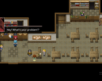
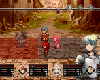
Oof! I love the style, but man, the graphics distort horribly every time anyone moves and it really gives me a headache. Also, story is interesting but extremely hard to follow the timeline. There's some obvious time jumps going on here, and there's no context between the scenes. It almost feels like an RPG flow chart in video game form. I feel like it would have been better if you just had us go to the mock battle and the demo into the first mission. I love LMMV and GubiD, but if those graphics are going to distort like that, you may want to give strong consideration to another system. It looks like problem is tied to the camera movement script you're using. I suspect it wouldn't have been nearly as bad if you hadn't made the game in fullscreen.
Thank you for playing!
It appears to be both the isometric script and engine limitation, because it does run smoothly on smaller maps with fewer objects. We'll definitely have to look into optimizations.
We're very sorry if the story feels rushed, because we planned something bigger, and this prototype was supposed to be its prologue of sort. We'll fix this in later releases after we have clearer project goals.
VL Gothic font error? Really? To Google it is!
Sorry for the inconvenience, for future reference, you can find the font here.
Great Story, love the bust animations, characters feel real. More choices would be nice.
We'd definitely like to expand and give players more freedom in the future!