Indie game storeFree gamesFun gamesHorror games
Game developmentAssetsComics
SalesBundles
Jobs
TagsGame Engines
A jam submission

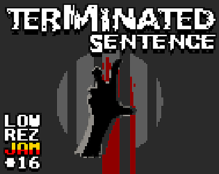
Terminated SentenceView game page

Top-down survival horror
Submitted by chilly_durango — 4 days, 8 hours before the deadline
Add to collection

Play game

Terminated Sentence's itch.io page

Results

CriteriaRankScore*Raw Score
Aesthetic (sound and visual)#863.7503.750
Overall Enjoyment#1193.1253.125
Overall#1623.3443.344
64x64 Authenticity (was it truly lowrez?)#1834.1254.125
Game Feel (playability and control)#2522.3752.375

Ranked from 8 ratings. Score is adjusted from raw score by the median number of ratings per game in the jam.

Leave a comment

Log in with itch.io to leave a comment.

Comments

Controls were a bit hard for me, but I liked hte look of the game! I included it in my compilation video series of the Low Rez Jam games, if you would like to take a look :)

Submitted

Controls were a little difficult, but I like how gritty it is. Really nice work!

Interesting game - but i have really hard time with understanding "controls" - kind of complicated

Submitted

That was really interesting. I found the controls really confusing, and I couldn't quite tell what was going on during combat. I really like the concept though, and there's some great graphics work going on in there. Good job!

Submitted

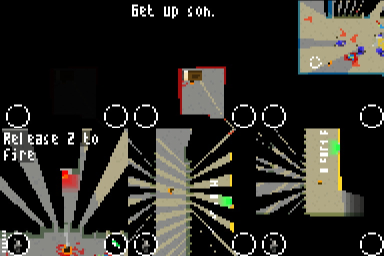
Hmmm, kinda hard to see what!s going on... There are some weird sprite scaling issues I think. The game itself is really cool! Great concept, good atmosphere, the controls are good after you get used to it.

I hope it'll be improved!

Submitted

Nice! Good idea, very cinematic! Controls were a bit confusing though. Looks good, like the perspective shifts.

Submitted

Like the concept but the visuals make it very, very rough to see proper and actually comprehend what you're seeing/react to it. Think it could have gained from being either a bit less zoomed out (so everything's bigger) or totally more zoomed out (so that everything's just a pixel and you use only color to differentiate.

I understand that part of your challenge was to design for some kind of handhelp on top of just lowrez but man, on keyboard, that didn't play well/smooth, at least for me, mainly because of the chosen key positions.


Other than that, pretty good (and pretty hard).

Kudos.