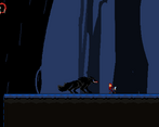
As a fan of Hollow Knight, I enjoyed this game. The artwork was really good and the mechanics were well thought out. One problem I had was that the controls often made the game go from difficult to frustrating. It took me a while to put my finger on it exactly but I'm pretty sure the problem is with having the change dimension key set to f, which causes problems when you need to dash and change dimensions. I would recommend switching it to a, which is also closer to the original Hollow Knight controls that I'm presuming the game is based off of
Like I already said the artwork is really cool and it's clear you put a lot of work into it, especially the animations. The game was also really fleshed out and for the time you had you made a lot of content.
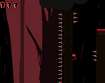
Mechanics wise it seemed well thought out, and I liked the fact that there was always a chance to save yourself by down-attacking the spikes if you fall. The levels were also well thought out and well designed, and I definitely enjoyed how they were made.
One last thing is that there was little in terms of telling you where to go, meaning you often died just trying to find your way around, so see if you can throw in some signs or something to tell the player which direction to head in. Other than everything I've already stated it was a really well made project.
Great job on making this game! It is inspired by Hollow Knight, if I can imagine? Maybe even path of pain? I do have to say that there is a number of things that could be done to make the gameplay feel smoother as a platformer.
As a game played with keyboard and mouse, it is awkward to hold down two movement keys at once--while also jumping, dashing, attacking, and swapping worlds. I would recommend taking the position of the mouse to determine the direction of an attack instead. I feel that there should also be indicators to hint to the player that they should swap worlds or show what path they are intended to take (this is why there are coins in Mario games).
I don't think that spikes should send you back to a checkpoint, instead knock you up because there would be a way to get out of the spikes (by attacking them). The acceleration on the player makes the controls feel a bit sluggish for a game that requires quite a bit of platforming skill. I would also add a double jump to make the game more forgiving, but that's more optional.
I think that there could have been more contrast between the two worlds, but I understand that is pretty restricted by the time. The forest could use a parallax effect too. Also, the lives on level 3 seem to be smaller than in the rest of the levels for some reason.
Overall, great for a first game, controls are a bit clunky but can be refined, art is great and the music is atmospheric!
Wow! This game is so unique and well made! Whoever worked on this clearly poured their heart and soul into it and it shows! Especially the programmers!
Ahhhh. Why did you guys make the jump Z and Space??? Am I here to suffer? The music... fits but is kinda generic. Those two things aside, give yourselves a pat on the back. Art was a pleasure to behold. It was your typical platformer, but the theme was integrated as expected. That is to say, it was one of the ideal uses of the theme in my mind. As far as I could tell, the mechanics worked, so I would say it was top-tier. It would have put me to shame if this had been submitted in the game jam last year. Fun to play, not to eat.
please add signs in level 3 that indicate we are supposed to go down because natural gamer instinct is to avoid the spikes since it kills us. we arent incentivized to see that descending spike pit as an actual path forward
Wow! This game is so unique and well made! Whoever worked on this clearly poured their heart and soul into it and it shows! Especially the programmers!
Comments
Congratulations on winning y'all!! Your game is awesome!! : )
As a fan of Hollow Knight, I enjoyed this game. The artwork was really good and the mechanics were well thought out. One problem I had was that the controls often made the game go from difficult to frustrating. It took me a while to put my finger on it exactly but I'm pretty sure the problem is with having the change dimension key set to f, which causes problems when you need to dash and change dimensions. I would recommend switching it to a, which is also closer to the original Hollow Knight controls that I'm presuming the game is based off of
Like I already said the artwork is really cool and it's clear you put a lot of work into it, especially the animations. The game was also really fleshed out and for the time you had you made a lot of content.
Mechanics wise it seemed well thought out, and I liked the fact that there was always a chance to save yourself by down-attacking the spikes if you fall. The levels were also well thought out and well designed, and I definitely enjoyed how they were made.
One last thing is that there was little in terms of telling you where to go, meaning you often died just trying to find your way around, so see if you can throw in some signs or something to tell the player which direction to head in. Other than everything I've already stated it was a really well made project.
Great job on making this game! It is inspired by Hollow Knight, if I can imagine? Maybe even path of pain? I do have to say that there is a number of things that could be done to make the gameplay feel smoother as a platformer.
As a game played with keyboard and mouse, it is awkward to hold down two movement keys at once--while also jumping, dashing, attacking, and swapping worlds. I would recommend taking the position of the mouse to determine the direction of an attack instead. I feel that there should also be indicators to hint to the player that they should swap worlds or show what path they are intended to take (this is why there are coins in Mario games).
I don't think that spikes should send you back to a checkpoint, instead knock you up because there would be a way to get out of the spikes (by attacking them). The acceleration on the player makes the controls feel a bit sluggish for a game that requires quite a bit of platforming skill. I would also add a double jump to make the game more forgiving, but that's more optional.
I think that there could have been more contrast between the two worlds, but I understand that is pretty restricted by the time. The forest could use a parallax effect too. Also, the lives on level 3 seem to be smaller than in the rest of the levels for some reason.
Overall, great for a first game, controls are a bit clunky but can be refined, art is great and the music is atmospheric!
Wow! This game is so unique and well made! Whoever worked on this clearly poured their heart and soul into it and it shows! Especially the programmers!
hop off jesswho
Ahhhh. Why did you guys make the jump Z and Space??? Am I here to suffer? The music... fits but is kinda generic. Those two things aside, give yourselves a pat on the back. Art was a pleasure to behold. It was your typical platformer, but the theme was integrated as expected. That is to say, it was one of the ideal uses of the theme in my mind. As far as I could tell, the mechanics worked, so I would say it was top-tier. It would have put me to shame if this had been submitted in the game jam last year. Fun to play, not to eat.
please add signs in level 3 that indicate we are supposed to go down because natural gamer instinct is to avoid the spikes since it kills us. we arent incentivized to see that descending spike pit as an actual path forward
Wow! This game is so unique and well made! Whoever worked on this clearly poured their heart and soul into it and it shows! Especially the programmers!
Hope we win!