Play game
Fading Light's itch.io pageResults
| Criteria | Rank | Score* | Raw Score |
| How well the game fits the theme and goal of the jam | #17 | 3.000 | 3.000 |
| How captivating the tone, feel and style of the game are | #17 | 3.200 | 3.200 |
| How elegant the game’s design is | #20 | 2.800 | 2.800 |
| How strongly maps are integrated in the game’s design | #25 | 2.200 | 2.200 |
| How easy to understand and use the game’s rules are | #26 | 2.200 | 2.200 |
Ranked from 5 ratings. Score is adjusted from raw score by the median number of ratings per game in the jam.
Leave a comment
Log in with itch.io to leave a comment.


Comments
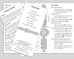
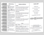
I'm a big fan of the tri-fold (bi-fold? idk) pamphlet format. I think there's something very pleasing about the ratio of width/height, I like the tactile nature of the folded pamphlet and the limited space means you have to think really hard about what is truly essential to the game.
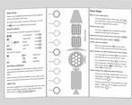
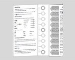
That said, one of the problems with that format is that it can be a little bit hard to parse which part you are meant to read first. As a reader, I felt a bit confused here as to where to start and that meant I only got the rules properly after reading the whole pamphlet a couple of times. That said, it's not a lot of text so it's not a big problem by any means, just an observation. The fact that you have the stat blocks for the different worlds on a side that you have to fold over to meet the map was clever, but it took me some time to realize that is what you were meant to do (I think?). It also took me an embarrassingly long time to realize that the track of circles in the middle panel was the map. This probably says something about my congnitive abilities, but maybe it could be more clearly indicated on the pamphlet what is the map and how you are supposed to use the map with the stat block for the worlds? I'm also a bit confused about how exactly light lag works and how it affects play.
The game focuses pretty hard on mechanics, and that's fine of course, but I was left with a bit of uncertainty about how the game plays differently as a single person game as opposed to having more than one players. The game doesn't really tell you how to play it as a group, so it feels maybe more like a single person game where you're trying to beat the game. That is a totally valid design choice, of course, just an observation.
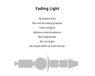
All in all, I really dig the theme and style of this game, there's a bit of understated humour in it as well that fits nicely. I think it seems like a fun game that you can easily carry around and play in a café or something.
Thanks for the comments! I think you're right on all counts.
Ideally I suppose there should be a companion document with some samples of play. This could demonstrate how the map is filled out, and how the stat-blocks interact with it. I tried to use the stat block icons in line with the text to provide some breadcrumbs, but actual examples are probably necessary.
You are correct that there are no explicit instructions for using the game with multiple players. Some thoughts I had involve either playing collaboratively and coming to group decisions for all tasks, or dividing up responsibilities such that perhaps one player sets the course and another chooses how to spend artifacts.
The intention behind the light-lag is that you never know exactly what the conditions are on any world, until you get there. The further away it is, the greater the change might be when you arrive. I'm not sure it bears tracking as I instructed to do, though. All you really need to do is count the distance from your ship and it is self evident.