I've got to admit, I ended up enjoying this a lot more than I was expecting at first! After having read Blossoming Love from last year (which was ok, but not very memorable) and knowing the dev was throwing this entry out as quickly as possible in order to get back to work on their main project, my expectations weren't very high.
My initial impressions weren't very high either, mainly because of the presentation: pretty much every background in this game screams "generic stock photo". The pictures of Pierre's house, in particular, felt very out of place: the vibe was more "interior design website" than "white collar worker's house".
Minor spoilers to follow.
However, I think the story and the writing definitely salvaged this entry! The first-person narration has a nice snarky personality to it, and the story competently builds up to the big twist. I am even hesitant to call it a twist, because past a certain point, we're given so many hints of what is coming. That leaves the reader with a strong sense of suspence as we anticipate what will happen, which is much better than the cheap shock we'd have if the twist had come out of nowhere. Hitchcock would approve!
I do have to say that the story suffers a lot structurally though. The initial set up feels too long considering the length and small scope of the story: the scenes with the protagonist's colleagues are kind of wasteful, considering that the only thing that comes out of them is Pierre and Arthur meeting for the first time. Conversely, after all the excellent build-up, the ending feels so rushed that the game basically cuts to the main menu mid conversation.
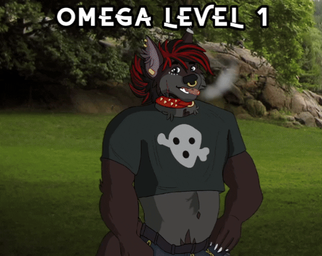
My final gripe (but this is not something against the story, just my personal grievance) is that, as a BDSM enjoyer, it saddens me a bit when BDSM is used as a shortcut for horror or danger. At least Arthur is a saint!
I'm utterly mystified.
Putting aside the plentiful ESL-isms, the dev seems to have internalized all the worst lessons from other popular FVNs. Not only is the plot paper thin, but most scenes seem to exist just to bloat the word count.
Our attention is pulled all over the place: from an overly long job interview that goes nowhere, to an entire scene describing the protagonist making himself a sandwich in painstaking detail, from the random worldbuild elements with no payoff, to the weird obsession with the protagonist's brutal chest... If you stripped all the fat away, you'd probably be left with a few hundred words worth of story.
I must confess that, when I read this for the first time, I was actually gripped by the possibility that this would turn out to be a compelling horror story. Without going into too much detail, the moment when Lauren confirms that what we experienced wasn't a dream left me genuinely stunned and excited. Unfortunately it quickly becomes apparent this is not the direction the story is going to take.
Having said all that, this has become a guilty pleasure of mine. Streaming this with friends (twice!) has been a magical experience and random sentences from this VN have infected my brain. I desperately need more people to understand my random quotes and references.
Serious Loudo is rating this one star for the complete lack of story, but meme-obsessed fun Loudo had a great time with this. I wish the developer all the best.
(Review originally written for MAY WOLF 2024)
(Note: major spoilers)
Bold in concept, well-written, with a clarity of purpose to every element that I dare say surpasses most of the competition.
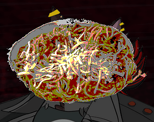
The pacing is economic despite the work essentially consisting of a single scene and an epilogue; it has the confidence to linger in its images and characterize the narrator with subtle mentions of backstory. Seeing that the word count matched the game jam's lower limit, I expected to see more padding, but there's not much here that feels completely extraneous. In terms of presentation, Spaghetti uses both of its two (!) image assets to a great effect: the former's nightmarish mood is effectively realized via digital artifacts and stark colors, and it provides a nice contrast to the mundane photorealism and the offbeat composition of the latter. There is really nothing to add or nothing to change: the concept is executed perfectly.
What is off screen is as important, of course. The spaghetti – in this context most obviously recalling Lady and the Tramp – curiously lacks a visual representation, only being present in the text via its absence, making it a fitting symbol for the protagonist's self-sabotage. No matter how hard it tries, the narrative cannot even bring itself to reveal the supposed centerpiece of the whole thing. This angle is emphasized even further by the Itch page containing a prominent image of the titular dish wholly absent from the work itself, as if a mere paratextual demon haunting it.
The transformation the motif goes through is equally interesting. What lies in front of the narrator is first ambiguously revealed as "not spaghetti" before the game settles on "popcorn", positioning the protagonist simultaneously as an audience to and an actor in the infernal dreamscape conjured from their feelings of guilt and shame. This self-inflicted mental anguish, the work suggests, can be thought of as a kind of private performance where they're portrayed a victim of incomprehensible circumstances, rationalizing their fundamentally nonrational behavior.
On the other hand, it's also a punishment. The self of the narrator is partitioned, the other half comprehending the other's transgressions ("But I always do that. I’m always lying. ... I don’t know what I expected from myself.") but lacking the power to stop them. Spaghetti hell, then, acts as a form of unconscious justice the protagonist inflicts on themselves.
The wolf is an equally deep image. Fourth-wall breaking references to the furry fandom paint it as an object of desire, a fantasy (and, in literal terms, a dream) made real. The text's insistence on its unreality, then, can be read as another manifestation of guilt – even in an escapist environment devoid of consequences, the protagonist cannot allow themselves the carnal pleasures embodied by both MYWOLF and, through food–sex-dualism, the dish the couple is having. How the wolf is specifically and pointedly described as "two-dimensional" further emphasizes the gap between the narrator and other subjects: they are so skeptical of their ability to recognize the equally rich inner lives of others that they're startled MYWOLF is capable of speech.
Worth mentioning is also how the 2D sprite graphics traditionally employed by both visual novels and video games in general are here recontextualized as ontologically suspect, unattainable illusions. The genius of this move is the ambiguity of whether it is criticizing escapism on the whole or the protagonist's woes: it is their own self-deprecation that renders them unable to partake in the most likely harmless fantasy of enjoying a bowl of spaghetti with a wolf.
If you're in the mood for nitpicks, the lack of audio feels like a missed opportunity in a work this formally sharp, and the jam's theme is not present in any self-evident way. Sticking to the defaults of Ren'py with the UI doesn't read as a flaw to me, though, given how deeply Spaghetti is in conversation with its genre – framing it as just another furry visual novel feels right.
Let the masses know that there is no hint of irony in my bones when I declare Spaghetti to be one of the best entries in the game, a compelling exercise in formal minimalism not wasting a single pixel that doubles as a sharp psychological portrait.
(Review originally written for MAY WOLF 2024)
While the writing is pretty polished for a game jam project, the programming work is rough – dialog tags errors are so frequent it doesn't feel like anyone read through the finished product before hitting Publish on itch. There's no title screen (just using one of the pre-existing backgrounds or CGs would have worked in a pinch) or music, either.
Going for full custom assets is respectable, but the backgrounds feel too sparse, with a couple even lingering long after the characters have left the places they depict. I wouldn't have minded a stock photo or two to fill the gaps. Sprites lacking expressions, meanwhile, leaves the whole thing feeling pretty visually static. (Also, is it just me or have some of them, the protagonist's in particular, been stretched horizontally? What's up with that?)
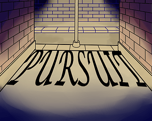
As mentioned, the prose is readable, and the sex scene has a pretty good flow to it. I think my biggest doubt about the story is its tendency to go for what feel like extreme tonal shifts – the game starts on quite non-horny note, and then the protagonist is suddenly admiring a guy's ass, which is both described at length and portrayed with an illustration. The same could be said about the near-instant jump to plot and action; even with some mild foreshadowing, it feels like it comes so fast there hasn't been enough time for character work to put weight into the emotional stakes. I do like the double meaning of the title, though.
Finally, Pursuit doesn't have the most elegant ending in the jam, with a "to be continued" that feels lacking both as a conclusion as setup – not a lot has happened so far, and the idea of what will happen next remains somewhat vague. I get what it's going for, but the execution could be smoother in a lot of ways.
(Review originally written for MAY WOLF 2024)
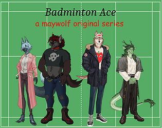
this is my CHALLENGERS (2024)
The prose is as unpolished as you'd expect from what is basically an unashamed joke entry; won't go into specifics in the interest of not killing the author. It also does kind of feel like the shitpost status is used as an excuse to not present a story about sports in a compelling way, in terms of both the writing and the visuals.
That being said, there are some really, really good jokes in there, the 8K words fly past relatively smoothly, and many aspects of the production (like the soundtrack being full of the sweet tunes of Kevin MacLeod and other classic public domain composers) feel purposeful. Can't say I had a bad time, and the author's comedic chops are obvious to the degree that I'd love seeing them make something... if not more serious in tone, then at least willing to risk sincerity on an occasion or two. Badminton Ace is a perfect example of the kind of barely-tasteful satire that remains tolerable and even enjoyable as long as the whole competition isn't just those.
(Review originally written for MAY WOLF 2024)
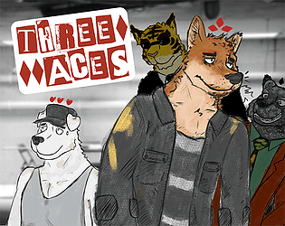
Stylish (the art style is just lovely) and well-written, with straightforward prose that does a good job at conveying information and a strong specificity of time & place. The tone is grounded and gritty without being miserable, and the central conceit of a card game where everyone knows everyone is cheating is so sharp as a metaphor that the social commentary basically writes itself.
Presentation-wise, there's stuff to nitpick. The single jam-provided sprite sticks out pretty badly, the lack of any kind of transition to the opening scene is kind of jarring, and how the card game is visualized works on a basic level but is really subtle and understated. Making use of more visuals and maybe animations of some sort to emphasize what actions everyone is taking would make a difference in terms of clarity, I think; as of now, the prose has to explain a lot by itself. Besides that, it would just be a cool way to use the medium to go all in on showing the card stuff.
As for the other formal elephant in the room ("Should this video game about a card game be playable?"), I found it all so engaging and so skilled in its use of the premise that the thought didn't really cross my mind. It's clearly a story not only written by someone who enjoys card games but someone who knows how to turn them into compelling drama! The player lacking choices has also felt like a pretty effective literalization of how the narrative portrays the competition in general; turning it into an actual game with strictly defined rules and boundaries would be missing the point, I think. Excited to see how this comes up if the VN does decide to go nonlinear in the future, but if it's entirely kinetic, I'll say the point lands.
While the "to be continued" screen dampens the mood somewhat, Three Aces does feel pretty well thought out as a serialized work – far from being all setup, the first act contains a fun twist and ends on a stinger that teases the continuation perfectly. My only concern is that the story is probably something the reader would want to finish in one go anyway. It's dense with information, and I have probably already forgotten something crucial while typing this.
Definitely a "more than the sum of its parts"-category entry; it all just works so well together, and I'm excited to read the rest.
(Review originally written for MAY WOLF 2024)
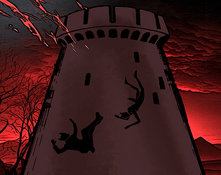
Even if you can smell the looming submission deadline (there's a noticeable amount of typos and text blocks in need of line editing), Ugolino in the Tower has some of the sharpest writing in the competition. It's no-nonsense pacing never slows down after the great opening line; the atmosphere is all in the action, and worldbuilding bits are incorporated with a careful eye for both the clarity and the stakes of the story and the flow of the narration on the whole. More than just making the work pleasant to read, every quiet moment feeling pointed and weighty does a lot to sell the urgency of the situation.
The imagery is sharp, with the game's particular focus on the physicality of lycanthropy conveying the social situation of the protagonist so well that laying it out explicitly feels almost extraneous. Equally stylish and meticulous is the presentation; a scene of two characters enjoying a conversation provides some of the most striking imagery in the VN. Heavy use of negative space and silhouettes also just matches the mood the narration establishes perfectly. Not a single visual element feels out of place, although some of the assets themselves could use a little polish – unaltered photographs feel slightly out of place with the game's striking aesthetic, and zoom-ins of the sprites' eyes are distractingly low-quality.
When it comes to what could easily have been the most disappointing aspect: the game convinced me of its episodic release model better than any other unfinished work in the jam with its insanely good final stinger. Honestly, I'm pretty content lingering in the excitement of the next part for now, like how good TV used to work before bingeing came along.
Insanely good as a jam entry (the weak link probably being the implementation of the theme) and a thrilling start for a VN in general. We'd be looking at a breakout hit if the plain Itch page and the sort of messy and muted thumbnail didn't undersell the game's strong visual sensibilities.
Visually, this is possibly the most striking FVN I have read, ever. Thanks to both your visual assets and programming skills. There are a bunch FVNs these days that exploit what Ren’py has to offer beyond the basic features, and while I appreciate them, the presentation of such tricks often has a touch of goofiness to it. Not here though: everything here looks so polished and professional. I think I saw the dev say this was inspired by Backbone and the final menu screen/credits immediately made me think of that. They look amazing.
Programming-wise, I have only one big complaint: this was possibly the most frustrating FVN I’ve ever played in terms of me having to constantly open the “History” tab to read some text I missed. This is both because of the abundant use of {nw}, but also because the text will sometimes be revealed with pauses and I ended up constantly clicking to forward thinking I have read everything, realizing just a moment too late new text was showing up (apparently, I’m a fast reader).
SPOILERS to follow
For all its advanced tricks, two of the most affecting scenes in the FVN for me were accomplished with very basic visual language. One was the scene when the Mikkel receives his rejection e-mail: even before the narration said anything, just seeing the preview of the message on the screen gave me PTSD. The other was the scene where Mikkel makes his "attempt". Again, I love how the narration didn’t have to say anything, the camera starting to move up was enough to tell me exactly what was happening. A masterful use of the visual language.
As for the story itself, I must admit I found it a bit uneven, although it is difficult to judge in the current state since it looks like a prelude to a much larger narrative. While I generally enjoyed Mycroft’s perspective more than Mikkel’s, so I’m not sad the story went in that direction, the shift of perspective did not feel particularly graceful? I think this might be because this happens together with a complete shift in genre, not to mention in tempo (Mikkel’s very slow introspective narrative vs Mycroft’s action-packed fast-paced story). Even though the plots are connected, it felt like basically reading two separate stories. I'm not sure what the fix would be, but I think maybe we could have used some “mix” of the two styles much earlier in the story, or at least some hints.
I must admit that I really became invested in the story starting from the aforementioned scenes in Mikkel’s bedroom. The beginning scenes did not grip me as much. I see what the scene at the lake(?) was going for, but it felt a bit impersonal to me? You don’t really get what the “real” conversation happening beneath the space talk is because it happens too early into the story, and the fact that there is basically no narration, no physicality in the scene, just dialogue, made it feel emotionally distant. And the flashback of the “accident” is perhaps told a bit too analytically: some vague flashbacks focusing on what Mikkel remembers, filtered through his own lenses, rather than just retelling what happened as if through an external observer, would have been much more effective IMHO.
(Btw, I’m being this nitpicky because I saw the author say he wants walls of text as feedback! Don’t let this fool you, this was one of my favorite entries so far!)
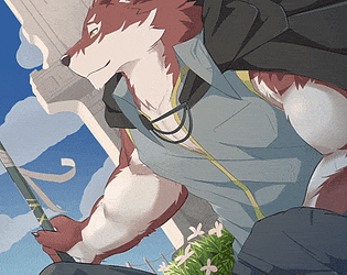
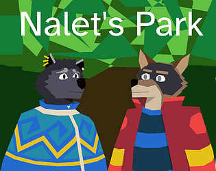
Finally, I have to mention that I loved the art for the characters: I love how most of them are clearly based on the sprites provided for the jam, but redrawn in an artstyle that makes them so reminiscent of the wolf from Moonlit Field.
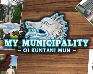
I loved it! While the subject matter is definitely not for everyone (I read this both on my own and with a some people who found it extremely boring), as someone who studied law, works in public administration, and loves political geography, I was personally ready and primed to like this game.
The implementation of the theme, the journalistic quality of the work, the way it tries to teach real life lore to horny furries via gay wolf shenanigans, were all just a joy. And everything in the presentation looks crisp and purposeful.
Minor Spoilers to follow
The story was fun but surprisingly engaging: the scene where the game shows you real life pictures of Östersundom today was a genuine gut punch that almost made me teary. My main gripe with the game is everything that follows that moment: the way the game goes straight into explaining what happened in Östersundom right after showing the pictures lessens the impact somewhat (don't explain to me what you've already shown, the pictures are worth more than a thousand words!).
And the final scene between Dom and Sipoo, while very nicely written, is part of something that left me a bit confused about the game. There are some hints here and there that Dom might not be completely happy with Sipoo and might have some doubts about their relationship after all, and this seems to be reinforced in the final scene when, given the opportunity to do otherwise, the two don't really reconnect and keep going their separate ways. However, this underlying thread doesn't really seem to be explored and I'm not sure what the story is doing with this, and how it relates to the overall metaphor.
(Review originally written for MAY WOLF 2024)
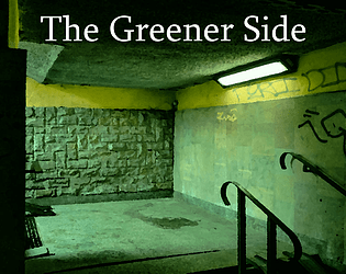
The presentation is kind of rough, firstly – the UI is both really plain-looking by itself and not that different from the Ren'py defaults, even using the same font. Besides that, there are a lot of "missing image" errors. The backgrounds feel well-chosen, however, and the dungeon in particular is a nice interpretation of what that could look like in an urban fantasy setting. I also like all the things the game does with sprites, even if animations aren't as plentiful as they could have been.
In terms of writing, The Greener Side is not a bad read; the pacing feels fast even with all the travelogue in the beginning, the character voices are distinct, and the tastefully implemented worldbuilding wisely prioritizes fun details. The frequent punctuation errors (most often a missing comma) are kind of distracting, though, and some character backstories are exposited smoother than others.
I think the story's greatest strength is feeling appropriately tropey, with the isekai conceit and various other fantasy elements being given an entertaining, gently satiric spin. The ending feels way too brief, however – I'm actually not even sure if this was supposed to be it or if there's more to come, which I guess various unresolved plot points suggest. (It's also very sudden in its implementation, with the instant kick back to the title screen feeling slightly jarring.)
The overall lack of polish betrays that we're dealing with a game jam project, but the story is inoffensively realized and eminently readable. I honestly had a pretty good time with The Greener Side, just wish things could have been pushed a little further all around.