Play game
Save the Forest's itch.io pageResults
| Criteria | Rank | Score* | Raw Score |
| Overall | #16 | 3.000 | 3.000 |
| Art | #17 | 3.250 | 3.250 |
| Presentation | #17 | 3.250 | 3.250 |
| Gameplay | #19 | 3.000 | 3.000 |
| Audio | #22 | 2.500 | 2.500 |
Ranked from 4 ratings. Score is adjusted from raw score by the median number of ratings per game in the jam.
Team members
Moon Moth (Mohammed Abushawarib)
Software used
GamemakerStudio 2
Cookies eaten
Sadly none.
Leave a comment
Log in with itch.io to leave a comment.


Comments
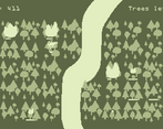
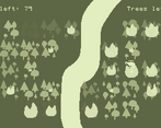
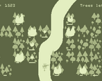
Game play is motivating and there is always something to think about, as fires increase in size trees burn down and especially the water having full strength on the tile its splashed but only a part of its power on the neighboring tiles. Having a strong visual style truly helped here as well with the game boy style colors used to a good extend (and recoloring the helicopter over water was so subtle I only realized it after playing for 2 minutes or so.)
Refill time for the water felt just right, as it gave a moment to think about where to fly of next and which fire has the main importance right now.
You have a spelling mistake at the start of the instructions (figher fighter instead of a fire fighter)
Reached a Score of: 13417
I still don't know why I keep making these stupid spelling mistakes. I'll fix them soon. Thank you for your feedback!
I actually like the way this looks woth the limited palette. Fun to play in short bursts, but gets a bit stressful for my taste after a while. I appreciate the animations, but the refill-at-the-river animation might be a bit to subtle and take a bit to long. I actually thought the game had cfrozen at my first couple of attempts.
I added the animations to make the game feel more alive, make it so that there is always something moving on screen. It is odd to me that you thought the game had stopped, because there is always something moving.
Well thank you for your feedback, I will try to make the animations more see-able in future games.
I appreciated the effort you put into settings and animations! There was a surprising amount of polish, although I found the movement slightly unresponsive. Being able to hold down a movement key would've been a nice convenience.
Ah frick, I should have thought of that.
Thank you so much for your feedback
EDIT: I added the ability to hold, the gameplay should feel a bit better now
Probably my favourite submission so far.
(also, another person who uses GameMaker :))
I would have liked to have known which way the healthbars were supposed to be aligned.
Thank you for that :)
I wanted to add frame to the health bar as well as gradiant to make it a little bit easier to differentiate. I just didn't have colours to work with.