Play game
Magicon Stadium's itch.io pageResults
| Criteria | Rank | Score* | Raw Score |
| Presentation | #6 | 3.375 | 3.375 |
| Concept | #7 | 3.250 | 3.250 |
| Enjoyment | #7 | 3.375 | 3.375 |
| Overall | #7 | 3.344 | 3.344 |
| Use of the Limitation | #9 | 3.375 | 3.375 |
Ranked from 8 ratings. Score is adjusted from raw score by the median number of ratings per game in the jam.
Team members
1 (https://twitter.com/AbcGodDev1)
Software used
Unity, Visual Studio, Photoshop, Blender
Cookies eaten
3
Leave a comment
Log in with itch.io to leave a comment.


Comments
The sounds are hilarious, and the effects are great! The combat felt just a little spammy, but it's pretty close to pokemon's system. Clearly, a lot of work went into this project, well done!
I really like the way the fight are planned in this game, I have yet to crack how each color measure against the others but a nice game !
Pretty fun ! It's pretty much exposing the simplicity of Pokemon's strength/weakness system (at least in the first 2 generations) that is hidden through complex words about elements and other types. You actually need a good enough memory of said strengths and weaknesses by the third battle :) And also a good usage of your wizards early on, I personally didn't level up enough one of the three and he was too weak by the third battle. I think reducing damages slightly and making the player skip a turn when switching wizard could be a plus but I'm not sure.
At first I thought the strength/weakness had to do with the complementarity of colors on the color wheel which would be a neat concept for an action game (in a turn-based game like this you would just need to have your color wheel in mind and take all your time).
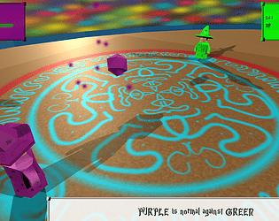
For the aesthetics it's all pretty fitting to the them and limitations, I just wish the shadows weren't as obviously modern, but it takes either changing shaders or tweaking annoying Unity settings so it's fine for me ;)
I honestly looked into the shadows 30min before commiting, cause i felt the same, but my brain was to fried to get in anything less haha.
The strenght and weaknesses do have something todo with the color wheel.. but more the RGB one, so R>G>B, and then Yellow is half R and half G, Purple R/B and Cyan G/B. It might have been clearer using the actual color wheel...
Am glad to read you enjoyed it, it was the goal to get as much of the pokemon first genearation system in there :D
Ah interesting ! I feel like it's actually a more interesting system. And yeah in a full game it would be nice to have kind of a color wheel with some arrow pointing in the sense of strengths, but for a jam it does its job well ;)
Ahah don't worry I was pretty much the same. My brain couldn't get any work done. At the rate I was working I should have been able to code in the shooting, but nope, 5 hours before the deadline it was already 1am here and my brain was starting to get confused xD
i like the idea and i enjoyed my fight.. UI taking a bit too much space on the screen though