Indie game storeFree gamesFun gamesHorror games
Game developmentAssetsComics
SalesBundles
Jobs
TagsGame Engines
A jam submission

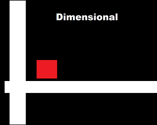
DimensionalView game page

A puzzle game in multiple dimensions
Submitted by macro_scenery — 10 minutes, 50 seconds before the deadline
Add to collection

Play game

Dimensional's itch.io page

Results

CriteriaRankScore*Raw Score
Theme#34.3004.300
Audio#73.6003.600
Innovation#93.5003.500
Fun#93.4003.400
Minimalist#144.1004.100
Overall#143.4623.462
Adherence to Restrictions#174.0004.000
Design#182.9002.900
Polish#251.9001.900

Ranked from 10 ratings. Score is adjusted from raw score by the median number of ratings per game in the jam.

Did you make the game solo or with a team?

Team

With a team? So, what was/were your role(s) and every person on the team role(s)?
Macro_Scenery (Art/Game Dev/Programming)
Markositta (Music)

Did you make the audio for this game during the game jam period?

Made all the audio during the game jam

Did you make the art for this game during the game jam period?

Made all the art during the game jam

Leave a comment

Log in with itch.io to leave a comment.

Comments

HostSubmitted(+1)

Good game and challenging! But needs some improvement. Yeah! Congratulations on finishing your first game jam!!!

Here is my feedback:

What did I like the most?

  • I enjoyed the mechanics and the gameplay of the game.
  • The music.
  • The level design.

What I disliked the most?

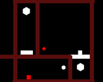
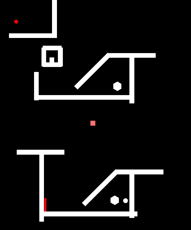
  • The corner of the levels. And the useless stuff. [1]

To fix

  • There are four colours in the game!!!
  • The player jitter with the stuff (also, the box that you can move). E.g. walls. 
  • Jumping is floaty. (i.e. The player seems like it is flying rather than jumping)
  • You should lock the rotation of the players/object.
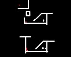
  • The players are looking on the top of everything. [2]
  • The objects look like they are on the top of the walls. [3] 
  • The game name's text on the main menu is too big.
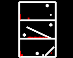
  • Bug/glitch whatever. [4]

Suggestions

  • On the main menu, add a button to start the game and one for exiting the game. 
    • When I press the start button, the level selector should display.
  • When moving between buttons, show next to the selected button. Something like an "Enter/Return" icon. 
  • Remove the control's text from the main menu.
  • On the first level of the game, explain how to play the game avoid long text. For example, show arrow and WASD keys and write next to them move. And display a space-bar and write next to it jump.
  • On all the stages, show the number of the current level and the total levels.
  • On every level, display somewhere on the corner something like: "R - Reload".
  • Load the upcoming level automatically after finishing the current one. 
  • Make the music doesn't destroy on load.
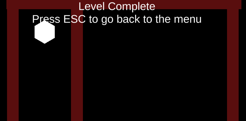
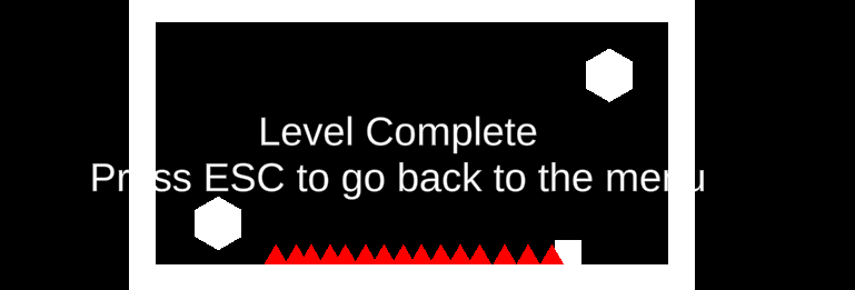
  • Move the "Level Complete..." text move it to the centre/centre-right/centre-left, make it smaller and bold. [5]
  • Change the font. The default font doesn't look good.
  • "Press ESC..." text make it smaller than "Level Complete" text.
  • "Press ESC..." change it to something shorter. For example, "ESC -  Main Menu".

Endnotes
[1]


[2]

[3]

[4]
[5]


I hope this was helpful!! :)

Developer(+1)

Lot's of advice! Thanks so much. I'll try my best to make my next games better :) This is one of my first jams.

Submitted(+1)

I enjoyed it. It's a short but neat little puzzle game. I did notice a lot of clipping in your movement for the player character. I suspect you are setting the velocity of the player directly, rather than adding force on rigidbody2d. While this is what most platformer games do to make their movement more snappy, this game shouldn't do that because it relies more on physics for it work.  For your next game, look into more sophisticated movement scripts and you will notice just how much of a difference that makes. 

Good luck!

Developer

Yes that makes sense. I just used a simple direct transform movement system. I'll make sure to look into better movement scripts in the future.

Submitted(+1)

Pretty interesting! Certainly a bit buggy and unpolished, but let it be known that you freaking finished something and that that's great; a first step to building a creative habit! Keep going, even if it's just exactly this game with a few improvements. : )

Developer

thanks this is only my second jam so I hope to improve over time!

Submitted(+1)

 Great idea for the game! I would've liked to see a little more polish as I was unsure of what had to be done. I was able to glitch into the walls, but I'm not sure whether that was intentional. I'm sure you would've been able to have done better if you had more time!

Developer

Yea the game is a big buggy. Sorry :(