It's great that you continually look for ways to tweak and improve the game for players. I hope others take note - it never hurts to improve a project if you feel strongly enough.
Play game
Redshift Blueshift Generations's itch.io pageComments
You did a really good job on this, Dallas!
This was my first time playing a game with this hex-flower system, and I gotta say it surprised me. This was way more tense than I expected. I really like that the most powerful mechanic (Memory) requires the player to envision a dramatic change to the culture of the ship. It's such a sneaky way to make the player even more involved.
As for the criticisms, here's my takeaways after playing the game:
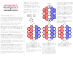
- The flow of the text could use a rework. In playing the game I found myself struggling to find the information I was looking for, it was good that I'd read the rules in advance! Personally, I think you could tackle this in two ways: (1) trim the rules so all the mechanical text fits on one side, with the oracles in the back or (2) move the "playing area" to the back of the sheet, so once the player is in "play" mode they have everything they need in front of them.
- Although I appreciate you adding design notes (as a game maker I always read them), it's taking up real estate. You could still publish these thoughts as a "director's documentary", a lot of people do that. But it's not necessary for the pick up and play nature of a one page rpg like this.
Note that all my notes are about flow. Give yourself a pat on the back, what you made here is very good mechanically. I had a total blast playing it. Can't wait to see it evolve and what you make next 👍


Leave a comment
Log in with itch.io to leave a comment.