Play asset pack
toast and jam for the jam!'s itch.io pageResults
| Criteria | Rank | Score* | Raw Score |
| Technical | #38 | 3.296 | 3.296 |
| Concept | #42 | 3.222 | 3.222 |
| Overall | #46 | 3.074 | 3.074 |
| Visual | #53 | 2.704 | 2.704 |
Ranked from 27 ratings. Score is adjusted from raw score by the median number of ratings per game in the jam.
Limitation
Yes
Leave a comment
Log in with itch.io to leave a comment.


Comments
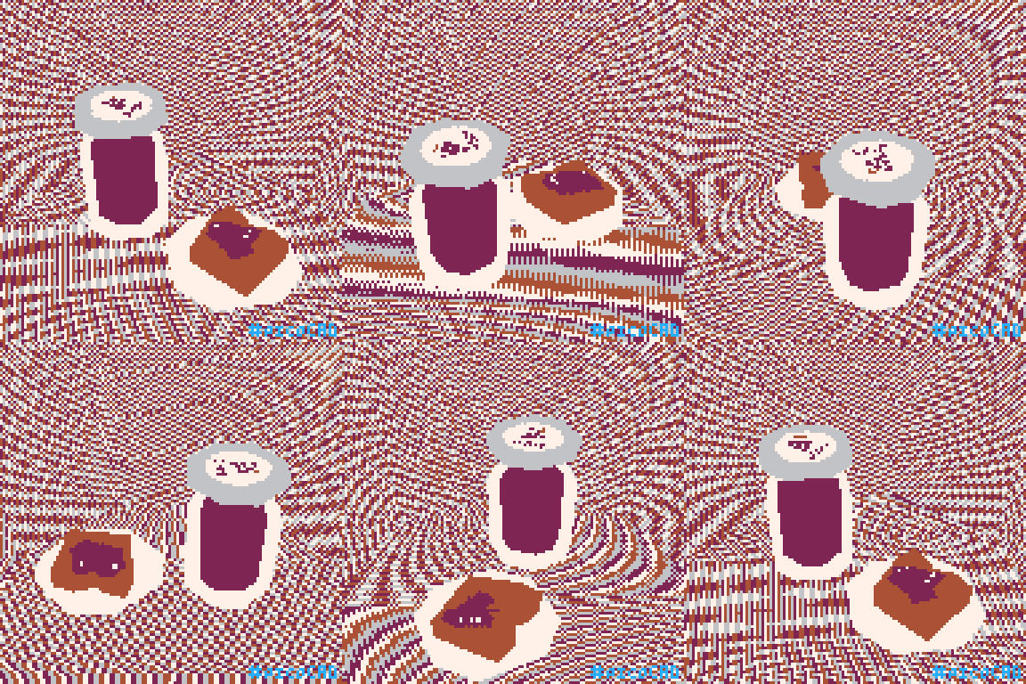
Really cool scene you got there! The background is absolutely trippy and the jelly looks like it's slithering on the bread slice.
Background is interesting, but somehow makes the jam and the bread the main focus of the model. How does it work?? The jelly on the bread is just chilling with everything lol.
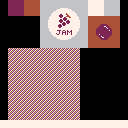
thanks! I wanted to stay within the 4-color limitation while keeping the model from blending too much into the background, so I decided a fun way to do this would be to use all four colors in the background equally and kind of make them look like TV static. I made my skybox texture out of a pattern of 1pt diagonal lines, and let the gif rotation add the distortion it wanted.
I attached the texture for download, but here’s a preview if you want to see what I mean:
The jelly wiggled no matter what I did, so I let it make its own decisions in the end :P
Holy fuck that background is trippy, I love it
thanks! I embraced the trippiness to stay within the 4-color limitation.
I like the glass effect on the jam jar.
wavy