Play project
ANOTHER LIGHT - RED VOX (picoCAD 25)'s itch.io pageResults
| Criteria | Rank | Score* | Raw Score |
| Concept | #3 | 4.500 | 4.500 |
| Visual | #4 | 4.500 | 4.500 |
| Overall | #4 | 4.333 | 4.333 |
| Technical | #5 | 4.000 | 4.000 |
Ranked from 8 ratings. Score is adjusted from raw score by the median number of ratings per game in the jam.
Meets limitation?
Yes
Suggestion for next theme?
Light
Suggestion for next limitation?
No eyes on the model
Leave a comment
Log in with itch.io to leave a comment.



Comments
This is cool, I like the perspective :)
Thanks :D
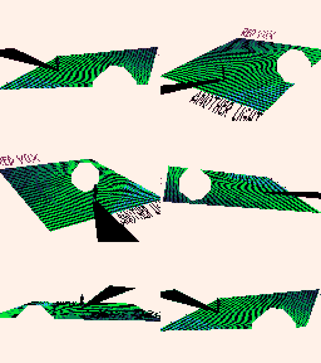
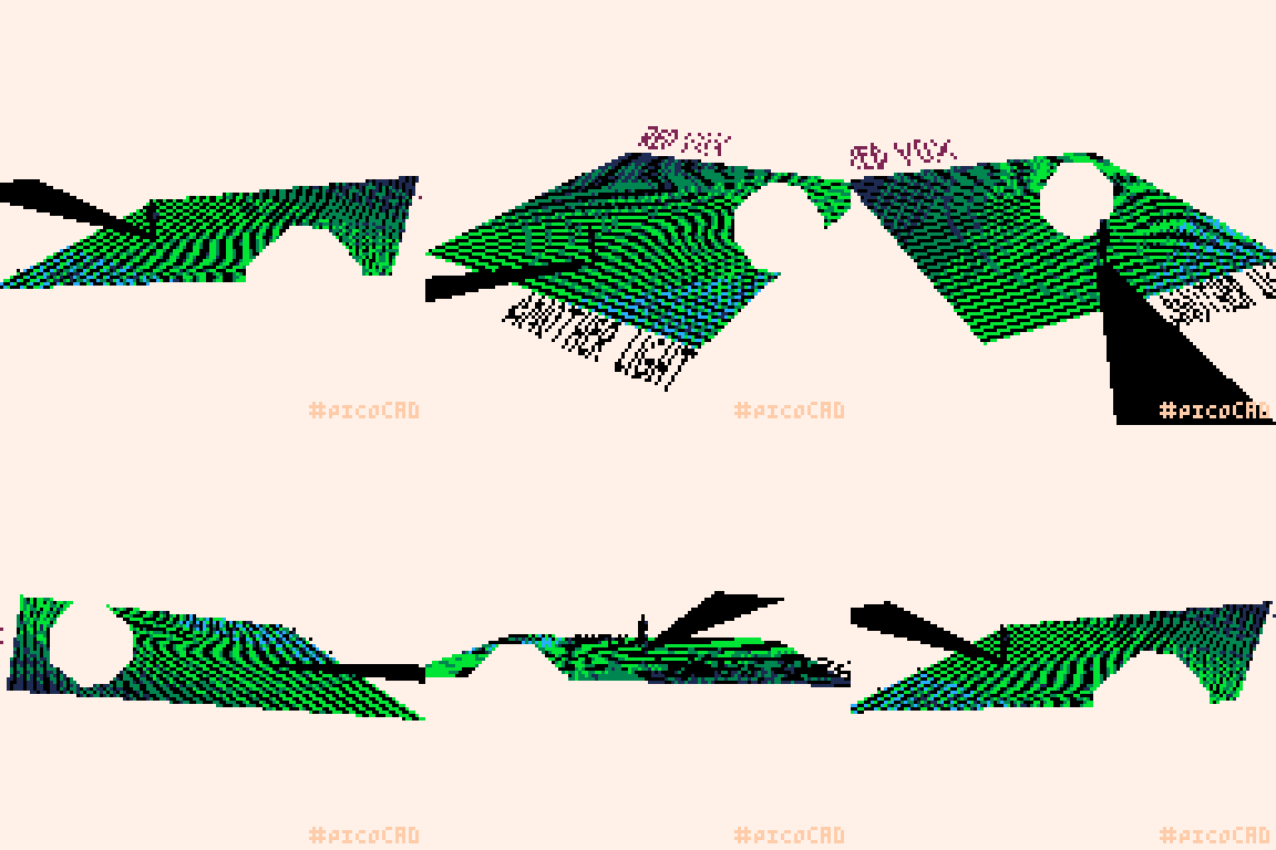
I really like the use of negative space, with the white sphere matching the white background
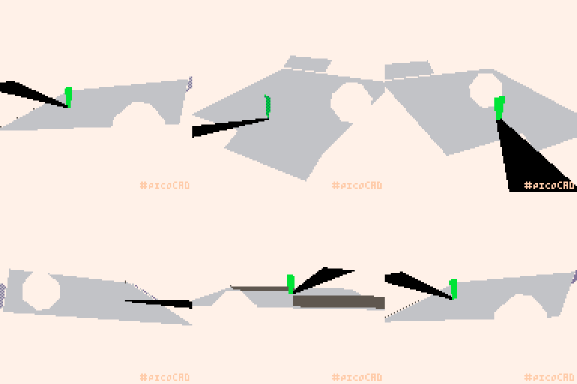
Thanks, but this white sphere/sun is the same colour as the background on the original thing soo it was not my art skills :P
There is such a crazy implied depth, feeling like everything extends within the middle square. Very cool!
Thanks, i tried to match how the cover wouldd be if it was animated, in the orginal cover i always thought the black lines were like sand dunes made out of sound and the white sphere was touching some lines and making they move
Really neat technical execution. Really dig the colors
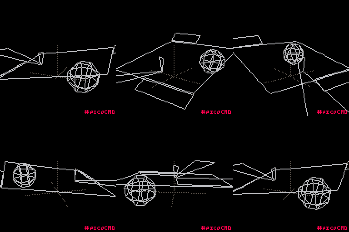
Thanks, this was my first idea when the album theme was revealed but i was kinda confused on how to execute it. In my mind the black lines on this gradient dark green to a bluegreeny were like sand dunes made out of sound, soo the animation part was to animate the little dunes, for some days i was thinking about making the person standing out of meshes but just one plane did the trick very well. About the colours i used 4 colours on the square part, dark blue, dark green, light green and light blue.
Amazing use of space and color, the angles are deliberate, the sphere really makes this whole thing pop.
Thanks, the sphere is ANOTHER LIGHT hahahahahahaha