Play project
[picoCAD] Tim Hortons's itch.io pageResults
| Criteria | Rank | Score* | Raw Score |
| Technical | #4 | 3.571 | 3.571 |
| Visual | #5 | 3.857 | 3.857 |
| Concept | #7 | 3.143 | 3.143 |
| Overall | #7 | 3.524 | 3.524 |
Ranked from 7 ratings. Score is adjusted from raw score by the median number of ratings per game in the jam.
Meets limitation?
No
Suggestion for next theme?
Toy art
Suggestion for next limitation?
4 visible colors
Leave a comment
Log in with itch.io to leave a comment.


Comments
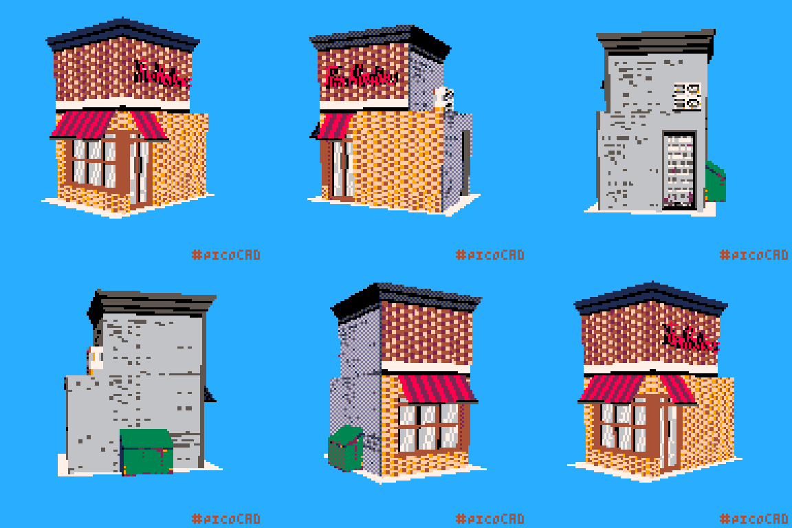
The insets add some nice depth, and good work with the sprite stacking for the signage!
Great details and textures, it's the small things like the double sign texture and the depth to the back door that really speak to me in this
Great brick patterns and sign text! Pick me up some tim bits~