Indie game storeFree gamesFun gamesHorror games
Game developmentAssetsComics
SalesBundles
Jobs
TagsGame Engines
A jam submission

A.L.E.X. :: Rebuild Thy ParadiseView game page

This Isn't The Story You Think You Know
Submitted by The Gentleman Loser — 3 hours, 49 seconds before the deadline
Add to collection

Play game

A.L.E.X. :: Rebuild Thy Paradise's itch.io page

Results

CriteriaRankScore*Raw Score
Fan Favorite#692.5933.667

Ranked from 3 ratings. Score is adjusted from raw score by the median number of ratings per game in the jam.

Leave a comment

Log in with itch.io to leave a comment.

Comments

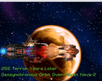
Interesting concept, and once you get past the intro it's actually a rather cool little 4X type of game. However, the scroll for the intro was WAY too fast, and there were some issues with pacing of the story and exposition.

Suggestion: The tutorial for the game was great...after the game proper started. I personally feel you could have used the intro bits (before the 4X part) to explain the history AFTER you get to the new planet. It was unnecessary for the game to start with it. Also, drastically slow down or give the player control over when to move to the next bit of text in the intro.

When the game starts it fails to find a file in a folder, but if you hit retry it finds it? That's weird. 

The scrolling text at the beginning is way too fast. It's implying that your story is soo bad that the player shouldn't even try to read it. If that's what you're trying to do, why put it there in the first place?

Make a decision. Either play the text at a readable speed or remove it. Pretty simple solution here.

The artwork in the background of the super fast scrolling text is pretty cool. It's very unique, but the art styles really don't match and they kind of clash in some places.

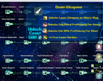
Once you get into the game the menus and sound effects seem pretty solid. I like the layout, there's a whole lot of default resources but that's to be expected in a game jam.

The game starts with five save files already baked in, so that's pretty weird. You should probably remove the testing save files before zipping and uploading.

The game seems to start you at the end of an epic journey which is fine, I've seen many successful games use this tactic before where it works. (Lufia, I'm looking at you) The main downside to doing this is the player has to spend a less than insignificant amount of time reading items and skill descriptions to know what everything is and it's purpose. The term for this is analysis overload. You will get a little bit of that in this game. 

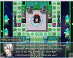
You get dumped on with a crapload of text lore then give a fully equipped and leveled up party with all the items and skills. It's just whole lot to digest in the span of a couple minutes.

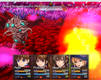
All built-in animations and no action sequencing to be found doesn't really impress me all that much, no matter how many skills you give the player, especially if not all your skills even have an animation. I'd rather have two or three highly customized skills than a dozen default looking ones.

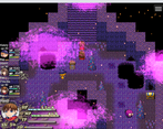
I think it wouldn't be a bad idea to tone down the number of particle effects that are repeatedly scrolling across the screen. There's too many giant purple clouds obstructing the view.

I really like how you added the health bars above the player battlers, that's cool.

The battles are not too bad, but the game could use another balance pass. There are a few things that are still off and don't feel quite right. The first aid skill is way too weak. Maiden's Stance sometimes hits really hard and sometimes hits weak, maybe the variance is too wide maybe it was a crit? The enemies Flame II AOE smashes the party and it could stand to be tuned down a bit. Darkness II is overpowered. Even if all four party members were to use a High potion they would still be taking more damage than they healed for, using their entire turn and consuming the items.

You can't save it after fights and the battles are hard. It's a good thing you give the player some starting items cause they will need them.

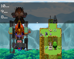
I liked the final boss's final form transition. Good work on that. The sequencing at the end of the boss fight is pretty cool, I really liked it.

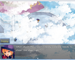
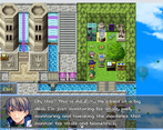
Nice job making the world map look good. Making the characters mini and adding that foggy cloud layer. It works here. Good stuff.

The Godrays look weird when you pan the camera upwards on the outside of the tower. 

I like the Hyper Phoenix intro scene, it looks corny and it moves very weird, but to be honest I thought it was great haha.

The game can get a little text heavy at times and I got bored trying to read through the lore and text dump with Turbo.

Imperial dropship, lookout! This game has some really cool eventing and sequencing going on which I really find refreshing and I enjoy quite a bit. I think there's still too much going on the screen at any one time though. Turn down the density on steam clouds and particle effects a bit both on the map scenes and battle scenes. 

This game keeps switching it up and right when you think you're about to beat the game a whole new chapter starts. I can't even, lol. This is great game jam entry and I really enjoyed it. Well done! :)

(+1)

I can definitely see a lot of effort put into this project - maps are pleasant to look at and pretty fun to explore; there are a lot of visual effects that make the game stand out; there's even a HUD. The beggining caught me a little off guard! It's pretty grim for such a colourful game. I also like that you can juke enemies on maps to avoid them. I definitely prefer it to random encounters. As for the negatives - the dialogues are very cheesy, but I don't mind; and the characters feel a little disposable because of the intro.