Play game
Game of Goofs's itch.io pageResults
| Criteria | Rank | Score* | Raw Score |
| UI & UX; visual design, clarity & ease of use, guidance, accessibility support | #8 | 2.500 | 2.500 |
| Features; gameplay enhancements, integrated systems | #12 | 2.500 | 2.500 |
| Creativity; innovation & originality across design, concept & execution | #13 | 2.500 | 2.500 |
| Gameplay; core mechanics, objectives, balancing, progression | #19 | 2.250 | 2.250 |
Ranked from 4 ratings. Score is adjusted from raw score by the median number of ratings per game in the jam.
Judge feedback
Judge feedback is anonymous and shown in a random order.
Feedback
The concept idea is most interesting, the core mechanic is there with hitting the enemy off the screen and having a goal of 5 points helps to know how long the game will last. The UI Main Menu screen is simple but used well, adding a function to change the music volume is a good add-on however it does not work. The volume in the game remains the same regardless what setting I put it on but I am pleased an attempt was made to make it work.
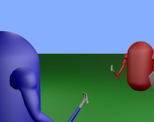
The animations of the capsules appears to be smooth and works well, scoring points works ok and the game did indeed finish when the number of points was reached. Your choice of music also appears to be good and helps to break the silence which will encourage longer gameplay.
However your concept of a ‘flipping map’ while certainly unique did present its own problems. When the map is flipped the players would appear upside down until they were moved by the players. But this did not resolve the control interface as everything was inverted (moving left made me move right, moving up made me move down…etc). As everything was upside down I’m afraid this was true with the controls.
There is a simple way to resolve this minor issue which is a small adjustment to the coding in C# however I was not able to see any documentation attached to your submission, this should be made for each game you make in the even problems like this occur but also to show how you built the game.
Summary
Despite some interesting bugs I found, I was overall quite pleased with this game, I can clearly see the passion to try to make something different and unique, perhaps if more time was spent on fixing these minor issues and more experimentation it would be more stable but I was still pleased with your efforts to make a game like this. There is certainly room for improvement but then again there always will be in game development. As a YouTuber and game developer myself we consider it a pleasure to try your games and I am pleased to have had the opportunity to try your game.
Thank you.
LCripps.
Website: http://fellowplayerstudios.com/
YouTuber – FellowPlayer: https://www.youtube.com/channel/UCXzcduiD99hcDMhhCzByRiA
The concept is nice and the game is fun!
It's a little buggy (I found the counter often increased more than once at a time when it shouldn't have) and the visuals are very simple.
The game lacks onboarding, this is key. Played at "fastest" settings and it was running extremely slow. I had no idea how to play, and tried to be a first time user - this type of game genre concept seems to be used/reused several times in this challenge, so you need to have a solid experience at least in order to shine.
Look at the onboarding, optimisation, and gamification elements. You need to keep players engaged, you don't want them to launch it, play it once and run away. It is your creation, make sure you have a solid and engaging experience. The core game loop needs to be there and needs to be as optimised as possible in order to be assessed.
No Documentation
Playthough
- Title screen, basic but does the job. Play!
- Level has been developed with some art, music hints at a medieval theme.
- Characters extended to have hammer and shield.
- Cant figure out the controls, no hints on pause screen.... figured it out.... don't like blue controls(cramped on one hand), red is better.
- Hitting doesn't feel very good, whats the point of hitting in this game? Neither does the shield. Cool concept but need more work to make it fun.
- Ah world flip. That was weird. Cool concept. Controls flipped though, unnecessary resistance.
- Winner screen is bare bones.
Overview
- Some interesting ideas, concepts have potential but all kinda just thrown in atm. needs organising and need to find the fun in the core combat mechanics. Hammer and Shield concepts are interesting visual motifs but game doesn't really do anything with it yet.
- World flip cam out of nowhere. Another interesting idea but let down by execution.
- Simple things can get big wins in a demo. i.e. Game-pad controls. Controls on pause screen or pre-game screen.
- Would be nice to see some development on the score game loop. The stock sandbox one is pretty boring.
Leave a comment
Log in with itch.io to leave a comment.


Comments
No one has posted a comment yet