Play game
SFAS 2018 - Molecumulate's itch.io pageResults
| Criteria | Rank | Score* | Raw Score |
| Creativity; innovation & originality across design, concept & execution | #4 | 3.000 | 3.000 |
| UI & UX; visual design, clarity & ease of use, guidance, accessibility support | #5 | 2.750 | 2.750 |
| Features; gameplay enhancements, integrated systems | #22 | 2.000 | 2.000 |
| Gameplay; core mechanics, objectives, balancing, progression | #23 | 1.750 | 1.750 |
Ranked from 4 ratings. Score is adjusted from raw score by the median number of ratings per game in the jam.
Judge feedback
Judge feedback is anonymous and shown in a random order.
The concept is good, and the game mechanic is simple. Consider the below points as a starter:
- Add tutorial/onboarding. I liked the presence of the control mapping on screen.
- Add a player vs cpu mode
- Make sure the UI gives clear and proper indications to the player. And that all fields are marked correctly in the way they communicate such info to the player
- Consider re-designing the menu
- Consider adding gamification elements
- Add leaderboards or anything useful that would make players come back and engage with the game
Feedback
The concept idea for this game works pretty well, the adding of atoms for each success helps the player to attain a goal. You also have a main menu system working although it is a simple one, however you have chosen to remove the Unity settings windows which lets the player choose a resolution and quality settings. This is good practice for a game but if you remove these then they must appear within the game itself, people may have trouble using one specific setting.
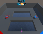
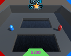
I feel you could have added some sounds to the game to break the silence, it would encourage players to continue playing longer or add some sound effects. There also seems to be a strange motion when colliding with the player, it seems every time a collision with the opponent is made they both ‘jump’ back randomly a little. If this is a deliberate function of the game I found it confusing to aim at my opponent without ending up falling into the water by accident.
Sadly I could not find any documentation relating to your project so I was unable to see how you built the game and the stages of development, this should be considered in the future.
Summary
There is certainly room for improvement but then again there always will be in game development. As a YouTuber and game developer myself we consider it a pleasure to try your games and I am pleased to have had the opportunity to try your game.
Thank you.
LCripps.
Website: http://fellowplayerstudios.com/
YouTuber – FellowPlayer: https://www.youtube.com/channel/UCXzcduiD99hcDMhhCzByRiA
- Documentation
- Looks appealing
- You got rid of that bloody capsule!! Yay! Easiest win ever!
- Like the justifications and gameplay focus of the document.
- Kept the colour scheme tho. Getting bored of this colour scheme.
- Looks nuts, pumped to play it.
- First play
- Graphics
- Nice effect on level. fits theme and style.
- very fluid, ruined a bit by camera jolts.
- Jump
- improved from starting project.
- physics and movement feels good
- shadow under the player. good call!
- Improved camera
- focus is good.
- gets you into the action
- can see everything.
- a bit jarring when you kill someone and they spawn back. pretty simple code to blend this. same for hitting opponent.
- UI
- like the updated style.
- controls on screen, good for this kind of jam.
- in world score on the character is pretty cool. good animation, is visually pleasing like described in the doc. is the UI score needed now? could count it up at the end of a match, ad tension/uncertainty for close matches?
- nice design on the clock and style BUT i'd try to reduce the UI a bit. maybe combine it as feature of the top bar so only have one place to look for all info.
- Underwhelming game over screen
- Graphics
- Second play
- Game modes
- Hard mode -
- nice visual effect
- subtle but worthwhile tweak to the game
- makes it harder as advertised
- Hard mode -
- No quit option - bad point for UX, wanna try them other levels!!!
- Levels
- Simplistic but consistent. Just adds a bit of variety. Nice.
- Game modes
- Overall
- very strong deliverable
- gameplay hasn't deviated far from sandbox BUT many improvements to style, UX and feel.
- no major bugs other than camera.
- Next time would be good to push the gameplay a bit more. Try to come up with something small and unique in this area.
- Documentation
I like the concept of this game, but the game does not seem to work properly.
I get that its a type of brawl game but it's lacking depth and proper mechanics. I would advice you to take a second look at how you handle your movement and "collision" as these were the main problems that I ran into. My guess is that you move the units by changing their transform to a new position when they hit each other rather lerping which would look much cleaner. Working with rigid bodies might have also worked better.
There is no option to exit the game once you are playing, the UI is limited but doesn't need more information. All that is required is a purpose, tell the player what is required of them when they first open up your game. The first few seconds I didn't even realize it was multiplayer or that I had to bump the other player off to win.
I do miss a lot of features, things like pickups that are usually very typical for a brawl game, an actual fighting mechanic rather than bumping into each other and hoping one if you gets pushed off. I like how you are talking about electrons but what are they and what do they do? Can I used them as bullets/ damage prevention/ ... To me they didn't seem very useful because all i could do was jump and move.
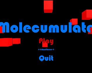
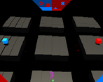
The concept is great, I like how you work with the floating cubes, it makes a overall simple game still stand out.
Leave a comment
Log in with itch.io to leave a comment.



Comments
No one has posted a comment yet