Play game
Supermarket Madness's itch.io pageResults
| Criteria | Rank | Score* | Raw Score |
| UI & UX; visual design, clarity & ease of use, guidance, accessibility support | #3 | 2.887 | 3.333 |
| Creativity; innovation & originality across design, concept & execution | #8 | 2.887 | 3.333 |
| Features; gameplay enhancements, integrated systems | #9 | 2.598 | 3.000 |
| Gameplay; core mechanics, objectives, balancing, progression | #10 | 2.598 | 3.000 |
Ranked from 3 ratings. Score is adjusted from raw score by the median number of ratings per game in the jam.
Judge feedback
Judge feedback is anonymous and shown in a random order.
Documentation
- Very details, clear and structured dev journal.
- interesting read. Game looks very good.
- Lots of thought gone into core mechanics and art style.
First play
- Cool music.
- Very impressive use of assets for single man team. Unity is great isn't it!!!
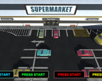
- Intro & Good title screen. Presentation is very professional.
- Gah cant play without more players and controllers!!! gah. Will have to come back to it.
*Given a temporary rating based on what I can see which is already a lot. Its clear the developer has put in a lot of effort and adopted a methodology that has allowed them to reach high level of quality and breadth of content. Well done. Hope i get to play it before the review phase is over so I can bump up the score.
Consider having a longer respawn time, and have the defeated player starting from the beginning of the supermarket.
Feedback
I found the concept for the game very good, the options to have multiple players appears to work well. The images of the ‘How to Play’ tutorial are a little small and difficult to see however there was enough to make out the objective of the game. Your choice of using a Main Menu system and pause system is simple but functional. These details are sometimes overlooked but makes a big difference to the game which I was pleased to see you did.
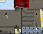
The models used in the game appear to work well and there is an ample number of assets in the scene to make it feel like a true supermarket (it was not an empty void environment). Creating a realistic environment can be time consuming and is sometimes overlooked while focusing on the core gameplay only. Interaction between players works well and interaction with objects in the environment is unique. Showing a progression bar is a good add-on function.
Music and sound effects appear to work well however I feel more sound effects could have added to the game to make it feel more realistic. The only sound I could hear other than the music was the cashier ringing. Other sounds such as picking up items, footsteps or other supermarket ambient noises would have added that extra bit of atmosphere.
The main issue with player interaction is when objects are picked up. These should be moving in the direction the player is facing rather than a fixed point. This can be fixed by adding an empty game object in front of the player and making it a child of the player so it is always in front of the player. Adding picked up objects as a child of this game object will let it follow the player correctly.
Your documentation appears to be well structured showing the stages of construction with screenshots on how you developed the game and short descriptions on how you progressed from start to finish, referencing your source of information was also good practice.
You were detailed in how you constructed the game and showing examples of problems and solutions, however when you started to talk about past games you took inspiration from I was a little surprised you went on to discuss the game “Genital Jousting”. I am…sadly, well aware of that game and although the concept is funny as hell it would not be a good idea to use these examples in official documentation. From the perspective of attracting stakeholders or investors to your game concept this topic could be insulting for them. I know too well about the FnaF, SCP, Undertale and other indie games that are cool to play but others sadly do not see it like that. I’m afraid you will need to limit yourself to other PG friendly examples so you can be as neutral as possible (if you had to give a verbal presentation on this to a room full of women…Run!).
Summary
I found the game to be engaging and overall performs well. There are some minor issues with the functionality of the game and more time is needed to be set aside to address there. Problem solving both in front end development and coding can take time but helps to perfect gaming experience.
Although you have the option to change the settings within the Unity startup window, there should be an option to change these in game (such as resolution and quality settings).
It can be very easy to forget these details and can sometimes take a bit of time to work correctly but they can make a big difference to the gameplay experience. Overall I believe this game was built well and I enjoyed playing it.
As a YouTuber and game developer myself we consider it a pleasure to try your games and I am pleased to have had the opportunity to try your game.
Thank you. LCripps.
Website: http://fellowplayerstudios.com/
YouTuber – FellowPlayer: https://www.youtube.com/channel/UCXzcduiD99hcDMhhCzByRiA
Leave a comment
Log in with itch.io to leave a comment.


Comments
No one has posted a comment yet