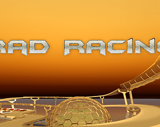
Play game
Rad Racing's itch.io pageResults
| Criteria | Rank | Score* | Raw Score |
| UI & UX; visual design, clarity & ease of use, guidance, accessibility support | #5 | 2.750 | 2.750 |
| Features; gameplay enhancements, integrated systems | #7 | 2.750 | 2.750 |
| Creativity; innovation & originality across design, concept & execution | #18 | 2.250 | 2.250 |
| Gameplay; core mechanics, objectives, balancing, progression | #23 | 1.750 | 1.750 |
Ranked from 4 ratings. Score is adjusted from raw score by the median number of ratings per game in the jam.
Judge feedback
Judge feedback is anonymous and shown in a random order.
Documentation
- Sounds like some cool systems work has gone into the project.
Playthrough
- Nice camera transition, view of the world on start screen
- Straight into the game
- Ai wont get out my way. they are cutting me up.
- One hit puts me into a massive uncontrollable slide.
- A lot of overseer and kickback generally. Craziness of the track design makes it seem like this will be an arcade style racer BUT car model feels like a sim racer. Very punishing.
- Doh. Got beached on a wall and cant reset the car.
Overview
- Very technically impressive to achieve this for a jam.
- Racing games are hard to get right and there are plenty of issues here. e.g. no sense of speed, handling oversteer, understeer, kickback, recoverably
- Basic racing elements are there but no sense of speed or racing. Getting round the track is hard enough.
- Ai is very aggressive and you cant jostle with them because of handling, only avoid them.
- Fun looking areas are to hard to navigate due to sim style handling model.
- Quite a punishing experience, with no carrot to make it worthwhile.
- Possibly look to exclusively embrace a sim or arcade style. Sim games is all about the meta layer, so perhaps expand the game loop to show some kind of goals. Arcade style fundamentally need to keep player moving and feel fast and awesome, so indicates more work required on the handling model.
Feedback
The concept idea for this game appears to work well. All the cars appear to move in the correct direction and work well, the sound effects affiliated with the racing cars work well too. Your main menu system is simple but functional, however it appears your UI setup is only designed to be scaled correctly to a specific resolution, without knowing this detail or adjusting the properties of the UI system to scale accordingly I found they disappeared off the screen and I was unable to see any details on what lap I was on or other information displayed.
The environment build appears to be done well, the race track is not just a simple two dimension build and has different parts of construction (such as the moving blocks) which is nice to see and provides an extra challenge.
While the gravity function seems to work well on the straight roads I did have an issues when it came to steeper climbs, if I lost control of my car I would end up tumbling downhill for an extended period of time before I am able to resume control, I believe the gravity level should be increased to give it a more realist feel. The camera should also be focused at all times behind the car, at certain points of the tack the camera would quickly shift position confusing me to know which direction to go.
Your documentation needs to be improved, the first line I saw was you mentioning how you prefer just to build games and not bother documenting stages of construction and this is something no one wants to see when they review your work as it immediately has a negative effect. While you detail some stages of construction you needed to add more and include more problem solving skills backed up with screenshots of your stages of construction, in the event the reader is unable to interpret what is happening the screenshots that relate to it will help them to understand. Visual imagery is always best to be added with literal descriptions.
Summary
Overall the gameplay experience was enjoyable. There is certainly room for improvement but then again there always will be in game development. As a YouTuber and game developer myself we consider it a pleasure to try your games and I am pleased to have had the opportunity to try your game.
Thank you.
LCripps.
Website: http://fellowplayerstudios.com/
YouTuber – FellowPlayer: https://www.youtube.com/channel/UCXzcduiD99hcDMhhCzByRiA
I love racing games, and was very optimistic about this one - the description gave away high expectations, although quite short. Now, graphically is OK as this is a prototype, but the response to the control system is very much frustrating. Racing games are known to rely heavily on fast response whereas in this game it was quite a challenge to have the car steering on time - the CPU also seemed very unbalanced.
The controls are simple and easy, however the break system is not introduced (I believe I could break with the space bar).
Two notes therefore: first, the control system needs to be reviewed. Secondly, make sure your description does not set high expectations, as when you present a concept/proof of concept build to a publisher you will need to be careful in what you say in order not to oversell what you have.
Leave a comment
Log in with itch.io to leave a comment.


Comments
No one has posted a comment yet