Play game
Search for a Starship's itch.io pageResults
| Criteria | Rank | Score* | Raw Score |
| Gameplay; core mechanics, objectives, balancing, progression | #10 | 2.598 | 3.000 |
| Creativity; innovation & originality across design, concept & execution | #11 | 2.598 | 3.000 |
| UI & UX; visual design, clarity & ease of use, guidance, accessibility support | #12 | 2.309 | 2.667 |
| Features; gameplay enhancements, integrated systems | #14 | 2.309 | 2.667 |
Ranked from 3 ratings. Score is adjusted from raw score by the median number of ratings per game in the jam.
Judge feedback
Judge feedback is anonymous and shown in a random order.
- cute name
- stock assets, could have got more in there using unity pretty quickly. free stuff on asset store. looking for biggest bang for minimal effort.
- everything appears to function, didn't see any obvious bugs, BUT quite bare bones in presentation, missing sounds, particles, gameplay timing balance
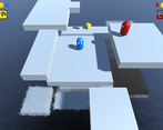
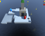
- camera is annoying, perspective means you cant judge jumps towards the camera.
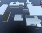
- platforms randomness is a bit noisy and hard to interpret/predict. things to try:
- design the platform arrangements a bit more. think about how does a player interpret a traversal solution from the given geometry.
- signing to the player using color/texture on the platforms. how could the art style be developed to do this?
- technical: perhaps use some variant on Wang tiles to reduce the randomness of new platforms, add constraints/preconditions for new platforms arrangements
- respawn often in useless places, makes it quite punishing. things to try:
- design respawn locations a bit more. make them safer so you don't die immediately after making a mistake. need a breather.
- make it clearer that you have respawned, don't hide player behind platforms. again camera perspective.
- Couldn't figure out how to get into the ship at the end. I put both characters in but the door remained open and we drowned.
Feedback
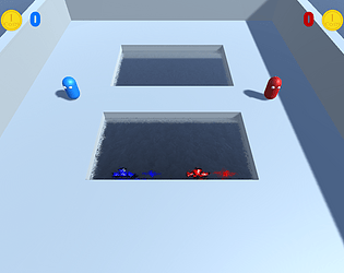
Upon reading the concept for the game it sounds interesting and simple to do. Gameplay I found to be fast paced and simple to control the players. The use of simple game mechanics (such as the random appearance of blocks and positions of coins) presents a unique challenge to the game that adds that little bit more difficulty. However the game is a little too difficult for new players and with no option to change the difficulty it was a struggle to play the game.
My goal is to collect coins to pay for the trip into space, however I do not know how many coins I need to achieve my goal, the blocks move very fast and although I have a power-up to make myself jump higher for a limited time I found I could not get any more than 10 coins as I kept loosing 3 when falling into the water. I thought I could move outside the map to find the ship but I assume I would eventually get to the ship if I lived long enough however I was not able to find it.
Your main menu function works well and is perfect for this game having two options of gameplay. The ability to go back to the main menu during gameplay adds that extra detail that makes this game feel like a well-built game.
It is unfortunate that there are no sounds in the game, at the very least there should be some ambient sounds to break the silence which helps the player to keep playing, as well as some sound effects such as coin collection, block moment…etc.
Your documentation shows your checklist and stages of construction but no details on how the game was built, you will need to provide more details on paper showing how you built the game, if you imaging I am a potential stakeholder or investor and I wanted to see how you built the game, you will need this information.
Summary
Apart from some simple problems experienced within the game I found it to be a relatively stable game, if more time was spent focusing on smaller details (such as sounds and other relevant information) I feel this could turn out to be a very good game, for a concept idea it starts off well. There is certainly room for improvement but then again there always will be in game development. As a YouTuber and game developer myself we consider it a pleasure to try your games and I am pleased to have had the opportunity to try your game.
Thank you.
LCripps.
Website: http://fellowplayerstudios.com/
YouTuber – FellowPlayer: https://www.youtube.com/channel/UCXzcduiD99hcDMhhCzByRiA
Loved the idea, a bit Labyrinth Zone but in a modern vision. Some points below:
- Consider onboarding the player better, it is a good start what you did with the mapping appearing at the beginning of the level
- Consider balancing and building up difficulty gradually
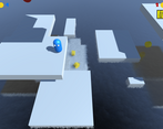
- Mind the collisions. It was very difficult to orient myself to make sure I was actually jumping towards a platform. It is not very evident. Maybe consider adding a shadow so the user knows if they are landing on platform or... falling
- Considering adding a player vs cpu mode
- Consider adding gamification elements to keep players engaged
Good luck!
Leave a comment
Log in with itch.io to leave a comment.


Comments
No one has posted a comment yet