Play game
Dungeon Simulator's itch.io pageResults
| Criteria | Rank | Score* | Raw Score |
| Creativity; innovation & originality across design, concept & execution | #13 | 2.500 | 2.500 |
| Features; gameplay enhancements, integrated systems | #16 | 2.250 | 2.250 |
| UI & UX; visual design, clarity & ease of use, guidance, accessibility support | #18 | 2.250 | 2.250 |
| Gameplay; core mechanics, objectives, balancing, progression | #23 | 1.750 | 1.750 |
Ranked from 4 ratings. Score is adjusted from raw score by the median number of ratings per game in the jam.
Judge feedback
Judge feedback is anonymous and shown in a random order.
The onboarding is very difficult. As the game requires a lot of thinking, having a straight to the point tutorial is key, players might get bored quite easily in the first minute - as getting familiar with that to do is very difficult - and abandon the game altogether. You don't want that, so probably best to focus on the onboarding first.
Feedback
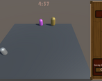
The concept for this game was sound, I like the idea of the dungeon with the ability to control it but not the players itself. Eventual upgrades to using different level monsters although represented by capsules appeared to work ok. To an extent it did work well at first but then some strange things started to happen.
There are no sounds or music in the game, I would suggest adding these in the future as it helps to break the silence and add to the atmosphere. The tutorial you added is simple but it did rush though a few times before I had a chance to read it, I was able to understand what I had to do but I had to restart the game a few times to make sure I read it all.
Although you had a UI for the assets within the game which appeared to work well I was unable to find a main menu which allowed me to start a new game or indeed quit the game, this should be added to all games you build. The story progression in the dungeon appears to be randomly generated which is something I like to see and keeping the players happy was a challenge but something strange also happened when I finished the time limit.
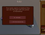
I got a purple banner appearing which was blank but in the background it covered something about the player spending his money and at the bottom I got something about “how drunk was he”, I was unable to see anything else as the purple blank banner covered about 90% of the message. From this point I was not able to restart or quit the game so this part should be fixed.
Your documentation has some details on how you built the game, however it did not show any screenshots relating to your game development descriptions. It also read a little informally like it was being taken personally, apart from that there was enough there to get the idea on how you built the game.
Summary
Despite some very interesting and odd experiences when playing the game I did overall enjoy it, I found the random generation of the events that happened kept me going and multiple choice answers gave me a sense of freedom. Perhaps this game was bigger than planned but more time could have been used to sort out the little bugs here and there. There is certainly room for improvement but then again there always will be in game development. As a YouTuber and game developer myself we consider it a pleasure to try your games and I am pleased to have had the opportunity to try your game.
Thank you.
LCripps.
Website: http://fellowplayerstudios.com/
YouTuber – FellowPlayer: https://www.youtube.com/channel/UCXzcduiD99hcDMhhCzByRiA
- Clear documentation. Interesting concept. AI and UI heavy. lets play.
- First play thought didn't really have a clue what i was doing and hit game over screen but broke UI so couldn't restart the game.
- Looks like a lot of effort has gone into the development
- Probably either too ambitious or problem with methodology.
- Has game been tested on players? Perhaps didn't get that far
- Second play
- The story elements are bonkers, doesn't seem to feedback into the sim tho...
- Cant get them to combat my slime.
- Not sure what the characters are doing. Just wandering around
- Seem like a good effort on systems features but a lot of basic UI/UX are missing in order to make it work.
- Developed lots on top of starting project but not really created a fully playable game loop.
- Vision and pitch of design is good but cant see it in the demo as is.
- Need to work on getting that fully playable game loop with no blockers and then get feedback from players to improve UX.
- While in development just draw the information on top of the AI's. What state are they in? Who are they? What are they doing? Then when 'what is the game' is clear start thinking about what is the important information for the player and crafting the feedback UI from that.
- Feels like two games smudged together. The dungeon master and a choose you own adventure. Either need to figure out how to make them feel like part of the same game and get the game loop to work OR reduce the scope by picking on a really focus in on that aspect
- Good effort, bold and ambitious concept BUT needs more work and practice in design, UI and behaviour development. Very hard to do this kind of game in a jam. Good to try and build up a collection of bits you can chuck together quickly when jam time comes around. Gives you more time to focus on getting the game loop working.
Leave a comment
Log in with itch.io to leave a comment.


Comments
No one has posted a comment yet