Play game
Trains Mission's itch.io pageResults
| Criteria | Rank | Score* | Raw Score |
| UI & UX; visual design, clarity & ease of use, guidance, accessibility support | #18 | 2.250 | 2.250 |
| Gameplay; core mechanics, objectives, balancing, progression | #19 | 2.250 | 2.250 |
| Creativity; innovation & originality across design, concept & execution | #23 | 2.000 | 2.000 |
| Features; gameplay enhancements, integrated systems | #26 | 1.500 | 1.500 |
Ranked from 4 ratings. Score is adjusted from raw score by the median number of ratings per game in the jam.
Judge feedback
Judge feedback is anonymous and shown in a random order.
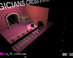
It took me about 8 tries to figure out what the point of the game was. 3 of which were after reading the document. Simply put you need to give the player more information. Assume that people, like me, don't have any clue what your game is about and will likely not read the entire doc before playing. Most of us just want to hop in an play. Therefore your penguin needs to be much more visible and your controls need to be clear, having to spam every possible button to figure out which one does something is not a great way to start off (it's not even in your document).
There is very little gameplay to judge over, it's a one button game so that's fine.
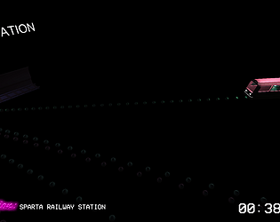
Your UI could use some improvements, such as an arrow to point you into the right direction of your penguin or even an arrow on top of him because I had to zoom in to go look in which station he was.
Feature wise it's very "dry", not a lot to it and the random generation could use some work. I would try making them not spawn in clutters because even now there can still be 2 stations which look more or less the same almost right next to one another. Some type of tutorial or instruction as to what to do is also required. When you start the game you get no information what so ever and it was impossible for me to figure out what you are supposed to do.
The concept in itself is pretty good for a one button game but the execution could have been better. The visuals and sound however were good.
Feedback
Thank you for the game. I found the concept to be very good and living in London I know just how chaotic the underground is. The style of gameplay is very simple but executed very well, the simplified and minimal use of visual graphics are used very well.
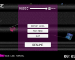
Your main menu system is styled well and fits the atmosphere of the game as well as the music, the added function of a music volume control demonstrates attention to detail for a better gaming experience, the music is a key part of this game and being able to control the volume is a great benefit.
Your documentation is ok however I feel some key details are missing, there are some spelling and grammar errors which make reading it a little difficult and after your intro it feels more like a checklist from that point, a bit more attention to detail is required when describing how you built your game (such as more problem solving solutions, how models are made, how they were programmed…etc).
The only downside I experienced I was unable to locate the player in the game. I love the concept and I desperately tried to find the player, I was not sure if the player was waiting at a station or already in a train. If there was an indicator showing where the player was I did not see it.
I would suggest a crude but simple method which would fit the style of the game well which is a large purple arrow hovering over the player at all times, this would match the colour style and I could follow the player much more easily. In saying that during my random clicking of the space bar in an effort to try to find the player I was able to arrive at my destination within 46 seconds so I got lucky :)
Summary
The core mechanic of the game was sound, the music worked well and the gameplay although simple and difficult to follow seems to work ok, I feel if I was able to pinpoint where I was more easily it would have helped a lot. There is certainly room for improvement but then again there always will be in game development. As a YouTuber and game developer myself we consider it a pleasure to try your games and I am pleased to have had the opportunity to try your game. If you choose to enhance the game and release it at a later date please keep in contact with me, I would love to share it on my channel.
Thank you.
LCripps.
Website: http://fellowplayerstudios.com/
YouTuber – FellowPlayer: https://www.youtube.com/channel/UCXzcduiD99hcDMhhCzByRiA
On paper, the concept/idea looks very interesting and quite original. The main menu has a good style to it, but does not quite match the ingame graphics.
I have attempted playing the game, and the first point to raise is the lack of onboarding/tutorial. I have tried navigating the camera, and pressing the space bar, but it is not really clear what is going on in the game - I've ready the description and you are supposedly getting Clarence finding his stop, but this is not communicated to the player nor is there a clear signposting on what to do while on the very first level.
Demonstrating the core loop mechanic is key when presenting a prototype. Also, optimisation to a basic level is kind of a must - I was playing in "very low" graphics settings and the framerate was extremely slow.
It is a great idea, just needs more work.
I cant find Clarence!
Unplayable, sorry.
Cool music choice. Need to work on getting the core game loop to be readable by the player. Try doing some play testing without explaining the game to people.
Better luck next time.




Leave a comment
Log in with itch.io to leave a comment.