Play game
Brawl Bay's itch.io pageResults
| Criteria | Rank | Score* | Raw Score |
| UI & UX; visual design, clarity & ease of use, guidance, accessibility support | #12 | 2.309 | 2.667 |
| Gameplay; core mechanics, objectives, balancing, progression | #16 | 2.309 | 2.667 |
| Features; gameplay enhancements, integrated systems | #23 | 1.732 | 2.000 |
| Creativity; innovation & originality across design, concept & execution | #25 | 1.732 | 2.000 |
Ranked from 3 ratings. Score is adjusted from raw score by the median number of ratings per game in the jam.
Judge feedback
Judge feedback is anonymous and shown in a random order.
As far as I can tell, this is a standard pvp game. Some points below:
- Game mechanic: this needs to be reviewed as there is not much for a player to revisit the game and be engaged
- Consider having a player vs cpu mode
- Consider introducing a proper onboarding/tutorial to guide the player on what to do
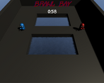
- Consider revisiting the UI ingame, I am not sure I could see the energy bar of the opponent
Good luck!
Feedback
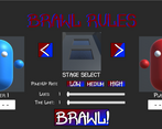
The concept idea of your game appears to be sound. Upon beginning your game there was no Unity settings window that let me choose the quality or resolution but I was pleased to see this was used within the game itself which is good practice. The UI methods are very well made and I liked your choice of design when entering player names and choice of arena to fight with options to choose number of lives and time.
The first arena I choose was a large circle but I encountered a critical error, for some reason my characters were not affected by any form of gravity or correct movement. When I moved forward they ended up floating into the sky and off screen. When choosing a different arena I found the controls worked correctly for these levels so I concluded this was a bug but I am pleased this bug was only limited to that map.
Your choice of music appears to work well in your environment although there was no other sounds used, some sound effects would have helped improve the gameplay experience. Aside from this having ambient sound to break the silence works well to help people play the game longer.
You have included documentation of the development process which I am pleased to see, however I felt it was a little limited and more detail could have gone into the construction process and screenshots showing your game development in Unity. This is to help people understand each stage of construction and any problem solving methods you had to implement. A visual representation backed up with your paragraph explaining what is happening within the screenshot is always the best method when detailing games development.
Summary
Overall I found the game to be a clean and simple construction. You did very well with the UI system and in general the game mechanics worked ok aside from a few bugs with the character controller. There is certainly room for improvement but then again there always will be in game development. As a YouTuber and game developer myself we consider it a pleasure to try your games and I am pleased to have had the opportunity to try your game.
Thank you.
LCripps.
Website: http://fellowplayerstudios.com/
YouTuber – FellowPlayer: https://www.youtube.com/channel/UCXzcduiD99hcDMhhCzByRiA
Document
- Contains some thoughts on the design but not really any documentation from the development process itself. Its good practice to adopt a methodology and figure out what works best for different type of projects.
- Its great to see the hand draw designs for the visual elements of the game and the kinds of games that influenced your decisions. The next step is to start thinking about why these design decisions have been made, and how they affect the player experience.
- Try to figure out what the game is about and really focus in on that theme, feature or mechanic to find the fun element.
Playthrough
- Non stock title screen.
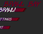
- Lots of options in the menu. Probably not the most important thing to get in for a jam but still cool.
- Added hands to the capsule.
- Lots of levels to choose from
- Can name our characters.... except our names don't fit. Bow bow.
- Played through the game.
- Problem with having shift key for attacks on windows is that it triggers the repeat shift lock.
- Punching doesn't feel very powerful. Perhaps some audio would help?
- Not very clear what the powerups do. Perhaps hud should explain them?
- Game ended. Try a different level.
- Tried the circle, but the characters are buggy on that level.
Overview
- A good attempt at emulating the menus from games of a similar genre BUT the game itself is lacking feature that help define the player experience.
- For jams, as in game dev generally, it is important to identify the games purpose as early as possible. This means finding the usp's and the fun in order to build up the identity of the game. Next time it would be good to really try and focus on a core mechanic and make it the best player experience possible for that mechanic.
- The menus have custom assets but the core game hasn't moved far away from the style of the assets provided in the starting project. A good way of making a game stand out in a jam like this is to replace the assets with something that reflects the identity of the game.
Leave a comment
Log in with itch.io to leave a comment.


Comments
No one has posted a comment yet