This is breathtaking ! amazing work
Play asset pack
Waterfall Bridge's itch.io pageResults
| Criteria | Rank | Score* | Raw Score |
| Presentation | #1 | 4.500 | 4.500 |
| Technical | #1 | 4.500 | 4.500 |
| Overall | #2 | 4.367 | 4.367 |
| Creative | #2 | 4.167 | 4.167 |
| Documentation | #3 | 4.500 | 4.500 |
| Research + Development | #5 | 4.167 | 4.167 |
Ranked from 6 ratings. Score is adjusted from raw score by the median number of ratings per game in the jam.
Judge feedback
Judge feedback is anonymous and shown in a random order.
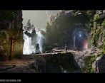
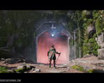
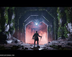
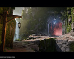
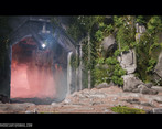
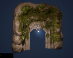
- You started with a really strong concept that fitted the brief and I really like where you took it adding the glow from the cave entrance work well to make the scene your own. All the element are well made and look great. Great use of foliage elements to add a living feeling to the world. The addition of the Knight works well too and adds to the sense of scale plus is a nice story element. The environment is very well lit and has a lot of atmosphere. This is a really strong piece of work well done, I think it was my favourite submission.
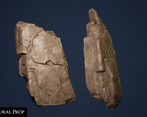
- Assessor: Anthony O Donnell – Art Director @ d3t Title: Waterfall Bridge Research and Development Even though the concept chosen defined a lot of the image elements and composition there was still a body of additional research carried out to further inform the details. It was good to see so many different workflows / techniques researched to assess which was the right one to complete this piece and attain the desired visual result. The reference and research carried out clearly has helped shape the final result Creative Art The piece stayed true to elements portrayed in the original concept and to the visual bar of God of War as a visual target. The overall lighting and final image worked out well. The art asset quality is consistent. The bridge transition into the cave is abrupt and not natural looking. Technical Art The blockout process was sensible and executed well. The original blockout and the time taken during this phase to get it right paid off in the end. This project has tackled many technical elements which were researched online and implemented from the distance fields blending and a custom post process material. The mask approach to larger assets such as the rocks is a good technique used appropriately. Decimation master is a good option for rocks, less ideal for the more cleanly defined architectural details. The use of Material Functions to keep things organised and setup for reuse / efficiency is great. Clumping all the foliage together in a large chunk does save on drawcalls but also means the mesh rendered won’t be culled as easy. If any portion of it is in view you’re paying for all of it. Documentation The document is detailed and well presented. It goes through the process from start to finish with clear evidence of how each decision was reached. Final Presentation The end result is a very strong image which is nicely composed and lit well. The day 2 shot (back of the knight) is a personal favourite. Overall the focus was put in the right areas. The final image was the main consideration throughout.
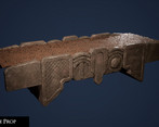
- One of the more impressive environments I've seen come from a student. Tackling a scene that is as reliant on Zbrush and organic workflows as this comes with many challenges, and you've done an impeccable job tackling them to produce a solid piece of work. Technically, you incorporated all of the tech that you needed to create this piece to a solid level, as well as defining an efficient mask workflow to litter the scene with high quality rock work. It's also rare that I see a student that pulls off a good shell technique, or even tackles moss to the degree of polish that you did here, so big congrats for that. Additionally, you've taken elements of your master materials and condensed them down to functions for easy re-use - it's this organisation that proves to be a very valuable commodity, so knowing you're thinking like this is a big plus as well. As far as creativity goes, there are a few areas art-wise that I would've loved to see improved upon, namely the rock materials. In the concept you've got an accentuation of color and vibrancy that is highlighted by the sunlight, as well as more secondary form break up to the left side of the door. Right now, your rocks carry large primary forms and foliage is used to break this up to add more interest. This is great efficiency as it lets you focus on the bigger picture, but once you start looking closer, there isn't much more to see, especially near your focal point. On top of this, further surface colour on the rocks in general (or quick decals to help scruff up specific portions of the rocks) would be a welcome addition. For the vertex paint blend with the moss, it feels too high contrast and there isn't much softness to any of the areas where it meets with rock. This is especially apparent on the bridge where I feel less contrast and more careful painting would've helped to bring the asset out more. For the lighting, I think you've done a good job with getting it matched up with the concept, however there's certainly more contrast and less falloff in your version. What this appears to result in is, from your main camera angle, you're moreso highlighting the right hand-side cliff face rather than the focal point that is the door. Better exaggerating the bounce lighting from the cliff and pushing for a softer falloff (or just adjusting the sun direction slightly) would help to amend this. This isn't a huge deal, however, as you've brought in your own elements with the red keylight and additional glint from the top of the arch, so understand that I'm nitpicking at this point! Overall, a very impressive piece of work that you should be very proud of - I'm excited to see how you progress as an artist!
- Great work, composition could be better though. The shot with the character is great but the others with the big rock on the left not so much (personnal taste). That being said, you've done a stunning work!
- Very solid submission. Great technical knowledge and overall presentation. Would be nice having some alternative lighting conditions.
Challenge Tier
Search For A Star




Leave a comment
Log in with itch.io to leave a comment.