Play asset pack
Forest Hidden Gem's itch.io pageResults
| Criteria | Rank | Score* | Raw Score |
| Final Presentation | #6 | 4.286 | 4.286 |
| Project Documentation | #6 | 4.286 | 4.286 |
| Technical / Workflow | #7 | 4.000 | 4.000 |
| Overall | #9 | 4.000 | 4.000 |
| Research + Development | #14 | 3.857 | 3.857 |
| Creative Development | #18 | 3.571 | 3.571 |
Ranked from 7 ratings. Score is adjusted from raw score by the median number of ratings per game in the jam.
Judge feedback
Judge feedback is anonymous and shown in a random order.
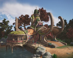
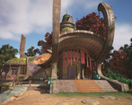
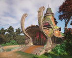
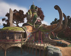
- This is a nice-looking scene with good modeling especially in the design of the building structures. Slightly let down by some UVing of objects eg. Curved wooden beams that were planar mapped straight through. Some more dramatic lighting and atmosphere, and some bevelled edges on the wood would have made this exceptional. Great effort!
- Nice project, very good interpretation of a concept drawing. Good technical understanding of the process, good use of Unreal techniques like RVT blending and WPO. Its an appealing environment to be in. If I were to offer some ideas for improvement I would say you can afford to go higher on the polygon count. We're living in the age of Nanite so it's a shame to see the polygons on curved elements and sharp edges. You could go bolder with the chamfers on the wood and I while world aligned mapping works well on straight and boxy geo it would be better to use actual UVs for curved pieces so that the grain of the wood follows the shape of the geometry. You should still be able to use the same tiling textures as before.
- Lots of quite nice technical stuff going on here. I particularly enjoyed the different RVT you employed, the vertex painting one looks particularly satisfying somehow. Some of the wood textures lacked overall definition and were a little too generic - were they bark? planks? However the pale wood with strong grain patterns was really nice. It would have been nice to see some more unique texturing and evidence of your baking skills and UV maps. Something to look into might be adding some AO, possibly by baking it onto the mesh, as this will help give the whole thing a bit more definition by providing separation to adjacent geometry that is using the same material. Overall a pleasant scene, you have captured the concept well.
- The global aspect of the building on a screenshot is okay. It would work as background building. Soon you get close, there are texture detail issues and lack of quality on the execution. I wish that the project was an original creation. I would be focusing on improving the overall landscape, add details and using a good texel ratio on critical path. This is the same of the building. The mesh itself is okay but you should improve the quality on the path of the player.
Challenge Tier
Search For A Star
Leave a comment
Log in with itch.io to leave a comment.


Comments
Not going to lie, I would move in here! Lovely work