Play game
LondonAlley(drop the bass)'s itch.io pageResults
| Criteria | Rank | Score* | Raw Score |
| Final Presentation | #11 | 4.143 | 4.143 |
| Research + Development | #17 | 3.714 | 3.714 |
| Creative Development | #21 | 3.429 | 3.429 |
| Overall | #21 | 3.514 | 3.514 |
| Technical / Workflow | #31 | 3.143 | 3.143 |
| Project Documentation | #37 | 3.143 | 3.143 |
Ranked from 7 ratings. Score is adjusted from raw score by the median number of ratings per game in the jam.
Judge feedback
Judge feedback is anonymous and shown in a random order.
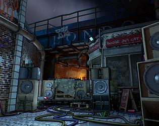
- This is a great piece that truly looks like a next-gen Telltale Games inspired project that makes me reminisce on games such as the Walking Dead. Really cool process of going from taking photographs and then beautifully warping them to find a good balance of relatable materials and meshes while introducing this effective and vibrant style. I think it'd would been nice to see more painterly textures which would fit the inspiration of the stylised materials. This article sheds some super valuable insights and techniques that might help you in future: https://www.beyondextent.com/articles/finding-your-own-artistic-style. It would've also been good to see a more in depth production diary to see your decision making progress as well as what you had learnt during production. Overall great project which achieved your key goals!
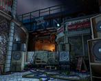
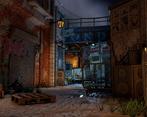
- I really enjoyed your SFAS entry, well done on your hard work - it has definitely paid off! I loved the use of local surroundings and inspiration, I thought it was a nice touch! Research & Development: - Nice use of moodboards - exploring particular artists that inspired you with a mix of real and in-game examples of work. Would be great to see annotations and specifics in images that you want to incorporate in your final piece. - Research and exploration was clearly demonstrated in the overall scene - with it having clear links to the Borderlands aesthetic! - I thought the use of warm and cool colours in the lighting was really interesting - with a colour palette and an example to help visualise how this translates to your intended scene. -It would’ve been good to explore more framing options and demonstrate the thought process and exploration behind lighting and colour palette choices. Showing different examples that you wouldn’t use helps demonstrate adaptability - it's fine for things to change and update overtime! -Thumbnail sketches in the section would also be super helpful to explore the framing - helps to highlight key props which would help prioritise the polycount and textures whilst showcasing other props which could ideally be lower res in the background. -Since stylised materials were a technical challenge you were approaching, it would be good to get specific references of materials - close up of props that fit your style or maybe standalone material renders which could help with that. Technical Art: - Assets visually look high quality and work well together in the scene. The post processing effect was also a great addition to the scene, providing a technical challenge which definitely pays off! - The use of warm and cool lighting also works well in the scene to add depth! - I would have liked to have seen more of your approaches to optimisation in the scene - consideration of texel density and polycounts, with lower polycounts and lower resolution textures being utilised for smaller repeated props and the high polycount and texture resolution being spared for the key assets in the scene. - A great way of cutting down on polys even further could be to bake even more detail onto the assets instead of modelling them all onto the base mesh - like the cup which is a relatively small asset may have benefitted from having fewer polys and had the ridges baked. Creative Art: - The creative challenge of the post processing effects and creating the stylised materials were exciting and helped add something quite unique to the piece. - The overall style was specified in the beginning - it was clear what your vision was and I really love how it carried through to the end and approached consistently with the props. - Materials look great - one way of pushing the stylised colours more would be to add a layered ‘painterly’ effect like this is stone material (https://www.artstation.com/artwork/4XGnx1) where you can see it’s still grey stone but has a vibrancy to it - like brick material highlighted in the preproduction. I could see this coming through in the props and could be even more amplified in the substance materials too. - I love the use of the sprawled out cables and litter on the floor - helps to add life into the scene. To push this even further, incorporating maybe scattered leaflets or a torn down poster potentially advertising the event the equipment would’ve been used for could be an interesting way to add even more world-building to the scene. - I really like the use of colour in the cables and graffiti to help add more colours into the scene, I personally would like this extended further into a few more punchier areas of colour just to make the scene more attention grabbing? Documentation: - With the documentation I felt it could have been a little more expansive - looking into current studio workflows and offering more images of the process (wireframe screenshots, sculpts/high poly models) etc would have been a massive help. It would definitely help with entering the industry, as highlighting wireframes and polycounts, and showcasing all of your considerations ensures studios are aware of your understanding of optimisation considerations as it is a huge part of creating game environments. - Having said this, it was great seeing the progression of the level alongside the breakdown of the shaders! Overall, the environment looks great! Your inspirations for the scene have definitely come through to the final piece and you should be extremely proud of your work, well done! :D
- I thought the Borderlands-esque style that you've got going on here was cool and quite different to 99% of other entries. It was also really cool how you collected your own reference, although it would have been nice to see a style breakdown of your stylised references where you worked out what was unique about each one and how they achieved their overall aesthetic. It's a good idea to straighten your UVs as much as possible and not have shells on an angle as it makes packing harder and can introduce "jaggies" into the textures. I like that you got the post-processing in place before starting, so that you could fine tune the scene geometry and materials as you went along rather than turning the PP on at the end and finding it didn't work with everything. I would have really liked to see some more asset breakdowns in your documentation, particularly wireframes and regarding how you tackled the buildings. Overall looks great though.
- I like that you took risks with the aesthetic you wanted to reach. You could improve the lighting in your scene to highlight what is important. Currently the scene is a bit noisy, there are a lot of texture variations and albedos. You can improve the aesthetic by blending through the light, fog, reducing contrast range between texture : good albedo are flat.
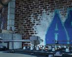
- Please note that the following opinions are my personal observations and do not reflect the views of Maxis or Electronic Arts in any way. This is a very visually striking and well generally well thought out project. Well done. You have shown excellent compositional skills and considerations for things like lighting and spatial layering which is great to see. The research and development process that you have gone through shows great thought and effort into the reasons you have included particular elements within your environment, and the selection of pre-made assets like the graffiti shows that you have considered what was in your scope for the project and what could have been sourced outside of your own personal creations. Whilst the documentation of the project overall is good, there were only a couple of slides dedicated to the actual 3D asset process and how you approached things like UV mapping and the actual texturing process. I would have liked to have seen some wireframes for final assets as judging by the renders from Blender the assets look a little too high poly to be utilised efficiently within a larger environment. For example, there are some normal artefacts that appear on the plastic bollards on slide 17 that could have an impact on overall texture quality when baked. There also look to be some UV map inefficiencies on the window frame and building trim detail where elements could be mirrored or parts reused within trim sheets. There are also no slides dedicated to the audio equipment which would have been nice to have seen - especially some breakdowns showing texture composition. You have demonstrated techniques like what appears to be vertex painting on the walls showing mortar beneath the brick, but in reality mortar is what helps secure bricks together rather than being the façade behind the bricks themselves. If you look back at your reference you can see this. Potentially the layering of graffiti to show new tags over the old ones may have been more appropriate here, but the vert blending between materials does work for the cobblestones you have also implemented on the floor. I really like the initial steps you took to include lighting as a primary focus on your blockout phase, as that really set the mood for the rest of the project. I also like the composition of the environment itself. It's well thought out, compact and directs the viewer's attention. In the future, I would focus on looking at reducing the complexity of your assets and displaying more of your technical process to provide a more comprehensive breakdown of your production phase to compliment all of the great research you have done. Good luck with your future projects! Antony O'Sullivan - Senior Environment Artist @Maxis/EA
Challenge Tier
Search For A Star
Leave a comment
Log in with itch.io to leave a comment.


Comments
This looks incredible, awesome work