Play Environment Art
The Slaughter Dock's itch.io pageResults
| Criteria | Rank | Score* | Raw Score |
| Research & Development | #4 | 4.025 | 4.500 |
| Documentation | #9 | 4.025 | 4.500 |
| Technical | #17 | 3.354 | 3.750 |
| Overall | #18 | 3.578 | 4.000 |
| Creative | #24 | 3.354 | 3.750 |
| Presentation | #30 | 3.130 | 3.500 |
Ranked from 4 ratings. Score is adjusted from raw score by the median number of ratings per game in the jam.
Judge feedback
Judge feedback is anonymous and shown in a random order.
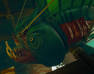
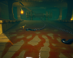
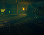
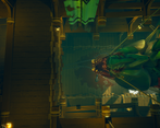
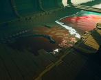
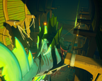
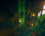
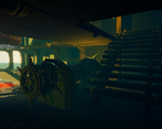
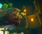
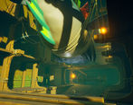
- Research & Development Research shows cool concepts. Reference games show the final style well. I'd still like to see some reference to add another layer of material interest. The use of color is a bit analogue maybe as well. The research into how things work is always nice to see. Creative Art Dock with a huge non-vegan fishy is a unique piece of art for me. Paired with supporting props, lighting and style direction, the piece feels like no other. Lighting works amazingly well and the color usage gives an eerie vibe. I would like to see maybe a bit of metals or other materials to break up the wood-centric architecture, some dirt maybe accumulating to the sides, stuff to use to move the meat along once it's been cut from the source and such, but I believe you ran out of time to implement all of those things. Technical Art Materials and shaders look great. The lighting works very well and seems fairly optimized. Meshes seem well optimized. Actor hidden in game setting for the boxes seems like a good policy to block out lighting. Materials could use maybe some extra master material, material attribute and material instancing. Documentation The development steps are written very well and showcase high sense of professionalism. Thoughts, conclusions and calls are written well. Images showcase the subject matter in a clear and informative way. Final Presentation The scene is presented well. The screenshots are of high quality and show interesting bits from every around the scene.
- Good to see you referencing games and their different styles and your early art direction tests. Also good to see callouts from reference and how you’ve added it to the textures. Use of game workflows is apparent (modular kits, trim sheets) but avoid using Photoshop for touch ups; keep the process as non-destructive as you can by using Substance Painter/Designer. Good early structural block out. I like that you added the skydome/lighting early on too. It would have been good to have the fish blockout in the scene at this stage too. Fish UVs could be much better. This would make texturing it easier. When baking hard surface assets identify the hard edges and split the UV islands up accordingly. In the scene cover up areas where tiling textures change direction or align the planks better eg. where the ramp meets the wall. Use of vertex painting, sea texture animation, lighting and fog really helps sell the narrative and look of the piece. Shots have good compositions and focus points. Well done!
- - Great choice of subject matter to demonstrate lots of skills - Great to see detailed workflow in the documentation, the documentation overall is excellent - Nice use of fog and lighting to add lots of atmosphere to the piece - Some further work on the fish materials would be nice to capture the look of fish scales with stronger normal map and materials. The eye could have some reflection map to help with material contrast. Would also suggest refining the area where a piece of the fish has been cut out, currently looks a bit to square / neat on the left side, also angle the fins a bit so there not so straight especially as the fish is dead. - The props look excellent, and really nice to see wire frames and texture pages in the documentation, will really help towards job applications. - For future updates to the work would be nice to see some rocks and vegetation using the same art style, clouds / sky could also be stylised to match. - Overall looks a very good use of the art style with lots demonstrated given the amount of time available.
Challenge Tier
Search For A Star
Leave a comment
Log in with itch.io to leave a comment.



Comments
This looks amazing dude! You really nailed the style
Thanks Appreciate it a lot! I loved the texturing in your scene, so clean - looks very professional.
aw thank you, that's super lovely of you. I'm looking forward to digging into some more stylised work soon, will definitely be reading your documentation for some pointers!
It's scary and exciting that someones reading my doc :o
It looked great from the skim through I had! Really cool processes ect :)
I adore the atmosphere of this piece, and that water/blood is just gorgeous
Thanks mate. Love the style of your diorama too, so bright and colourful - quite the opposite to mine :)