Play asset pack
Wallflower Bakery's itch.io pageResults
| Criteria | Rank | Score* | Raw Score |
| Creative | #5 | 4.143 | 4.143 |
| Overall | #15 | 3.657 | 3.657 |
| Presentation | #15 | 3.714 | 3.714 |
| Research & Development | #17 | 3.571 | 3.571 |
| Documentation | #20 | 3.714 | 3.714 |
| Technical | #25 | 3.143 | 3.143 |
Ranked from 7 ratings. Score is adjusted from raw score by the median number of ratings per game in the jam.
Judge feedback
Judge feedback is anonymous and shown in a random order.
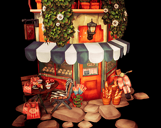
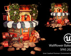
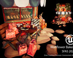
- Very well done - great hand painted textures. While it would have been nice to see a street for this diorama, I think what you've presented is not only scoped well, but shows a good set of skills. For a next step I'd consider the following: Fix some of the more monior technical issues on your assets For instance, you have normals issues on the smaller props (the handles on the handbags are facetted) and you have sorting issues on your foliage (use alpha test / masked instead of translucent materials). Push the spec/gloss on your assets a bit more - while I understand there is a style to all of this, I can't help but wish that you seperated the materials a little bit (like the glazing on the donut could have a tighter highlight). Would be nice to see you experiment with custom roughness / gloss maps with this, ontop of your diffuse. I think this would help the assets read better and 'pop' with your lights Try using tiling textures for your building - instead of an atlas'd sheet. I know for this it doesn't make much sense, but I'd love to see a prospective hire understand trim and tile sheets
- It would have been good to see a bit more reference but it’s good to see that you commented on the images you did find. I also like that you drew out and coloured your own concept of what you wanted to achieve. Good to see a block out and that you added model detail rather than simple shapes. Your foliage texturing looks great and keeping it all on one sheet is good to see. I like that you’ve painted over screenshots as you’ve gone to check and adjust things. It’s great to see your progression over time with these and the block out. The style is consistent from asset to asset and I really like that you’ve added some narrative to the piece (bags, baguettes and scooter). Although simple, I do like the lighting. The style and colours really help the scene stand out. Great work!
Challenge Tier
Search For A Star
Leave a comment
Log in with itch.io to leave a comment.


Comments
you've done so well with this! Absolutely nailed the atmosphere and the colours are so soothing
I really love your piece! Been really cool seeing it evolve and progress on the discord!
Thanks so much! It was super fun making it!