

Play asset pack
SFAS Old Metro's itch.io pageResults
| Criteria | Rank | Score* | Raw Score |
| Presentation | #34 | 3.000 | 3.000 |
| Research & Development | #45 | 2.600 | 2.600 |
| Overall | #48 | 2.560 | 2.560 |
| Documentation | #51 | 2.600 | 2.600 |
| Creative | #55 | 2.400 | 2.400 |
| Technical | #60 | 2.200 | 2.200 |
Ranked from 5 ratings. Score is adjusted from raw score by the median number of ratings per game in the jam.
Judge feedback
Judge feedback is anonymous and shown in a random order.
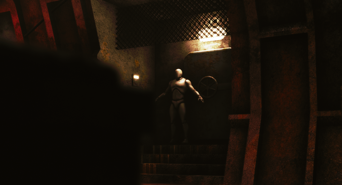
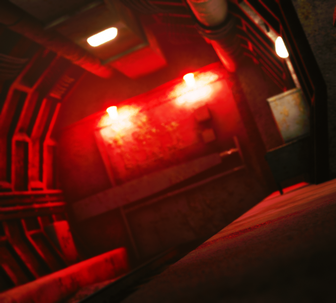
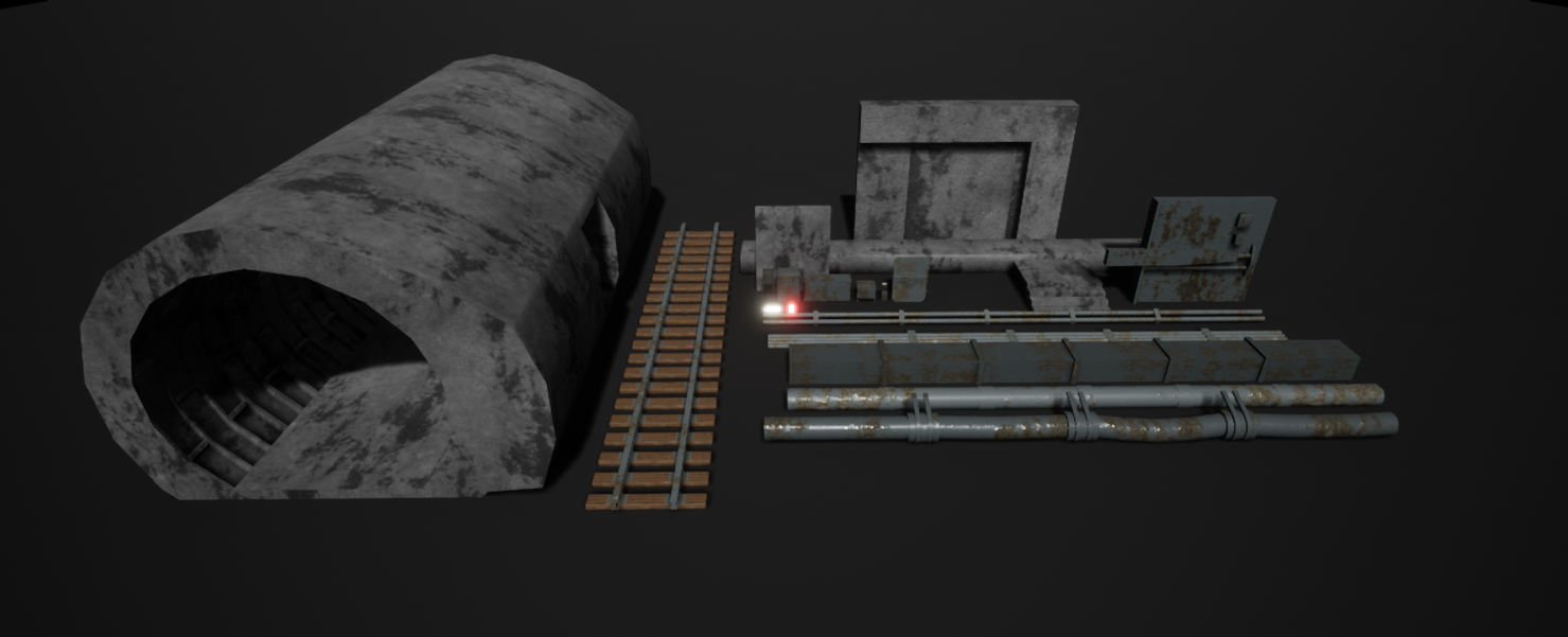
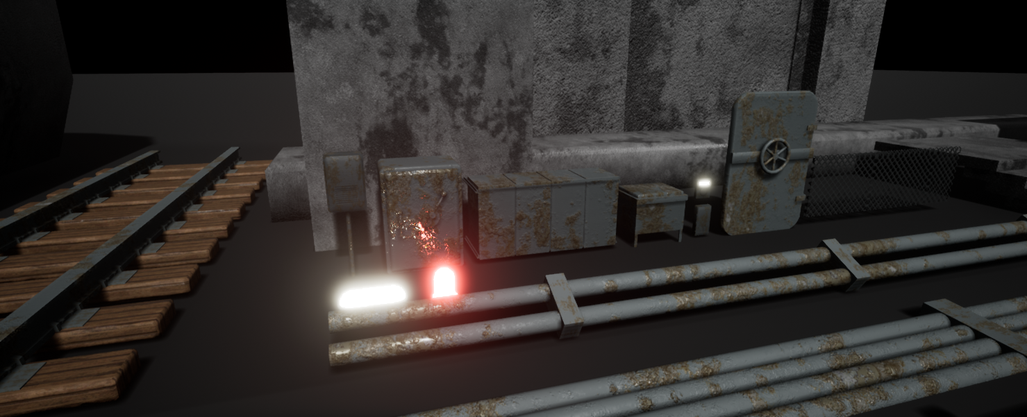
- It would have been good to see more reference but good to see a break of assets. Block out looks good, if a little straight; don’t be afraid to add in geometry with wonky angles or to increase the amount of polygons in a shape. The scene will look far more realistic when not everything is at right angles. Good to see the creation of tiling textures. I can see that you have created a kit of parts to be used throughout the scene but you could have extended this onto the walls themselves opposed to building one complete piece. The scale of the scene looks a little big (the mannequin next to the door shows this). Make sure you check the scale of the scene while in the block out phase. Unfortunately, with the mannequin in the scene, you can see how far off the scale is: train track size, cabinets, boxes, lights. I like that you’ve used decals to break up the materials but watch your placement of them; you can get streaking from the projection angle on the geometry. I like that you have some colour contrast in the lighting. I think it would have made a more realistic impact if you used IES profiles on your lights and toned down the amount of bloom (don’t forget to had light fittings for your lights!) It would have been good to have some of the lights broken to give it a moodier feel and help draw the eye into the image.
- Hey, So you're on the right track with how you approach an idea or problem. The issue is with research and execution. I can see that you were obviously under a very tight deadline, but a few quick things. 1) Make sure that you don't use a plugin which requires the user to have to find and download said plugin to view your work, there's a lot of these to get through and it's annoying. 2) I'm curious why you used the landscape, it's a bit overkill for a scene this size. 3) The polycount in the pipes is likely too much, there's a bunch of methods you can use for various pipes and wires. Thin wires can be alpha with a normal map to give a sense of 3D. For example, in other places, low poly is fine, it's so dark, no-one will notice really. I would take a good look more at how a real world environment like this is made up, maybe take a trip to a subway and see how dirt and grime gathers on surfaces. Where it gathers, for example, in the corners, when running from disused electricity boxes. This piece feels like you just ran noise all over everything without much thought. Making it simpler and taking time to think about your materials would have brought this piece along so much more, especially as the lighting is not terrible. It at least sells the atmosphere you were going for. Hope this helps you in future projects, Chris Harper Snr Technical Artist @ Splash Damage
- The idea is good and you are up to a go start but there is much to improve. One of the main areas that you need to further look into is the scale of the environment, objects and assets. In your moodboard, the tunnels are much bigger. You can recreate that by firstly checking if the diameter of the tunnel is similar to real world size. The second way of improving that is to have the rest of the objects at the correct proportions in relation to the room. One main thing would be the rail which has some wonky proportions. The lighting set up helps you a bit, hiding some of the issues but for an abandoned place, the lights should be more dimmer and missing from place to place. On the technical side, she modules seam to be well thought out, and well optimized, some could have had more detail. You should always have in mind the overall poligon density of the scene. At the moment the biggest object in your scene, the tunnel has the lowest density, looking very low poly and affecting your entire scene making it look very old gen. On the other hand the light fixtures and the small wire bundles have the most geometry density and detail. On the texture side, the scene could use more variety in materials, also using some blending filters. Most of the objects have a similar looking material making them hard to distinguish . The scene is almost there, it just needs a few things updated and improved. Keep at it!
- - Good breakdown of assets required from the mood boards, clear and concise goal for the project. Nice to see the planning and breakdown of assets and timelines. - Shows good blocking out process and thinking about composition - Shows good technical knowledge of substance and thought behind materials - Models are neat and well thought out - Would agree with conclusion that some more details on the textures and smaller props would have been a great addition, and potentially some high res sculpting to creating normal maps for some of assets, but a great effort all round!
Challenge Tier
Search For A Star
Leave a comment
Log in with itch.io to leave a comment.
Comments
Research & Development
There are nice references of environments with proppings. Lighting, color and elements vary a bit. Pushing the research of real-world locations a bit further could be beneficial in the future, as well as adding more detailed shots of things such as props and materials you want to make for your scene.
Creative Art
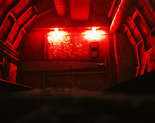
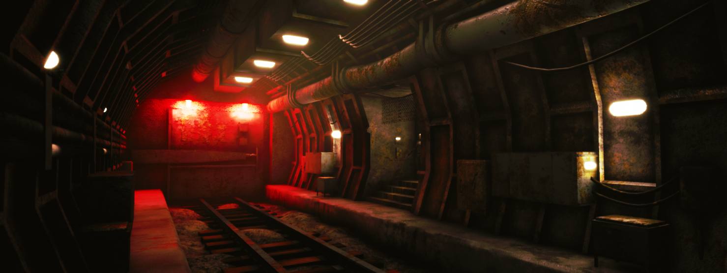
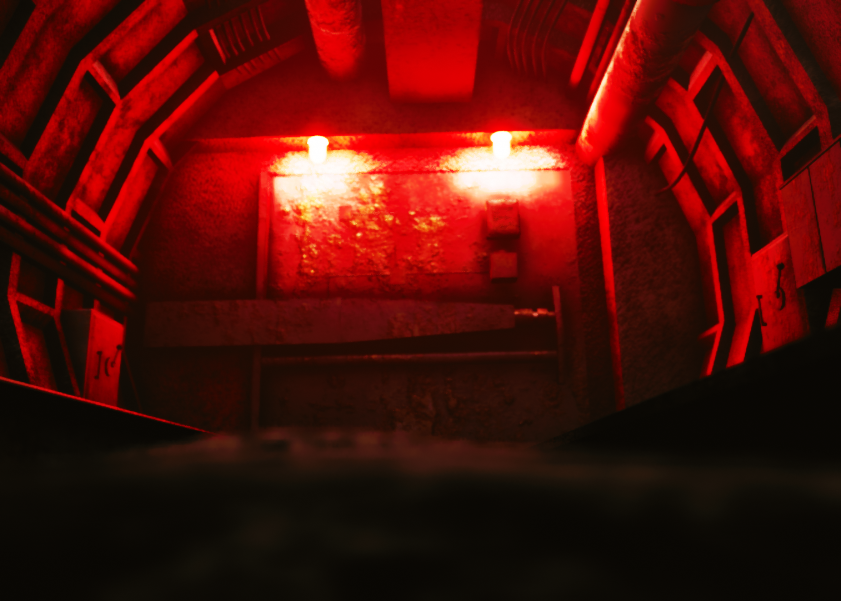
The scene feels ominous and dangerous with dominant red lights. Props work well with the location. The scene could be pushed to the next level with researching face-weighted normals, and using maybe more roundedness to the tunnel walls. Material work could also maybe be worth to put more time to, as well as looking into tiling textures and vertex blending to achieve better texel density. Props could also benefit from thoughtful irregularities achieved by adding more geometry to objects.
Technical Art
Materials are done in instanced fashion which is good. Lighting is done with spotlights and the scene showcases use of decals. There's also an unbound post process with also the breakdown about experimenting with it with lighting shows good knowledge about what polish work needs.
Some things, such as cables and ground are abit on the high end on polycounts, but mostly the scene is a bit low on polycount to today's standard.
Documentation
Text is easy-to-read and showcases good progress throughout the development.
Final Presentation
Post process and lighting show the scene well. Screenshots are of high quality.