


Play asset pack
Street Market Oasis's itch.io pageResults
| Criteria | Rank | Score* | Raw Score |
| Creative | #1 | 4.556 | 4.556 |
| Overall | #3 | 4.156 | 4.156 |
| Presentation | #3 | 4.444 | 4.444 |
| Technical | #4 | 3.889 | 3.889 |
| Research & Development | #9 | 3.889 | 3.889 |
| Documentation | #12 | 4.000 | 4.000 |
Ranked from 9 ratings. Score is adjusted from raw score by the median number of ratings per game in the jam.
Judge feedback
Judge feedback is anonymous and shown in a random order.
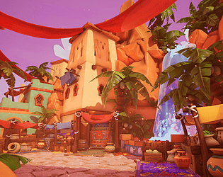
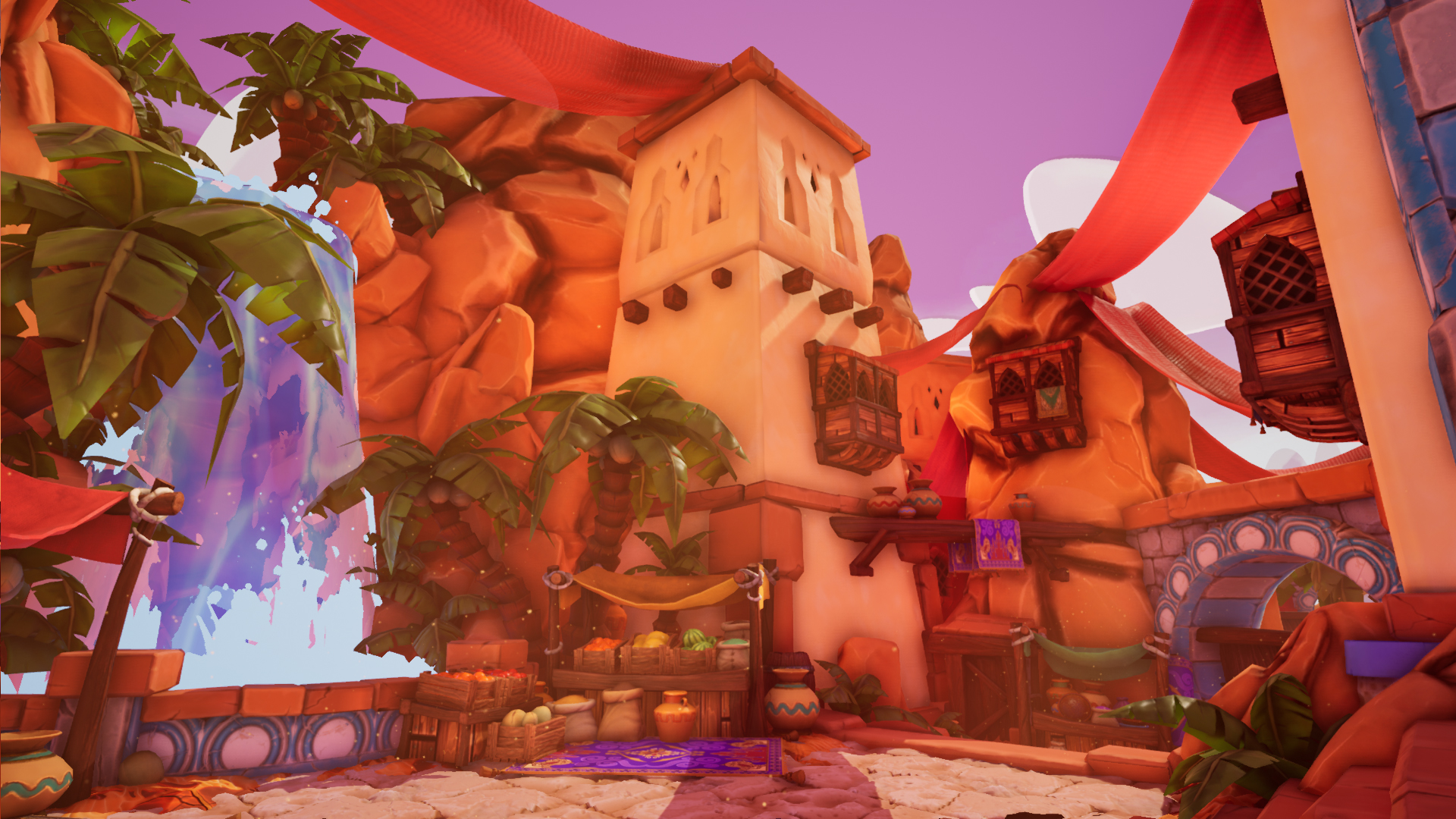
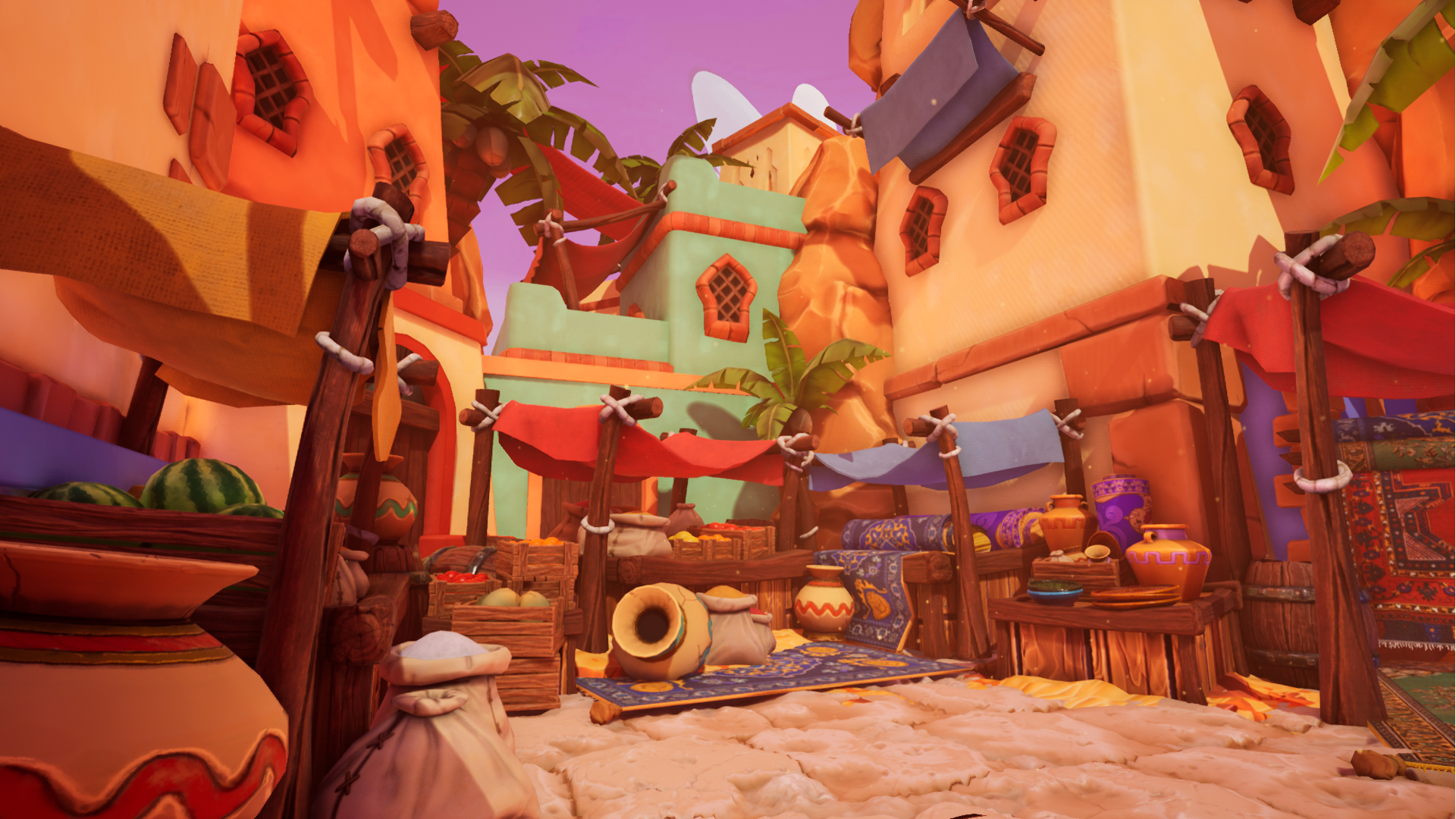
- Great to see lots of reference though it would have been good to see some annotations. Good to see a block out in engine and paintovers of what you want to achieve. I really like that you did a small art test to help define the style you wanted to use throughout the piece. Asset modelling looks good and in keeping with the style. Good to see use of trim sheets and modular kits. I really like set dressing in the scene; this adds a lot to the ‘lived’ in feel to the place. The parallax looks a bit too strong in places (stone slabs). I like that you have lots of colours going on but the lighting does lean towards a more orange colour (this isn’t a deal breaker). Great looking scene!
- Great Moodboard/References. Even better that you went there and got them first hand. Will help with any little detail that you remember about the place. Nice touch in getting a friend to do a paint over, but since it was based on your own blockout and you had all the reference images that you needed it might not have been needed. But it can help you with colour schemes etc, depending on how stylized/real you want to make it look. For the waterfall material you could add some white streaks going through it to align the style more to the rest of the models/scenes. Same goes for the particle effect. Instead of it being a solid blue colour, add some different hues with in, or a few different coloured sprites. Palm tree seems abit high poly and could have been optimized better. Maybe the leaves could be alphas instead of poly modeled. The Sculpt detail on the tree trunk parts are nice, but seem to be abit lost on the final texture pass. You could add abit more highlight colour to certain parts to make it pop slightly. I think you might have went abit too far with the over all lighting and colour of the scene. Its really nice that you have a hot and cold area (outside and inside). But the outside has a lot of reds and oranges in the scene plus the lighting. Same goes for the purple/blue "indoor" area, it could be toned down a little bit. When you look inside one of the market stalls under the arch ways, you have loads of colourful items there, but they are all getting washed out by the blue/purple light. So you need to be a little bit careful using too much colourful lights. The ground stone texture is quite nice, but im guessing the parallax mapping you have done on it is making it bit too stretched and noisy. It might be nice to have some exposed brick or some wear and tear on the towers or the building structures. Remember that this whole place is out under the baking sun all the time, so will wear and crumble a bit. Over all this is a smashing piece. Looking at it, it looks like you have created loads of individual models when in fact you have not, which great!. Nice touch with some particles blowing through, might be nice if you can crate some kind of subtle heat haze. Best of luck.
- Research & Development: Love the choice of subject matter and first hand references from Turkey + the influences to solidify the concept. Wide variety of images on the moodboard but mentioned the key stylisation you wanted to achieve which is good as it’s important with reference to have 1-2 key images which you use as the main ref. It would be nice to see the iterations you took to get to the final blockout but what you ended up on looks well composed. Creative: There’s a lot of atmosphere and personality to this environment which is very nice to see. It’s all quite vibrant with a lot of depth. The stylised textures work well together and feel generally cohesive, for all future textures though it’s a good idea to check the ‘Base Color’ view mode under ‘Buffer Visualisation’ in the viewport to see if there’s any values which don’t gel so much with its surroundings i.e. require a shift in hue, or is too dark/too bright etc. It’s nicely lit and well composed, the one thing that sticks out to me especially in the thumbnails is the strong red colour cast over the image. I totally understand this might be the stylistic choice as it would mean it’s closer to the Aladdin concept art shown in the documentation, however I did have a play with colour correction to remove some of the colour cast and personally feel that it creates a final image with some more distinctive colours and a bit easier on the eye. Great work overall :) Technical: Good use of material instances to get the variety of colours to tint. If you know you’ll be tinting a material it’s good to author it as a mid grey albedo/diffuse and then you can tint more easily into other colours, if you want it to be brighter than 127,127,127, you can increase the ‘value’ slider above 1. You’ve made a master material for the pots which is good, but a master material should be used for splitting the kind of shader it will be, e.g. opaque, translucent, decal etc. That way you can use 1 master material for anything using an opaque shader instead of just one type of asset. I like your use of the trim sheet which is authored well, and the lighting for the scene looks great with the bounce lighting. For lighting a scene I personally like to try to push the bake settings as far as I can to get the look I am after with the 1 directional light rather than using loads of little lights dotted around as it makes managing the whole thing a lot easier, as mentioned though it does look nice. I’d be careful with what you choose to add tesselation to as most of the time it isn’t needed unless it’s on a landscape material where you need the fidelity. Especially more so with stylised assets as it’ll probably look nicer without it rather than sticking out/adding noise. Presentation: The overall quality of work is very nice, screenshots are well composed, high quality, and everything is presented clearly for the viewer. The addition of the video showcase is also a good way to present the environment. Documentation: From the start to the end everything looks well documented showing your workflow for the key elements, everything is nice and clear and enjoyable to read through. For final thoughts, it’s always good to reflect on what you would do if you have more time, is there anything you’d do differently, or explore different workflows for making things etc.
- Love it, I'm very surprised you didn't mention Overwatch when you were looking for reference for this. Even though that is Egypt.. But it's really good that you took a lot of real world inspiration and strong concepts. Loving the colour and vibrance, noteworthy improvement are look at how to use parallax occlusion mapping in UE4 its very easy to use with your heightmaps and you don't need tessellation, it will fix your floors looking all wobbly and you can use it on those blue tiles. On the subject of the blue tiles, I think they "glow" a bit too much in the corner room and its kind of ruining the composition in there. Maybe look at tweaking that. Anyway, awesome work. Chris Harper Snr Tech Artist @ Splash Damage
- Artist – Louis Sullivan Category: Search for A Star Assessor: Anthony O Donnell – Lead Artist at Firesprite Work name: Street Market Oasis This scene has a pleasing visual style which was handled well. Good asset reuse has produced a dense and interesting scene. Research and Development /Documentation The document is clear and well written with nice presentation. It’s good to see the project be inspired by personal experiences. Additional research was carried out to further inform the scene, specifically how stylised it should end up. The approach to blockout was nice and loose via BSP use to focus on size and scale. The creation of one building as an example early on to validate the visual design choices was a good decision before committing fully to it. Technical Art Geometry Clear evidence of modular construction of assets is visible throughout the scene. Tessellation used on the ground and planks is excessive when parallax occlusion mapping would have provided a nicer visual result and be more efficient for the GPU to render. Assets which are not tessellated have a reasonable polycount. Materials and Textures Trim sheets and channel packing was used. Material parameters were also used effectively to cut down on duplicate texture use. The texturing style is appropriately simple and well-handled across the scene balancing the amount of noise for a clear read. There are a few texel density discrepancies about and some lightmap seams are present. Creative Art The use of a complimentary colour palette observed during reference gathering really suits the chosen visual style. All the assets are consistent in terms of visual style which was handled well across the scene. An addition to add more visual interest would be hand painted grunge , dirt or sand build up in appropriate areas around the scene. The game Dishonored is a good reference for stylised textures which also manage to be visually interesting. The use of vertex animation in shaders and VFX add a lot of life to the scene. Final Presentation The final images are very strong and achieve the desired visual style and mood that was defined out the outset. Nice use of colour via texturing and lighting. Atmospheric and post effects were used in a meaningful way which contribute to the final image. The scene has a good sense of depth and visual interest through height change. The use of blue foreground elements contrasted against the warmer oranges in the background is a nice framing device. A bit more dirt and grime alongside some variations in the stalls would make this a very good scene. Nice work overall.
- This is a very impressive and extremely attractive stylised environment. It has bags of character, a real sense of place (helped by some real-world research) and an accomplished level of detail variation. There are large, medium and small scale forms in good balance, giving lots of interest without overwhelming the eye. Stylised environments can sometimes be regarded as 'easier' than ones that push for photo-realism - they're not. It's as much about knowing what to leave out as to include, which is often difficult for us artists who just love to detail things! Creating a style that works, remains legible and that remains consistent across multiple assets and compositions is no easy task, and the artist achieves it well. Great work! Feedback: - I'm not personally a fan of the purple sky, although I understand the reasoning for the artist's choice. I did a very quick paintover, turned the sky blue (hazing down to white) and to my eye, it immediately helped offset the very warm palette of the rest of the environment. I feel that the purple used is too close in hue to the oranges that dominate the scene. - The scene could be made to feel hotter by increasing the intensity of the directional light, so that a few areas come close to flaring out. Bloom would help here. Also, turning the orangey plaster of the towers white, or close to it could add some contrast - the overall tone of the scene is too similar, it needs more contrast to really sell the feel of a blindingly hot sun. - The floor stone tessellation isn't working, it's too lumpy and the jagged tessellation artefacts are fighting with the art style.
Challenge Tier
Search For A Star
Leave a comment
Log in with itch.io to leave a comment.
Comments
Research and Development
There's nice research, and a trip to the place. Judging by the image, there are lots of screenshots that show nice detail of scene, mood, objects and materials.
Creative Art
The scene is a beautiful, stylized market which is buzzing with life, supported with lots of vibrant colors. Feel of location is supported with nice detail such as volumetrics and shadow colors, adding to the gorgeous stylized feel. The scene is simply stunning.
There are mostly smaller things you might do better after this point, like materials might have a bit too dark values thanks to object's ambient occlusion and don't fit that well with the rest thanks to it, or doorways or the wooden balcony bits could have further structural correctness that would play together with UV mapping, roof planks could be pushed with geometry to add an extra layer of interest, some objects are clipping with each other.. Minor polishwork, really, as the scene looks very nice and has well-made and all round supported structure to it. Layout wise everything feels slightly too close to you to maybe give a bit of a claustrophobic feeling, but it might as well be because there are so many things to look at, with no clear spaces for your eyes to rest.
Technical Art
Post-process, lighting, atmospheric fog, bubble and water give a lot to the scene. The moving clothing is also nice with simple grass wind effect. Material instances for objects also add nice variation to play around with.
The landscape and marketplace floor has a huge tesselation factor going on without adding that much to the end result. Flat surfaces, such as on marketstand_covered mesh, also have lots of unnecessary polygons. I'd like to see pushing those materials into a single prop master material, of which all could be instances of.
Documentation
The work is well presented and goes through research to high detail. Images and texts are easy to read and well polished to make for a great learning experience.
Final Presentation
Images are of high quality, and showcase area as a whole. I'd like to see images that showcase a certain aspect of the scene maybe next time, like prop cluster or similar, as these images feel a bit funky, as the center of attention, or what you'd like to probably showcase, wanders a bit off the images.
Thank you for the feedback, I agree with everything said. Lots to think about and work on:)