Play asset pack
Location Unknown's itch.io pageResults
| Criteria | Rank | Score* | Raw Score |
| Technical | #52 | 2.324 | 3.000 |
| Documentation | #53 | 2.582 | 3.333 |
| Research & Development | #56 | 2.324 | 3.000 |
| Presentation | #58 | 2.324 | 3.000 |
| Overall | #61 | 2.324 | 3.000 |
| Creative | #70 | 2.066 | 2.667 |
Ranked from 3 ratings. Score is adjusted from raw score by the median number of ratings per game in the jam.
Judge feedback
Judge feedback is anonymous and shown in a random order.
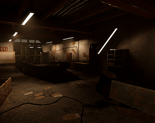
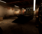
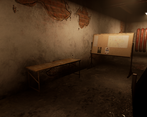
- Cool looking place, and i really like the idea! First of all, the documentation of the process is really neat and full of to the point information. I like that you have a background story and a place to start a new story when the player finds the boat. Getting back at the game references that you used, as a former Enviro artist for Wildlands, I can tell you that you are not far off the quality benchmark. The only things you could do to improve the look of your building, is to have more realistic textures, and have your UVs tilable, so you have bigger texture density and on top of that you can use decals for details like bricks, cracks, corner elements etc. I think the uvs on the boat look good, but it could have more love in the texturing area. You could get more variation in the materials, some graphics, and for sure some weathering, on the concave, curvature and position channels. In the overall scene, the beams from the sealing look a bit off proportion, on the ground, the only thing I would add, would be some props around the boat, so the boat could be tied to something, and also to block the player so it can't fall and get stuck between the concrete base and the boat, and guide him to a safe place to climb the boat. Keep it up!
- Good to see you’ve referenced both films and games, and that you’ve found reference in the real world too. I also like that you’ve concepted a rough layout of the scene before making a block out. I think you could have worked up the block out by refining the shapes and adding lighting before moving into production. The boat looks well modelled but it looks like you spent more time on this than the rest of the assets/environment. Adding detail is good but from the shot angles you’ve chosen you can’t really see a lot of them. The texturing between assets is consistent. Good to see tiling textures being used but the plaster/brick effect doesn’t look realistic in the way the plaster exposes the brick. The lighting looks quite soft and uniform. It would have been good to not have all the lights on to add contrast and perhaps a couple of high windows in the garage door to let in a blue/white light in from the outside sun.
Challenge Tier
Search For A Star
Leave a comment
Log in with itch.io to leave a comment.


Comments
Research & Development
I liked a lot the images of boats and how the research developed further down the line to fit with the end results. Researching also lots of different series and movies for reference was also cool to see, and could be something I could pick up as well.
Creative Art
The shape of scene and the sense of space work very well and the lighting looks nice. I also like the bits of story telling with the fallen props and decay. The scene could use a bit more clusters of props and higher texel density.
Technical Art
Greybox stage looks interesting and nice.
It was nice to see you dividing bigger boat asset into separate materials. The polycounts can be a bit on the high end on rounded surfaces but they look rather good.
Breaking the scene into architecure modules, based on metrics, and assets/props, is a rather common policy in the industry. Reuse of texture space is a good policy as well to hit 512 or 1024 texel density. Tileable textures with material blending and decals are also a nice way to add interest into larger wall modules. After that comes adding irregularities in a sensible scale based on good reference images.
Documentation
Process is well written and research and its results are easy to grasp on. I also like links to databases and references to similar TV shows and movies make me want to go watch those. Also the top and bottom bars add an extra layer of movie enthusiast/writer feel to the documentation. :)
Final Presentation
Small thumbnails look nice and inviting. Renders are of high resolution, and you can clearly make out what you see in there.