


Play Western Enviroment
Western Poker Room's itch.io pageResults
| Criteria | Rank | Score* | Raw Score |
| Technical | #69 | 2.000 | 2.000 |
| Presentation | #76 | 1.800 | 1.800 |
| Creative | #84 | 1.800 | 1.800 |
| Overall | #85 | 1.640 | 1.640 |
| Research & Development | #86 | 1.400 | 1.400 |
| Documentation | #88 | 1.200 | 1.200 |
Ranked from 5 ratings. Score is adjusted from raw score by the median number of ratings per game in the jam.
Judge feedback
Judge feedback is anonymous and shown in a random order.
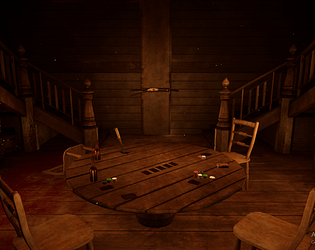
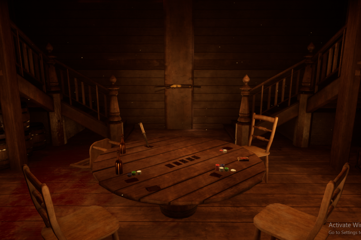
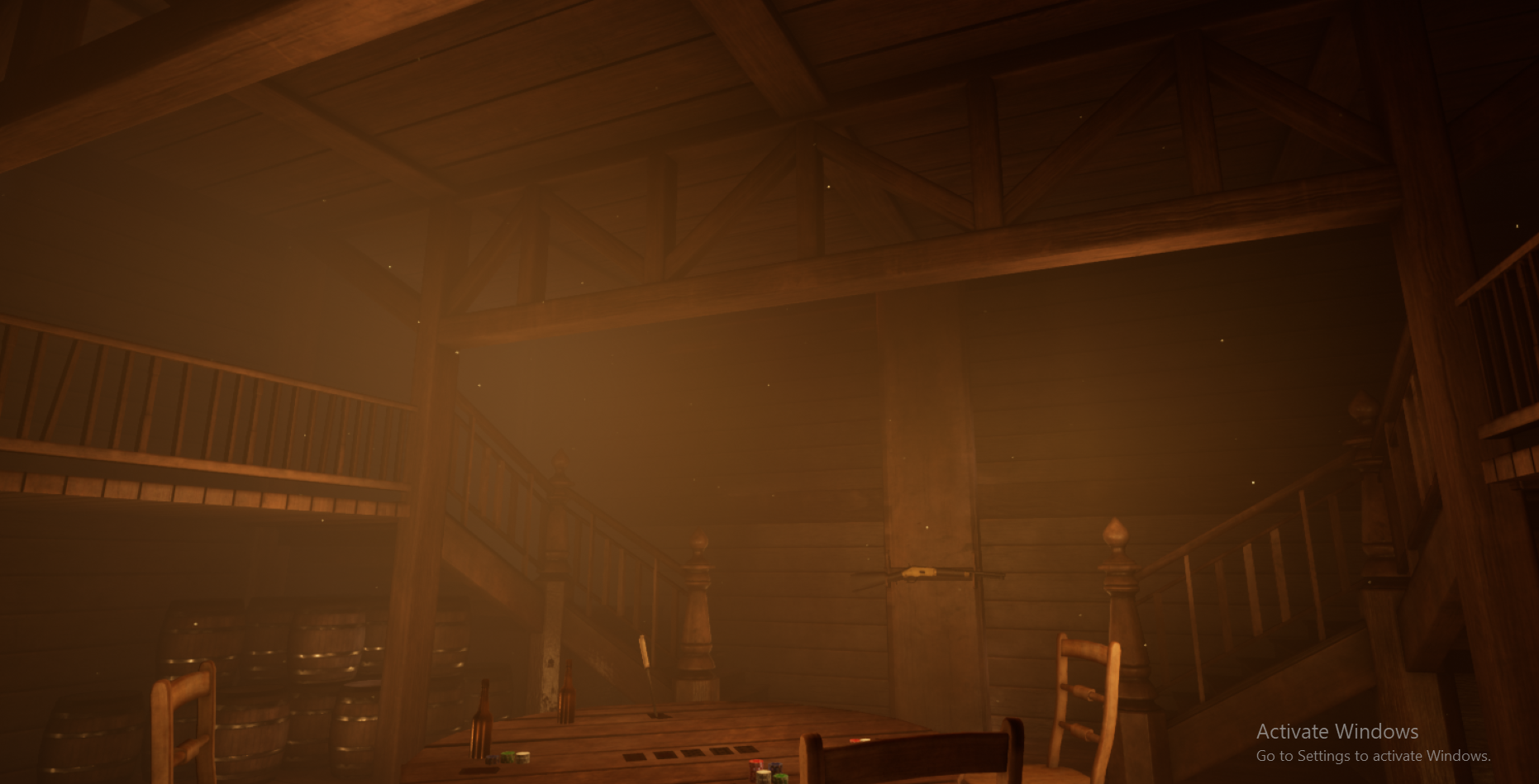
- Research & Development: Unfortunately there wasn’t a document to show the research & development, though it appears to have Red Dead influences perhaps. It would be great to see what kinds of references and research you were looking at to create the scene as they’re extremely helpful throughout the creation process as you can find ways to add narrative, key details, and overall mood to the project. Creative: I like the idea of the secretive gambling space and it shows a good foundation to work further into it. To develop this further I’d try to think more about the narrative as there’s a lot of opportunities to create a good story behind the piece. The scene is lit from the centre of the room but without a light source, any lights should really have a supporting mesh for it to feel good, and it helps keep things in check to make sure lighting isn’t coming from nowhere. The gun looks great and it would be cool to see it emphasised more in the scene/used in the narrative, and I like the structural element with the trusses which help the roof feel supported nicely. Western bars/saloons do have a lot of wooden elements, however you could definitely break up the repetitive nature of this by changing the upper part of the walls to something else with wooden trims along the bottom, give the wooden elements different treatments to make them visually different and feel more unique. Technical: I couldn’t find the umap in UE4 to have a look around properly in 3D so have had to base this off the screenshots & included assets/materials. It looks as though you have a good base understanding of the process of modelling the assets, texturing, and arranging them in the engine, and now it’s a case of developing those skills further to push the art as well as the technical understanding of good practices to adhere to for a game setting. For example, understanding PBR and how to create realistic materials with it (The PBR guide by allegorithmic is great!), making good use of the uv’s, texel density, modelling in the correct scale, high to low poly model creation to help keep the tri count down, a good naming convention/organisation in the engine etc. It would also be beneficial to look into some tutorials (plenty for free on youtube) on understanding lighting for a scene/baking (The UE4 lighting academy by 51Daedalus is amazing), bounce lighting, creating material blends in the material editor etc. Presentation: The idea of a dusty western gambling den and the mood comes across nicely, and I get the idea that whoever owns it isn’t someone I’d like to cross with considering the blood. Though the fog adds atmosphere, it should be used for only that as a supporting element, in this case it does make the overall shots feel fuzzy and harder to read. A good way I find to take screenshots in UE4 is by adding in a cinematic camera, tweaking the settings, spending some time to compose the shot, then use the “high resolution screenshot” under the “viewport options” menu. Documentation: As mentioned unfortunately the document isn’t with the submission.
- Research & Development There is no evidence of R&D submitted unfortunately. Technical Art I was unable to find the level for this project, which made it very hard to judge, so unfortunately I have to mark this down. It's a pity because what I could see in the SM viewer seemed to be of a reasonable standard. Lighting is OK, though some things seem off - table and chairs not casting shadows for instance. Creative Art It's an interesting choice of scene, but without the level it is hard to judge overall. There is some attempt at narrative storytelling in the scene which is nice to see, the dagger and the blood stained floor etc. But the scene was missing so much in terms of clutter and set design that it didn't quite come off. There is too much tiling wood everywhere. I get that this would have been the case in this setting, but that makes it really important to take every chance to add in some splashes of colour - for instance the table using the floor board textures (or something so similar) is a missed opportunity. The table design looks really weird, like no table I have ever seen. These is very little attempt to add in the grunge and dust that would be a big part of this scene, or the wear and tear that you would get on the edges of sufaces, scratches and stains on the table etc. It makes the scene very monotonous and cg looking. There is some attempts at vfx and atmospherics but not enough to really sell the scene. The lighting is ok, but there is no visible light source, which is a bit of a cop out. The Winchester looks ok, but I can't help thinking time would have been better spend developing the fundamental parts of the scene, rather than on what is quite a small asset in terms of screen real estate. The stair case spindles look completely out of place next to the ornately turned newel posts. You have to do one or the other - either the stair case is basic and utilitarian, or ornate and fancy looking - just pick one. The poker chips look really incongruous - only seen in a casino or a high class saloon I would imagine. The setting would look so much better with big piles of crumpled dollar bills and coins and pocket watches to make the stake etc. Also there is no stake pile in the middle, which suggests you don't really know how poker works. This would also have helped tell the story of someone caught cheating in a high stakes match. Documentation There was zero documentation submitted. Final Presentation The final renders were ok, but not inspiring. There was no other supporting material, and most importantly the level scene was entirely missing.
Challenge Tier
Search For A Star
Leave a comment
Log in with itch.io to leave a comment.
Comments
Research & Development
Research seems to have included western bars in sense of Red Dead Redemption, but the documentation seems to be a bit missing, so I can only make assumptions.
The research should comprise of real world reference, images that would fit the mood you want to achieve, lighting and atmospheric references. In terms of props, there could be a quality bar image, real world reference of the object and closeup shots of the materials that showcase intricate detail such as detail, wood grains, directionality of wood, possible wear and tear etc. Story elements and how for example a place looks after a fight could also be added to help with the creative part of the area.
Creative Art
Scene shows promise. I get a feeling of dusty, off the record gambling place with shady personnel playing there. Chair and other elements showcase nice modeling. The constructed ceiling support elements shows an interest towards real world building.
The scene could be pushed to the next level with modeling planks of the floor, adding irregularities to meshes to further get rid of the 3D feel, and adding good looking material blends. Also, the gun is actually very impressive, and could be lit better as the center piece, or maybe placed on the table as the price for the poker game, or someone felt a bit aggressive after losing a game and...and... The story bit could be maybe taken to the next level a bit, along with some extra material separation, as the scene reads as mostly wood right now.
Technical Art
The project file includes meshes which look nice. Face-weighted normals look nice on meshes, and most of the round surfaces look great with maybe the time running out on the SM_Door mesh' doors that look a bit whiteboxy. Modeling is definitely your strong suit. UVs, if done with unique texturing, could be further pushed to minimize the so-called empty, or 'wasted' texture space.
Documentation
The documentation seems to be M.I.A. :)
Final Presentation
Shots are of high quality and showcase the feeling and mood of the scene well. Darker areas are hiding a bit what's going on in those parts.