Play asset pack
In the Woods's itch.io pageResults
| Criteria | Rank | Score* | Raw Score |
| Technical | #19 | 3.200 | 3.200 |
| Research & Development | #21 | 3.400 | 3.400 |
| Documentation | #27 | 3.400 | 3.400 |
| Overall | #32 | 3.040 | 3.040 |
| Creative | #42 | 2.800 | 2.800 |
| Presentation | #56 | 2.400 | 2.400 |
Ranked from 5 ratings. Score is adjusted from raw score by the median number of ratings per game in the jam.
Judge feedback
Judge feedback is anonymous.
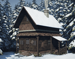
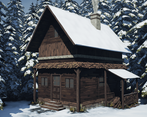
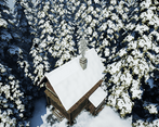
- Good to see lots of reference and annotations with them. Also good to see a block out (albeit a simple one) and a couple of tests of the techniques you want to implement. In your final images you’ve included a ground and some trees in the scene. It would have been good to see these in the block out too. I can see you wanted to use a modular approach to the building but I think you’ve fallen short of implementing it successfully. It would have been much easier to use tiling textures and simple geometry instead of copying and pasting the same geometry over the house. The trees would look less uniform if you had more than one frond of the the texture sheet too. Good to see the creation of tiling textures. The ground mesh is a bit too dense in geometry; it might have been easier to use a landscape (and sculpting of it) instead. I like that you have some directionality to the light. I think it would have been good to not have the trees as densely packed and have the snow a bit thicker on the roof. I do like the grass, wood pile and snow spray around the base of the building.
Challenge Tier
Sumo Digital Rising Star
Leave a comment
Log in with itch.io to leave a comment.


Comments
Research & Development
There's a nice reasoning for why you wanted to do this, with references and moods. The structure seems to be done pretty well in the model, but I'd like to see a bit more research on that regard.
Creative Art
I like the lighting and contrast between lighting and dark wooden structure of the wooden hut. I like how there are several different wood textures in there to mix things up, and not everything is of the same texture.
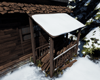
The structures could use a bit more research; for example how the stairs would be made out of separate wooden planks nailed on to supports. Some good reference images could help with defining the wood meshes with more realistic dents and deformations. I'd also love to see some signs of life in there, like piles of snow, maybe snowblower, lanterns, rocks or some such. The end result feels a bit blocky right now, if you squint your eyes and look at it, and the main reference feels a bit heavier, sturdier and overall wider.
Tehnical Art
These are definitely game-ready assets in terms of poly counts. The lighting looks impressive, even if the thought was to give the scene a different vibe judging by the pdf. The renders look nice on small scale, but there seems to be a filter of some sort to cap some values. I take it pages 40 and 41 are images of custom lighting channel UVs with forgotten explanation? You seemed to take your time to do some cool decorations, maybe you could showcase those a bit more :) Blending, layering, displacement etc. could also be researched in the future, as a food for thought :)
Documentation
The written parts are easy to read, and the influences are showcased well in the documentation. The filtered screenshots give an idea about post process being in the works.
Final Presentation
The Quality seems quite nice for a Life Is Strange scene. The framing, color, contrast, lighting, it's all there.