

Play asset pack
Tokyo Alleyway Konbini's itch.io pageResults
| Criteria | Rank | Score* | Raw Score |
| Presentation | #23 | 3.354 | 3.750 |
| Technical | #27 | 3.130 | 3.500 |
| Overall | #33 | 2.996 | 3.350 |
| Creative | #36 | 2.907 | 3.250 |
| Documentation | #40 | 2.907 | 3.250 |
| Research & Development | #44 | 2.683 | 3.000 |
Ranked from 4 ratings. Score is adjusted from raw score by the median number of ratings per game in the jam.
Judge feedback
Judge feedback is anonymous and shown in a random order.
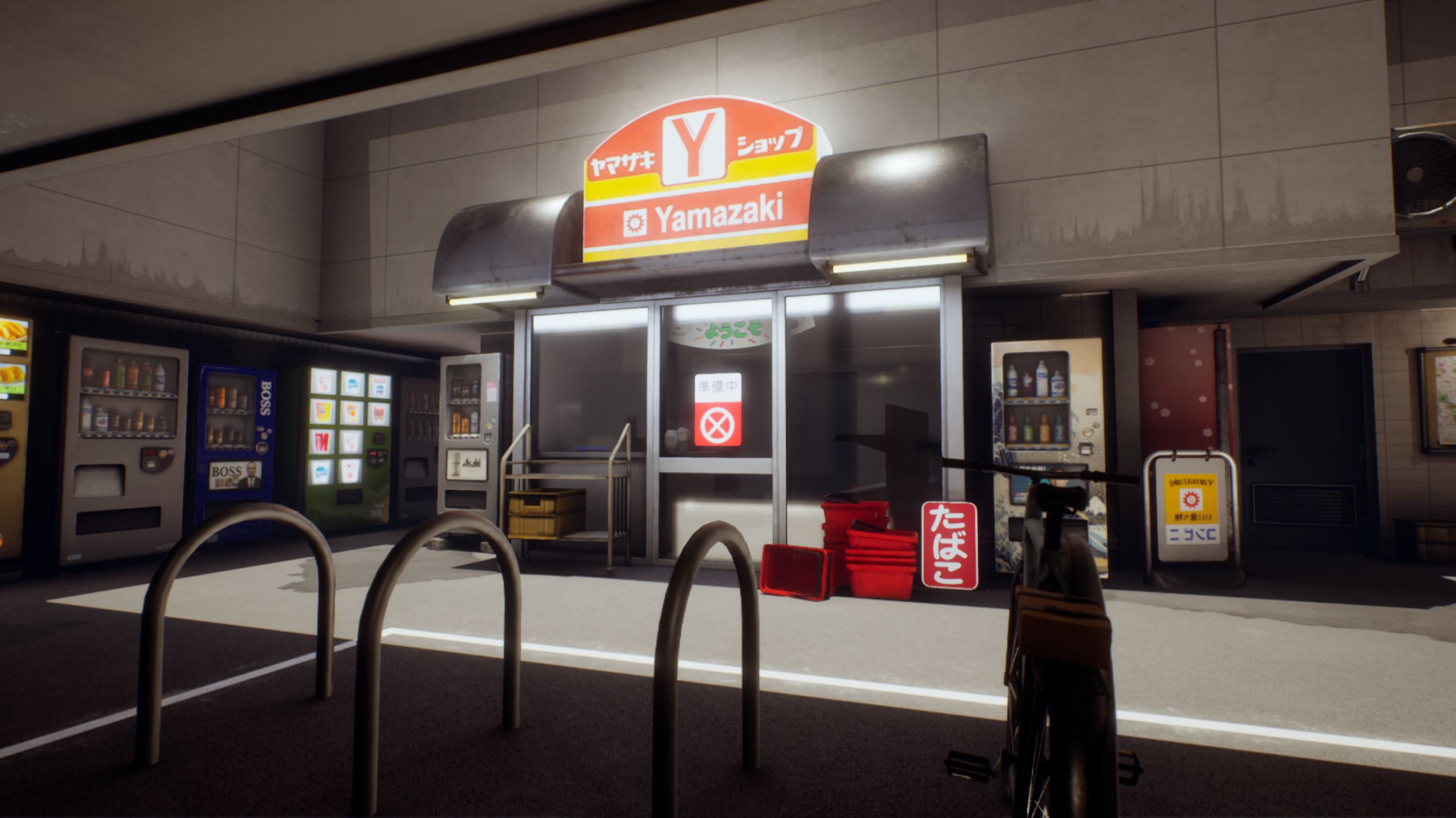
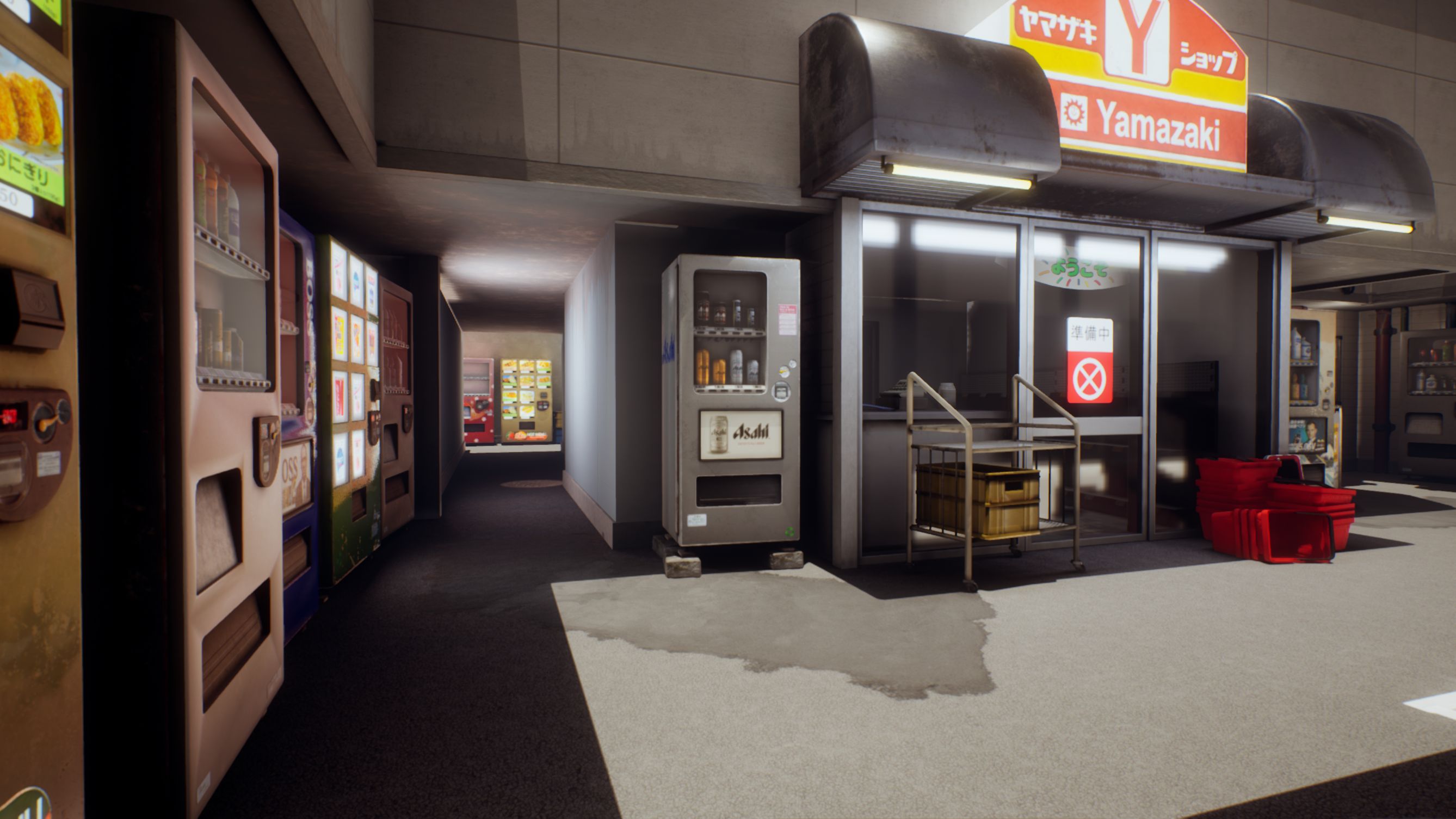
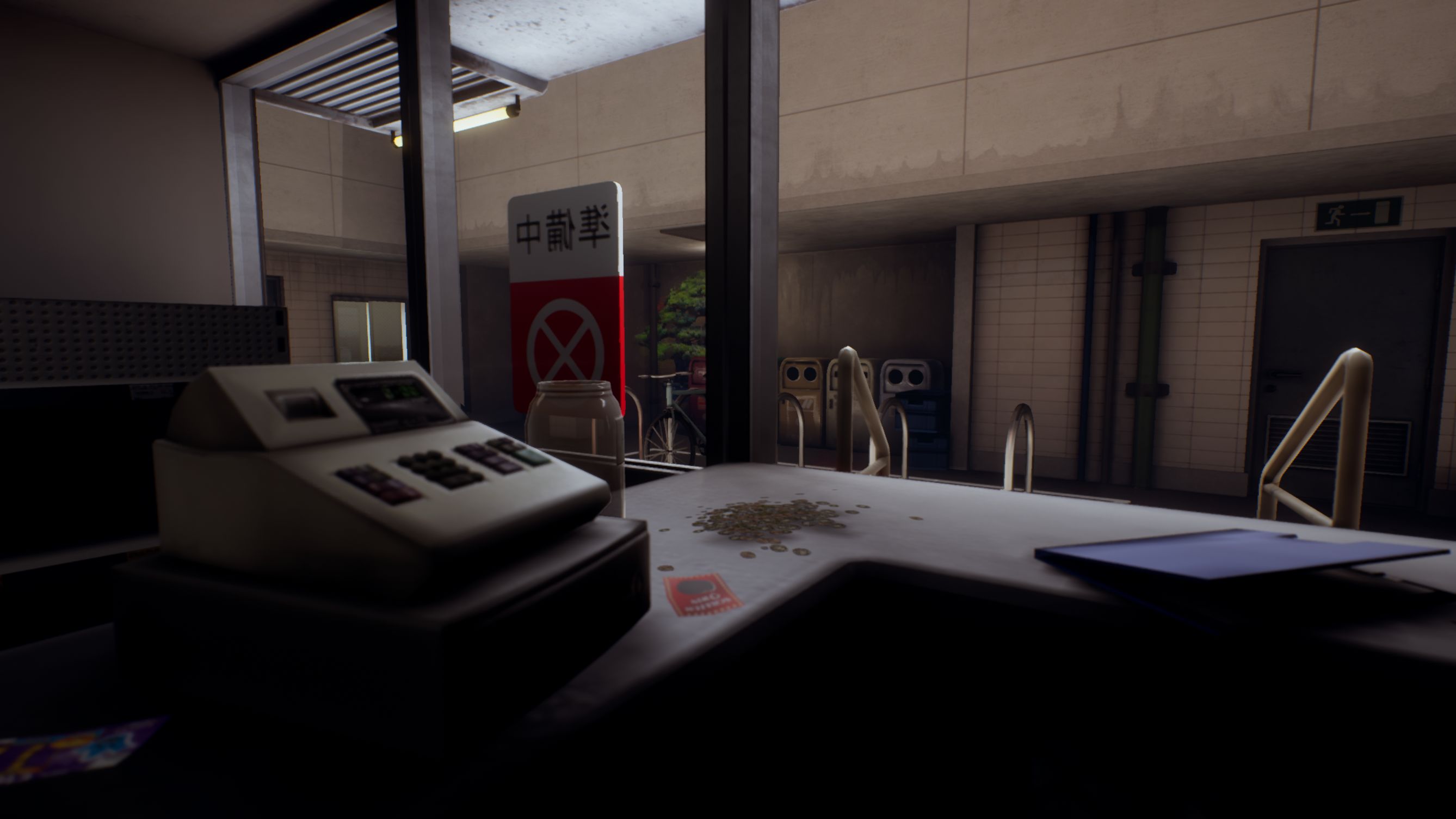
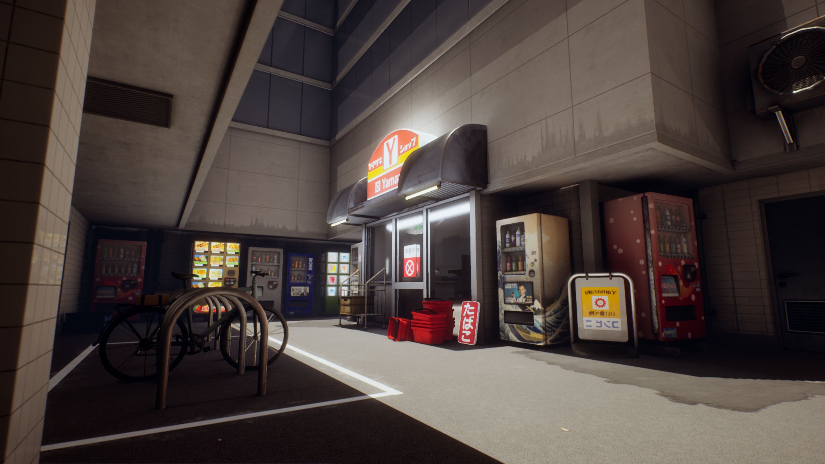
- Research & Development I really liked the choice of scene, which was full of potential. The research was not detailed but sufficient to generate some ideas. The concept image was nicely done and picked out the elements that you wanted to focus on. However I don't think it captured everything about the initial inspiration. The cluttered and busy feeling of the photos does not come through in either the concepts or the final piece, which I think is a real shame. Making the shop abandoned seems a bit of cop out, and just makes the whole thing seem even more sparse. I realise of course this is mainly a time issue, but I feel that you could have made different choices on where to focus and the overall result would have been stronger. For instance, you could have blocked the widnows to the shop with posters, and avoided doing all the interior stuff, instead focusing on more clutter for the exterior (which is the only navigable part anyway). Then you would have had more time for pipes and ducts and wires, as well as junk lying around and so on, which would have really lifted the scene and made it feel more lived in. Creative There is some evidence of dealing withe the creative challenges of the this project. There is nice use of the vending machines and murals to add accents of colour and detail that contrasts well with the gret concrete. I initially thought that the materials were a little bland, but I now think they actually work quite well for the most part, though it might have lifted the scene to have some blending going on. For instance areas of damp or puddles on the ground, some grime and dirt around the bins and vending machines, cracked or broken tiles etc. There is some really nice detailing on the vending machines. The overall composition of the scene is really nice. I like the open patch of sunlight and the almost vertical light angle, and the overhangs. It really helps sell the mood of the scene. Technical Technically the scene is very strong. The modular set is employed well. There is an appropriate use of trim sheets, tiling textures and unique bakes. The glass is set up well. For the materials, there is a strong understanding of PBR workflows. Metal reads as metal, glass and transparency is handled well. Diffuse colours are more or less correct. Paint edge wear is handled correctly. Normals are baked correctly. The only thing I noticed that was out of place was the mural paint should have been smoother, where it was the same value as the surrounding concrete wall. Texel density is mostly ok, but the decals on the ground tarmac are way off. This could have been fixed with a detail map on the decal. Poly count is spot on for the most part. I would have used more subdivisions on the circular part of the air con units, and I would have modelled the individual planks of wood on the bench. The workflows outlined are fairly standard but would fit in with a studio workflow. I wasn't convinced of the need for expresso as channel packing should be more or less a standard feature of substance painter and designer? Unless I'm missing something. There is little evidence of atmospherics, though the light setup is adequate, more could have been done in this area. For instance, it would have been nice to have some vfx coming from the air con units, or some subtle atmospherics and distance fog to help sell the feeling of a hot sunny day. Presentation The presentation is good overall The final renders were adequate and nicely framed, though they didn't show some of the best aspects of the scene, ie the mural. Documentation The documentation covers all the points. but I would have liked to see evidence of experimentation and trying different things before finally settling on the final layout.. It seems as though only one option considered.
- Would have been good to see more reference and a break down of it. I like that you made a photo-bashed image of what you wanted to create but I do feel like it’s too clean and missing detail compared to the reference that you did pick out (loads of wires, AC units, boxes, signs, etc). Good to see a block out. Adding a bit more detail at this stage is always a good idea. Good to see a modular kit to make up the environment along with tiling textures. Vending machine assets look good and the UVs look to be laid out well. Make sure you’re using hard and soft edges before baking; the pillowing you’re getting in the normal map shouldn’t be there if you’ve set the edge to be hard. Be careful about using known brands in your texture work. The plastic crates and bench look a little low-res and they aren’t showing the correct PBR values. The lighting looks good if a little plain. The decals you’ve used on the edge of the buildings are quite uniform and could have been layered/broken up with other decals. Like I said previously, I think it would have been good to add more clutter to the sides of the buildings. It would have also been good to see the ceilings through the windows of the buildings.
Challenge Tier
Sumo Digital Rising Star
Leave a comment
Log in with itch.io to leave a comment.
Comments
Research & Development
The research showcases different assets to be used on the scene. Exploration of narrative possibilities, lighting and material closeups might call for an extra layer of research.
Creative Art
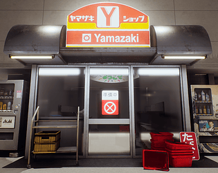
The final image looks easy to read, with large surfaces and mostly subtle variations. The bakes have also very nice soft, round edges. The focal point is a bit on the storefront, but also the vending machine with lights on, that the shadow's line are leading towards.
The surfaces could use a bit larger polycount to make use of vertex blending and shadows could be made a bit lighter to sell the feeling of open air. I might also suggest looking at thicknesses of objects, as everything has that extra cartoony and rounded feeling with exception to architecture. Most of the props also feel more exaggerated on widths rather than height, which adds to the stylized feeling. Adding polygons to add interest to silhouettes would also be considered a plus, as most things feel a bit thin of irregularities, which gives a bit of a 3d feel to the image.
Technical Art
The modular pieces are well optimized. Some of the objects could be pushed a bit with on polycounts; planks on benches could be made with geometry and the plastic containers could have a bit more shape to them.
The lighting settings and post process showcase you put time and effort into adding an extra layer of polish into the scene. From what I've been able to tell, those two are the things that make scenes feel the most connected; as in, objects belong into the environment along with architecture. Were you missing skylight from your scene? It's an easy way to add brightness to the shadowed areas.
The rounded edges look nice with unique bakes. I'd suggest baking with face-weighted normals to get rid of gradients as they can mess up LODs of your objects. You might be more prone to tangent basis errors as well. You did the low polies with Max smoothing groups, right?
Documentation
Images showcase the scene and props very well. I would have liked more progression shots with lighting, whiteboxing and greyboxing stages.
Final Presentation
Screenshots are of high quality and showcase different aspects of the scene.