Play asset pack
ColeCorp - Elevator Foyer's itch.io pageResults
| Criteria | Rank | Score* | Raw Score |
| Technical | #15 | 3.429 | 3.429 |
| Presentation | #19 | 3.571 | 3.571 |
| Research & Development | #19 | 3.429 | 3.429 |
| Overall | #23 | 3.400 | 3.400 |
| Creative | #28 | 3.286 | 3.286 |
| Documentation | #29 | 3.286 | 3.286 |
Ranked from 7 ratings. Score is adjusted from raw score by the median number of ratings per game in the jam.
Judge feedback
Judge feedback is anonymous and shown in a random order.
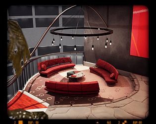
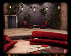
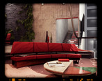
- Very impressed with this environment - and all the more so considering it's 10 days work. It's refreshing to see a different type of environment that isn't too 'game-y' - it's completely understandable, but aspiring game artist students tend to look to existing game environments for inspiration, leading to a bit of a subject matter feedback loop. This project looks beyond that, and is to be commended. The research is thorough, detailed and the thinking behind this environment clearly communicated. The artist has a strong grasp of composition, colour theory, lighting and good consideration has been put towards function driving form, something which is often overlooked in game environment art. The result is an engaging space with a clear identity and style - something that is a reward for the artist's clear and coherent planning. Any criticisms I have are minor, especially given the time taken to create this. There are some textures that aren't working - the lift surround in particular isn't reading well and needs to be toned down in both pattern contrast and scale, and I think the same could be said to a lesser extent for the marble floor. A few pot plants dotted around would also help break up the man made nature of the space. But I think the biggest win would come from the area beyond the balcony. It clearly hasn't had as much time spent on it as the main area, which is entirely understandable given the time constraints. I would darken this area down almost entirely, leaving just a few low lights hinting at form, as if the office is closed and after hours. This will allow the seating area to really become focal against a dark backdrop. Dimming the lighting around the rest of the environment, leaving the seating area at its current brightness would also make that area stand out.
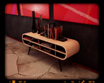
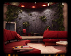
- You seem to have alot of wasted polys on the red couch/chair and table and the legs on the book stand. These could be removed of distributed better to make the most of what you have. If the polys are not effecting the shape/silhouette of the model, then remove them. Black meshes on walls at other side of office space do not look like windows. They just looks like black shiny pieces of plastic. Nice choice of different styles. Syd Mead and Frank Loyde Wright. It seems strange that a Foyer is in the middle of a high rise building, unless its the foyer to a different company with in the building. In that case you would want a reception area for that company floor. Company logos etc. Maybe a large company logo decal on the floor as you step out of the elevator? The Slate curved wall is a very nice touch, adding the ferns to it is a nice way of adding colour and life to it. Maybe look at the placement of some of them. It looks like its growing like Ivy when architecturally they would have been placed with purpose. Very nice to see that you made your own nodes and shaders for what you wanted. There was probably no need to create a specific curved version of the fern, when you could have just placed the texture on a mesh and manipulate the mesh. Might have been best if you just used that space to make a different version of the texture leaf. LUT can be very helpful, but make sure that its not the main factor driving the colour in your scene. Try and get the lighting and colours near perfect as possible before adding LUTs to give that small hint of colour change etc. Beyond the balcony you can see the other offices across the way. The Black windows do not look like other offices, or even glass. Plus the lighing is very bland in the large drop in the middle of the building. For the video, you could have edit it abit better, so you dont have pauses between the camera change. Overall, very nice job given it was 10days. Best of luck!
Challenge Tier
Search For A Star
Leave a comment
Log in with itch.io to leave a comment.



Comments
Research & Development
Research showcases a lot of overall scene research in terms of lighting and feel. I'd like a bit more closer references as well, your objects might also benefit from getting some real world details to the as well for example material wise.
Pie chart color wheel works very well, I could adapt similar to my work.
Creative Art
The scene looks like an interesting futuristic office space on its own. Shapes and elements look interesting. Dang, do I like the shapes in there a lot, with mix of lamp's round shapes, rough rock wall, and flat surfaces. Canvases are also something I make a connection to modern spaces. Use of color and its ratios are mature and interesting.
The space a bit dim. Who has a place like this? Is it a company's office space? Is the owner some rich billionaire?
The shapes also, while being interesting, feel a bit off scale which might be due to them either not being done to what is commonly viewed as the object dimensions in real world, or just the fact that there's not so much ordinary/common stuff to compare it to.
The ceiling color is a bit maybe too eye catching with hot red wood to it; I'd suggest desaturating and darkening it to give the space a bit more of a relaxing feeling. Rock and concrete elements look intriguing, floor decision seems slightly odd (or the material on it does, maybe polished marble surface would do better), and the stairs could benefit from maybe a different material to it. Couch works well shape and color wise, but the material seems slightly beaten/something that would introduce dust into the air of the space and as such isn't exactly catering to the futuristic office feeling.
Modules could use edge decals to give breakage to the edges as well as some irregularities with polygonal usage to mimic the real world materials such as the plaster and concrete.
Technical Art
There are wasted polygons on chairs, railings on the bottom of chair are on high on polycount, cushion could use more polies to add more roundedness and reduce the 3d feeling. Materials use material instances (it would be nice if you showcase this also in the prefix of suffix, I use "MI_" for instances for example). Fuzzy shader is a nice addition to the carpet, but is a bit hard to read in editor. Lighting could use some optimization (I'm looking at you, dozen pointlights in the ceiling!)
Documentation
Documentation is well written and colorful. Words are well written; I'd like to get the fonts maybe a tad bigger for easier reading. Texts could maybe also do with shorter chapters.
Final Presentation
Images showcase the scene well. The video was a pleasure to look at.
Thanks a lot for your feedback!