Play game
The Dollmaker's Shop's itch.io pageResults
| Criteria | Rank | Score* | Raw Score |
| Halloweeny? | #50 | 4.125 | 4.375 |
| Fun | #70 | 4.007 | 4.250 |
| Candy!! | #115 | 2.711 | 2.875 |
| Overall | #116 | 3.088 | 3.275 |
| Monsterous! | #139 | 2.475 | 2.625 |
| Scariness... | #143 | 2.121 | 2.250 |
Ranked from 8 ratings. Score is adjusted from raw score by the median number of ratings per game in the jam.
Log Line
You're a lost soul, visiting the local dollmaker to get yourself a new body before Halloween.
Content Warnings
Mentions of death
Team Members
Submitter (Sycamore Nest) is the sole developer of this game
Leave a comment
Log in with itch.io to leave a comment.


Comments
Hi! Just finished reading it! It was a nice, cute, relaxing and short reading. It would be nice to have a bit more info about the Dollmaker, and some sprites for the dolls and parts too. The cat was cute!
I think the setting has the potential for a lot more! Keep up the hard work!
This one was short, but I guess that made it faster to play it a couple of times.
Writing: A fun little story, and I had fun trying different options. And also different names. And you can choose to be a cat? That’s cute!
Theme: It takes place during Halloween, it involves lost souls getting artificial bodies.
Audio: There’s quite a lot of music for such a short VN, and it does fit together nicely (it’s fairly consistent, no jarring genre switches). But also maybe I’m supposed to be advancing the text from time to time rather than leave the music playing until it loops: this isn’t really the type of music where there’s a lot of stuff going on. (Yeah, I guess eventful music could be seen as distracting from the text.) I do like when there’s some more eventful music on the main menu, well, there is some on the credits screen.
The music is pretty chill, which suits the story.
And I see the volume sliders let me change the volume of music, sound effects and voice. I don’t think I heard any voices. Are there sounds or voices? I’m guessing you either didn’t have time to add them or didn’t have time to remove the sliders.
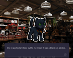
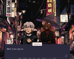
Art: I think I like the sprites more than the backgrounds. Probably because the sprites look more carefully drawn and the backgrounds look like edited photographs (also, I managed to look at one of the backgrounds on its own without the textbox, and I can see that the part that’s covered by the texbox looked a bit odd… I guess it’s okay considering it’s only visible for fractions of a second, but yeah, if a surface acts as a mirror reflecting walls and it doesn’t reflect people, I wonder if those people are… people).
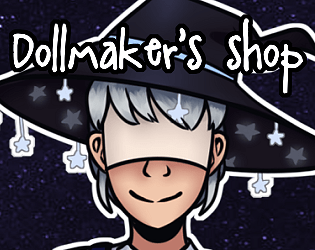
I like the sprites, including the pumpkin and the cat. And I wonder if there was meant to be some clothing sprite that you didn’t have time to draw.
The UI works. Maybe I’d preferred a slightly transparent background for the textbox, but I guess it helps hide a portion of the background. And having a sold background behind the text does help ensure it’s easy to read.
There weren’t images of the bodies, but now that I think about it, if they weren’t wearing clothes that could be a good thing (or they could be non-detailed).
Fun: The story was fun, and it was also nice to have to first pick a name, then pick some choices that would somehow fit that name, then pick more names that I would feel like they would make some different choices.
What I liked most: the worldbuilding and endings. What I’d suggest changing: Maybe edit the backgrounds to be closer to the style of the sprites.
The art and storytelling was all very well done, I was invested in the characters/world. I would love to see this become a bigger project one day. :)