Play game
The Drafty Nook (NSFW)(Early Concept Build)'s itch.io pageResults
| Criteria | Rank | Score* | Raw Score |
| Stealth | #10 | 2.239 | 2.375 |
| Sound | #11 | 2.711 | 2.875 |
| Kink | #14 | 2.593 | 2.750 |
| Aesthetic | #15 | 3.182 | 3.375 |
| Horny | #21 | 2.593 | 2.750 |
| Overall | #24 | 2.540 | 2.694 |
| Novelty | #24 | 2.828 | 3.000 |
| Harmony | #26 | 2.475 | 2.625 |
| Play | #27 | 2.357 | 2.500 |
| Narrative | #29 | 1.886 | 2.000 |
Ranked from 8 ratings. Score is adjusted from raw score by the median number of ratings per game in the jam.
Leave a comment
Log in with itch.io to leave a comment.


Comments
You got a cool idea going, impressive that you learned to make a 3D game just for this.
Thanks, I hope to run with it and develop it into something bigger, :3
oh this looks interesting but there's not quite enough yet to know what to expect it to be! i love the aesthetic (and the tongue-in-cheek commentary on it, like the loading screen ad copy for hexagonal mugs)
looks like ui was the hardest part; the coin count seems to be in the middle of my screen and the text is kinda hard to read, but i feel like i've seen the same issues in other unity games, so i'm guessing it takes a bunch of annoying extra work to wrangle unity ui into behaving sensibly
i hope you keep this going, i'm curious to see where you were going with it! and it's one of the very few 3D games ever made for a strawb jam so all the moreso
Since it was a timed competition/jam/thingy I didn't get to finish or even get half of the things i wanted to add implemented, hence why i'm working on an update, :3
Yea, unity ui from screen to screen is a tad wonky. Still glad you liked the concept build. I'll definitely be developing this further, I've already been working on an update that has enhanced, changed and added a lot and I intend to grow it into something rather big from rather humble beginnings. It was my first 3D game and honestly i'm hooked on 3D now, can't wait to see how it develops myself, XD.
I literally just made a dev log video for this version and i intend to make more dev log videos through out it's development, :D
Thanks for the awesome feedback, :D
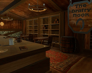
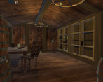
Very ambitious. I like the mixed low-poly aesthetic and the ambiance of the tavern. VERY comprehensive change-log. I don't know about the planned dungeon-crawling aspect of this game, I'd rather see it become more of a tavern simulator. Maybe you help Borris run the bar and entertain the guests. Then you upgrade the tavern, buy new rooms and get to know the visiting patrons. I think it's just got too much planned at the moment and I'd rather see it narrow in on a few select aspects but do them really well.
Some one actually looked at the Changelog, yay!
A tavern simulator is actually a very interesting idea, I just hope you don;t mind if my future update actually starts to steer that way, :D
I also fully agree, ended up trying to do too much and didn't finish or finalize anything as a result.
Thanks for the awesome feedback, :D
I might have answers for you in regards to a couple of glitches outlined in the Changelog.
Black lines from a distance is almost universally an issue with mipmapping. Mipmaps are downscaled textures used to save memory and render costs when viewing objects from a distance. They are generated automatically by downsizing the texture by powers of 2. This blurs the texture and if the polygons are mapped very tightly to it, the surrounding pixels (which in your case are probably black or transparent) will bleed inside. This can easily be fixed by expanding texture island edges past the polygons that they're mapped to. During my own playtests I didn't really find the black lines distracting, they sort of fit the low-poly look of the game.
Phasing through walls can be remedied by making the box colliders on the walls really big, or playing around with the Character Controller or Rigidbody on the player character (whichever you're using here, feels like a Character Controller to me). Making the colliders really big is a pretty good solution since most of your game is blocky, so the colliders can be expanded well past the actual wall. The other way is to change the collision detection on the player to "ContinuousDynamic" and play around with the skin width values if you're using a Character Controller. "ContinuousDynamic" detection is very costly, so only use it on the player character. If after these changes the player can still see through walls, change the camera clipping planes.
Coin locations not saving between scene loads can be remedied by any of the methods mentioned here: https://stackoverflow.com/questions/32306704/how-to-pass-data-between-scenes-in-unity
Also if this is your first stab at Unity and 3D in general I'm very impressed. This is nothing close to my own first Unity project.
Wow, a lot of good info, thanks, i'll try and figure this stuff out, @.@'
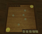
The tavern has a nice cozy atmosphere, could be the start of something interesting. It doesn't look like there's much to do besides play the dice game at present, unless I missed something.
Kinda uncomfy with the use of the word "homos" in the text, but it's possible I'm not understanding the context.
Yea, was trying to make Borris edgy, kinda ended up making him sound homophobic. Any who glad you liked it. There's a lot, i mean a lot of stuff that didn't really make it into the demo. Check out the ChangeLog to see everything that's been worked on. To see a little bit more of what was worked on hit "~", to open the cheat console (it wont show up til you start typing), type "t" and hit enter to go to a testing area to see literally everything that didn't make it into the demo.
Any who glad you liked the concept, hope you enjoy it more as it develops, :D
It's a fine line to walk, I think. We don't see very many lines from this character, so possibly with a more rounded picture of him, it would come across differently. As is, I'd probably tweak the language, it's a bit shocking to stumble upon without context. X3;
Will do, thanks for the input, :D