Fun and greate game, thank you for this :D
Play game
Liquids's itch.io pageResults
| Criteria | Rank | Score* | Raw Score |
| Overall enjoyment | #1 | 4.057 | 4.057 |
| Length of the game | #1 | 4.000 | 4.000 |
| Speed of the game | #1 | 3.471 | 3.471 |
| Originality of the game | #1 | 3.900 | 3.900 |
Ranked from 70 ratings. Score is adjusted from raw score by the median number of ratings per game in the jam.
Comments
This game is good. The theme is nicely utilized. A few visual bugs. A really nice original idea.
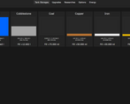
The few problems I have are that besides water you start with there are no other liquids, that game does get a bit repetitive without engaging the mind like the Red Market, and that the upgrades should really be on the same screen as the resourses.
9/10, the second best game I tried so far.
Unique idea, but here are a few things I find annoying:
-Tanks, researches and upgrades not being on the same screen make it a bit annoying, especially so for early game when your water keeps draining and you have to rush between the tabs to get enough water.
-I'd prefer it if the upgrades were organised in a sort of grid formation rather than just taking up all the space in a single line. Currently it feels a bit clunky. The purchase button being on the right also feels weird, I feel like it would be better if you could just click the whole div and you'd get the upgrade.
-Clicking enter on the water tank is pretty much always better than automation (or so I've seen from my early game experience so far) which makes for some clunky balancing. As I play through more, the above issue stays apparent with cobblestone, less so with water since at some point you don't need to bother with water anymore. This also seems to be the case with some later currencies.
Nontheless, pretty good for a game within 14 days. I'd like to see the theme get elaborated further than with water and energy though.
I enjoyed playing this overall, but have two feedbacks about how I played it
1) having the tank storages only visible on their own tab felt cumbersome, so one of the first things I did was force the tab0 element to always display and modify its render function to update no matter what tab was active (this made the tank storages pinned to the top no matter what tab I was on) and I feel like that improved the experience a lot for me. Part of what made it feel extra cumbersome in this game is that water, your first currency, constantly goes down, so a few times I clicked the upgrade tab and saw myself become unable to afford something in real time for not switching tabs fast enough
2) like in most games with a "you can click to make it go up" feature, I felt obliged to use an autoclick/autofire on my mouse (or hold down the enter key) instead of manually click. because of the variance in how people approach clicker mechanics like this its hard to know how close my experience with the game balance was to what you intended
I enjoy the uniqueness but I think this game suffers very much from tab overload so far.
I'm up to gold and I don't see any reason why Tanks / Upgrades / Researches can't all be on the same window instead of having to go back and forth between the three.
Also not sure if game is balanced around holding enter but an option to simulate holding enter would be preferrable
Edit: finished the game. Still agree with what I said above. Appreciate that the game had a concrete ending, was fun


Leave a comment
Log in with itch.io to leave a comment.