Play game
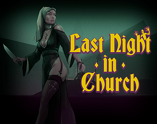
Last night in church's itch.io pageResults
Criteria | Rank | Score* | Raw Score |
Horror | #16 | 2.460 | 2.750 |
Gameplay | #23 | 2.460 | 2.750 |
Theme | #24 | 2.683 | 3.000 |
Creativity | #25 | 2.683 | 3.000 |
Overall | #26 | 2.422 | 2.708 |
Presentation | #28 | 2.683 | 3.000 |
Story | #32 | 1.565 | 1.750 |
Ranked from 4 ratings. Score is adjusted from raw score by the median number of ratings per game in the jam.
Which Theme from the list did you choose to implement in your game?
The Grim Aftermath
How did you choose to implement your chosen Theme in your game?
The game is quite dark. And quite gloomy...
Did you implement any of the optional Bonus Challenges, and if so, which ones?
Well, the game has a combat system. That is all.
Leave a comment
Log in with itch.io to leave a comment.
Comments
I think the atmosphere to the game was nice, and I thought the monsters were a good choice (surprised me a few time actually!). I unfortunately couldn't really figure out what the objective was. It seemed like the combat was throwing glass bottles, but this didn't seem to do anything to the monsters. I did eventually find the knife, but I still died quite easily, maybe a lack of skill on my part! There was a set of locked doors that seemed like the objective, but I also wasn't sure if this ending was a troll ending given the way the game actually ended for me (i.e. I was too curious about a piece of paper).
We are working to make the game clearer for the player. The game is not designed for direct contact between enemies and the player.
The game looks great and I like the idea I think we’re going for. However there are some flaws that prevent the game from being great in general.
Mostly it comes down to the monsters. It seemed that if I knifed them without them being aware of me they went down easy. But if they were aware of me, they didn’t seem to be kill-able. It was weird. Maybe it was just me and I missed something.
I think the beginning is well designed. You can see the monsters in the other room adjacent to where you start. And then you can see one patrolling the area below you if you go up the stairs and over a walkway. However, the monster sees you on the walkway and then comes straight to you. I think the player detect area should not extend to the second level. Once in the court yard the monsters can see you from quite a ways of it seems. Again, shrinking that detection area would be good. Or perhaps have the monster visibly do a “what’s that?” sort of action - maybe make a sound too - and give the player time to find cover.
The monsters make a breathing sound, but it’s very low and easy to miss. I would make them even more noisy. Add a walking sound. Make their breathing even more obvious or find another creepy noise for them to make as they patrol. This would help players know they’re there behind walls and corners.
Now, the first area is well designed as you can see the monsters before they see you. But after you leave that area, the rest of the level isn’t that way at all. Along with the increased and varied sounds, and the “what was that” sort of pause, I would change the level to allow players more chances to spot the monsters before really encountering them. Maybe even just reduce the number of monsters too.
If you achieved all of that, this game would be really cool! It still is in a lot of ways. But it’s very hard for we mere mortals to play.
We thrive on constructive criticism and really listen feedback! We would love for you to try our game and let us know what you think! Thanks!
This is a very useful review, thank you for such a voluminous comment. Such reviews help to make the game better.