Play game
Under Rail's itch.io pageResults
Criteria | Rank | Score* | Raw Score |
Theme | #3 | 4.429 | 4.429 |
Gameplay | #7 | 3.571 | 3.571 |
Overall | #7 | 3.738 | 3.738 |
Story | #7 | 3.714 | 3.714 |
Horror | #8 | 3.429 | 3.429 |
Presentation | #10 | 3.857 | 3.857 |
Creativity | #16 | 3.429 | 3.429 |
Ranked from 7 ratings. Score is adjusted from raw score by the median number of ratings per game in the jam.
Which Theme from the list did you choose to implement in your game?
How did you choose to implement your chosen Theme in your game?
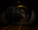
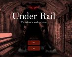
The game takes place immediately after a tragic subway train accident which happened as the train was mysteriously teleported to the underworld. The player is the sole survivor of the crash. They must investigate the deceased passengers and work with a sly demon in order to escape.
Did you implement any of the optional Bonus Challenges, and if so, which ones?
We implemented the Journal and Fight to Survive bonus challenges. The Journal is updated as players investigate train passengers. Players must use their skull weapon in order to fend off the passengers and collect necessary items to win the game (Fight to Survive).
Leave a comment
Log in with itch.io to leave a comment.
Comments
As a game it was.. an okay game? there was a gameplay. a bit spooky, even!
Camera focal length is messed up.
Movment controller is messed up
waliking to the left or right is 2-3 times faster than walking forward.
No mouse sensitivity controls...its not enough by def for me.
Train is distorted visibly(scaled up on vertical axis.
"Press E to talk" should be NOT dialogue window but simple text promt, its confusing.
no footsteps for anyone.. Not enough ambience sfx.
Thanks for playing the game, and I appreciate your feedback! I'm glad you found it a bit spooky--that was one of the goals for our game, so that is really good to hear.
The camera focal was intentionally set the way it is, but it does make the character appear a bit nearsighted if that's what you're referring to. I can definitely see an argument for it being too strong/incorrect and questioned this myself when adding the effect. I ultimately decided to keep it as is, but it's good to hear your feedback on it.
The movement controller is the default FPS controller. The left and right movement is strafing, not walking, so it should be a different speed, but shouldn't be that much faster, so that is a bug. Thanks for identifying that.
That is a good point about the dialogue window, and I agree with that. Having the entry point outside the box would definitely improve the dialogue interface.
You are right that there are no footsteps and few ambient sounds. It was one of the next things to implement if there was a decent amount of time. The monsters do have an ambient chain sound emitting from them if you are close to them, however.
I liked the story in the game, especially the monster that gives you tasks, it really feels like you got transported to another mystery realm. The journal was a nice touch. But the level design was a little underwhelming, I would have liked to see that the areas are different, they all felt really similar, to much in my opinion.
Thanks for playing the game and for the feedback! The journal was one of the most fun parts of the project, so I'm glad you liked it. We agree regarding the level design. It was sadly one of the biggest things we sacrificed in order to complete the game for the jam.
Nice job with this! At first I wasn't sure if there were two separate beings -- ones that you log in your journal and ones that attack you -- but I worked out over time the difference between sneaking up on them and confronting them, which was great and worked well. The mechanics worked well and the pursuit/attack by the zombies was dangerous but fair. The darkness added a nice feeling of suspense; when I tried turning up the light it definitely changed the vibe!
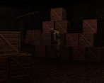
Some hopefully helpful feedback: I did get softlocked on one occasion and had to exit out of the game. I don't remember which room it was (not the one where you recharge the skull), but I climbed the stack of boxes near the entrance, where the ceiling was right above my head, and I was stuck. Separately, I did get the instructions on the journal and reloading the skull from the big guy (so it worked as you intended), but I did have a feeling at the time like that info would be better presented in the earlier talk with him. I also didn't realize there was a sprint in this game until I saw it in someone else's comment, so instruction on that would be good, too (or maybe I missed it somewhere?).
Smooth gameplay, great work!
Thanks so much! I really appreciate the comments, and I'm glad you felt some suspense when playing the game (and am really glad to hear your tried out the brightness setting!).
Your softlock is really interesting, and that is a great consideration for level design in the future. I'm also going to work harder next time on teaching the player how to play the game. It was a realisation we had coming to the end that it was a bit unclear how to actually play the game, but we didn't foresee the true impact of that until getting more feedback.
P.S. your game is beautiful, and I really enjoyed the art style. I'm going to be posting to it sometime this weekend when I get more time to finish it.
A very good game! I especially liked how creepy the level was! The lighting and monsters. It also felt pretty fair since you could get away most of the time when you got noticed. And the idea is generally very good.
I would have liked some more info on how to use the skull thing. I knew I had a limited number of shots. But I didn’t realize that I could recharge it until I watched the video by Bullhead Studios. I also felt that that the mouse sensitivity was a bit high.
I appreciate that I could use the arrow keys too, and not just the wasd keys. Being left handed, using the arrow keys is much less awkward. Unfortunately the sprint key was the left shift key. Perhaps you had intended both shift keys to work, but right shift did not engage sprint for me. Not a huge deal. But I thought I’d point that out.
So, all in all a very good game! I think this one should rank pretty high in the final ratings.
My team and I are hungry for feedback for our game and would love for you to try it, and let us know what you think! Especially any constructive criticism! That would help us learn the most and get the most out of our effort. Thanks!
Thanks for all the feedback! I'm glad you were able to play and am really interested in your comments on left-handedness. This was definitely an oversight, but I would have assumed both Shift keys to sprint. Next time, I'll be sure to incorporate that. I assume that also made the jumping a nightmare (although thankfully not required). What key is good for that? Keypad 0 or Enter?
I fully agree with regards to the information presented to the player. Hindsight is 20-20 they say! I've played your game and am working on some feedback.
I’m used to one of the mouse buttons being for jump. Either the right mouse button or middle. But that’s probably what I set it to whenever I play an FPS.
Not sure how hard it is to do, but allowing key rebinding would be great! Surely someone has some free pile of code on github that could be used. Or maybe free on the asset store.
I liked this a lot, but there were some annoying things with me getting the last shard. And the lighting seemed to be pretty bad for me.
Hey! Thanks so much for playing and giving feedback on the game. I think it's a really good idea to have the demon tell you the controls the first time instead of after. It seems like a tutorial would have been good to have! And also apologies on the lighting, I agree that it is both too dark and too light at the same time. We tried to provide a brightness setting to compensate for the overly dark areas, especially on the stairs. The material/shader on them seemed determined to be dark.
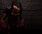
If you're curious, the monsters are meant to be passengers from the train your were on, so the descriptions are what the player remembers about them before they died. You get a journal entry by creeping behind the monsters, and that is what triggers the light under the monster.
The game is ultimately meant (although it doesn't do well at telling you) to be a puzzle game, where you connect the hints with the passenger descriptions. So the description of the person who wears great jackets that the player envies matches the hint for 'can only think of green' because of being green with envy. They may have been a bit too subtle :P.
Anyways, thanks again for taking the time to play!
Ah ok. Yeah I never figured it was a puzzle game, more just a trial and error game. But despite these flaws I really enjoyed it!
Thanks so much for taking the time to record the experience of playing our game (and for sticking with it all the way to the end!). It was really useful to see the experience 'live' through the eyes of someone playing it for the first time. And the comments were all really valuable . I could totally share your frustration at not being able to find that final ghoul!
Plus you really made me laugh when you immediately spotted the way we had to re-use the same room design to meet the deadline: "OK, this room looks safer.... oh wait, it looks exactly the same!" : D
Lighting is definitely going to be my next big area to develop!
Thanks again! : )
You're welcome! Yeah, I do try to be funny, and I did enjoy it, but I was really thrown off by the final guy already being "marked." I can't remember if I hit him already or not, but I wish there was a slightly better way to indicate they are the guy you need. I guess I should've looked at the journal so maybe it's fine and I'm just stupid?
Ha ha, no, not stupid - there's definitely lots that we would fine-tune if we were working on this more. This has been my first game jam, and it's absolutely opened my eyes to how valuable user feedback is for that kind of thing!
Glad I could help!
Great visuals, sound and story, I really like the train crash journey to the underworld concept. My setup I think made the gameplay (navigation) a little frustrating so I didn't get to far but what I saw was good.
Hi @RicoTV, thanks for playing the game! I really appreciate the positive feedback. Do you mind sharing your setup so I can consider it next time we're making a game? The game also supports controller input, but not in the menus, so it wasn't documented in the build.
I was using mouse and keyboard, but more of an officey setup so could have well been my tools - just made it a little clunky.
That's really good to know though! The controls are just keyboard for movement/actions and mouse to point the camera, but you do have to take your hand of the mouse somewhat frequently, so I think it's a valid point. :) Thanks and I look forward to trying your game out
Hi RicoTV, thanks for trying out our entry! Sorry the navigation was tricky - I think there are definitely improvements we could have made there with more time, so appreciate the feedback! : )