Play game
Battle for the Relic's itch.io pageResults
Criteria | Rank | Score* | Raw Score |
Audio | #7 | 3.333 | 3.333 |
Visuals | #9 | 3.556 | 3.556 |
How well does the game fit the themes? | #10 | 3.778 | 3.778 |
How do you rate the game overall (you can consider fun, dev time, etc.)? | #14 | 2.444 | 2.444 |
Gameplay | #15 | 2.444 | 2.444 |
Ranked from 9 ratings. Score is adjusted from raw score by the median number of ratings per game in the jam.
How long was your dev time?
3 hours
Leave a comment
Log in with itch.io to leave a comment.
Comments
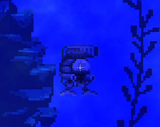
Really liked the presentation of the game! The beam weapon was nice, usually people go for simple projectiles, so it was fun to see something different!
For feedback, two points - both of which I raise being aware of the time limit! First off, it would be great to have some sort of a hit indicator for the enemies (e.g. they flash white when hit). Currently they have so much health, that I was uncertain if I was hurting them or not. Secondly, the relic being reduced to 0% health doesn't end the game. I "beat" level 2, but for the majority of the level the relic had no health, but I could keep killing monsters to win the game.
Edit: Also just read that you did the art yourself, for which I have to say the the Mech design is great (I'm a total sucker for Mechs)
Damn dude, this level 2 was no joke. My fingers hurt from trying to win. 🤣
Great job! The pixel art looks amazing, especially the monster. I'm amazed that you were able to pull off this level of art and still have the game working in less than 3h. Props to you man!
Thank you for your feedback. Sorry to disappoint, but I did not make any of the pixel art. I used CC0 licensed game assets from other creators
Ho. I see 😅.
Well, you have good taste in assets! And building a game in 3h is still quite a feat!
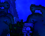
I understand where you were going with the blue moody filters, but I think the game could have been done with some more contrasting colours. The atmosphere was good.
Thanks for the feedback! That is good to know. I will try to have more contrasting colors in future projects