Play project
Elevator Going Down's itch.io pageResults
| Criteria | Rank | Score* | Raw Score |
| Overall | #1 | 4.520 | 4.520 |
| Composition | #1 | 4.800 | 4.800 |
| Emotional Value | #1 | 4.500 | 4.500 |
| Color Balance | #2 | 4.600 | 4.600 |
| Creativity | #2 | 4.600 | 4.600 |
| Theme Adherence | #3 | 4.100 | 4.100 |
Ranked from 10 ratings. Score is adjusted from raw score by the median number of ratings per game in the jam.
Name of Art Piece
Elevator Going Down
Description of entry
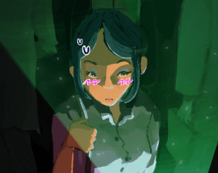
It took a few tries before I got to the elevator idea. I messed around with the literal meaning of the theme, until I took an elevator ride to my class and got inspired. The ceiling of the elevator was inspired by the ceiling in the middle of the first floor of pickerton hall. About halfway through rendering, I realized my theme almost paralleled the Catcher in the Rye, so I though it'd be fun to reference it by adding little bits of rye peeking through the cracks of the floor. The checker pattern i chose to use for the floor also reminded me of Chess, so I chose to add a small surrealist element and put a few chess pieces that "attack" the focal point. I took pictures of my own eyes to "cut and paste" into the artwork to make it feel a little "uncanny valley."
The entire work was made in procreate. When I sketch, I worry about composition the most., I used symmetry, with the focal being the middle person, and the four figured paralleling each other at her sides. . When choosing the color palette, I went with a dark green and red (reminds me of like, zombies or something alive) and pink and orange (compliments and "girly"). I used nomad 3D to create a reference for the lighting. The light coming from the phone, the checker floor, the tile patterned ceiling, and the red digital down arrow are all meant to act as leading lines that point back to the focal point. The visual hierarchy of the work was an important part of my process as well. To create depth in a cramped elevator, I chose to make the girl more detailed than the shadowy figures. In general, to push the idea of there being "different worlds," i purposefully made parts of the elevator that were in the light more detailed than the parts in the shadows.
How does it fit the theme: Between Worlds?
An elevator going between the world of girlhood to adulthood, or what's really a "man's world." I wanted to show how awkward it is to be an 18 year-old girl. In my head I'm still the same as I was in middle-school, a kid just bumbling about. However, at work, the chills I get from middle aged men thinking it's appropriate to ask if I have a boyfriend (and "am I sure?" when I say yes) is a constant reminder that I always have to be careful. No matter what achievements I make, how mature I become, at the end of the day, I am stepping into a world not meant for me. This piece is meant to show the worlds of "men and women" and "adulthood and childhood" from my perspective.
Type of entry
Digital Painting
Leave a comment
Log in with itch.io to leave a comment.


Comments
Excellent.