Play project
Alma Mater's itch.io pageResults
| Criteria | Rank | Score* | Raw Score |
| Theme Adherence | #4 | 3.889 | 3.889 |
| Creativity | #6 | 3.556 | 3.556 |
| Overall | #6 | 3.244 | 3.244 |
| Emotional Value | #7 | 2.889 | 2.889 |
| Composition | #10 | 3.111 | 3.111 |
| Color Balance | #10 | 2.778 | 2.778 |
Ranked from 9 ratings. Score is adjusted from raw score by the median number of ratings per game in the jam.
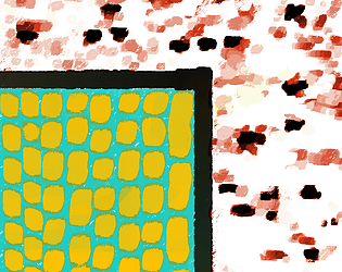
Name of Art Piece
Alma Matter
Description of entry
The piece is HEAVILY inspired by the work of Alma Thomas, a 20th century African-American artist whose work on colors and swatches is currently featured in an exposition in the Denver Art Museum (https://www.denverartmuseum.org/en/exhibitions/alma-thomas-composing-color). The other inspiration is Motherwell's Angust by Theodore Waddell (1991), also featured in the Denver Art museum in the North American collection (https://www.denverartmuseum.org/en/edu/object/motherwells-angus).
I used Clip Studio Paint and finished this piece in approximately an hour. I attempted to recreate both Thomas and Waddell's style using a single brush in Clip. The idea was to use colors to contrast the two environments, separated by a boundary.
The idea of a door between worlds ia also inspired by my reading of V.E. Schwab's book The Fragile Threads of Power. In this fantasy book series, 4 Londons are stacked on top of another, with only certain magicians capable of creating doors between worlds.
How does it fit the theme: Between Worlds?
There are distinct subpieces that make Alma Matter. They are separated by a boundary, in black, akin to a door. The blue and orange world is ordered and contrasts in hue rather than value. On the other hand, the red world contrasts in brightness and is unordered. The piece focuses on the difference between the two pieces separated by a black line akin to a window or door corner.
Type of entry
digital painting
Leave a comment
Log in with itch.io to leave a comment.


Comments
No one has posted a comment yet