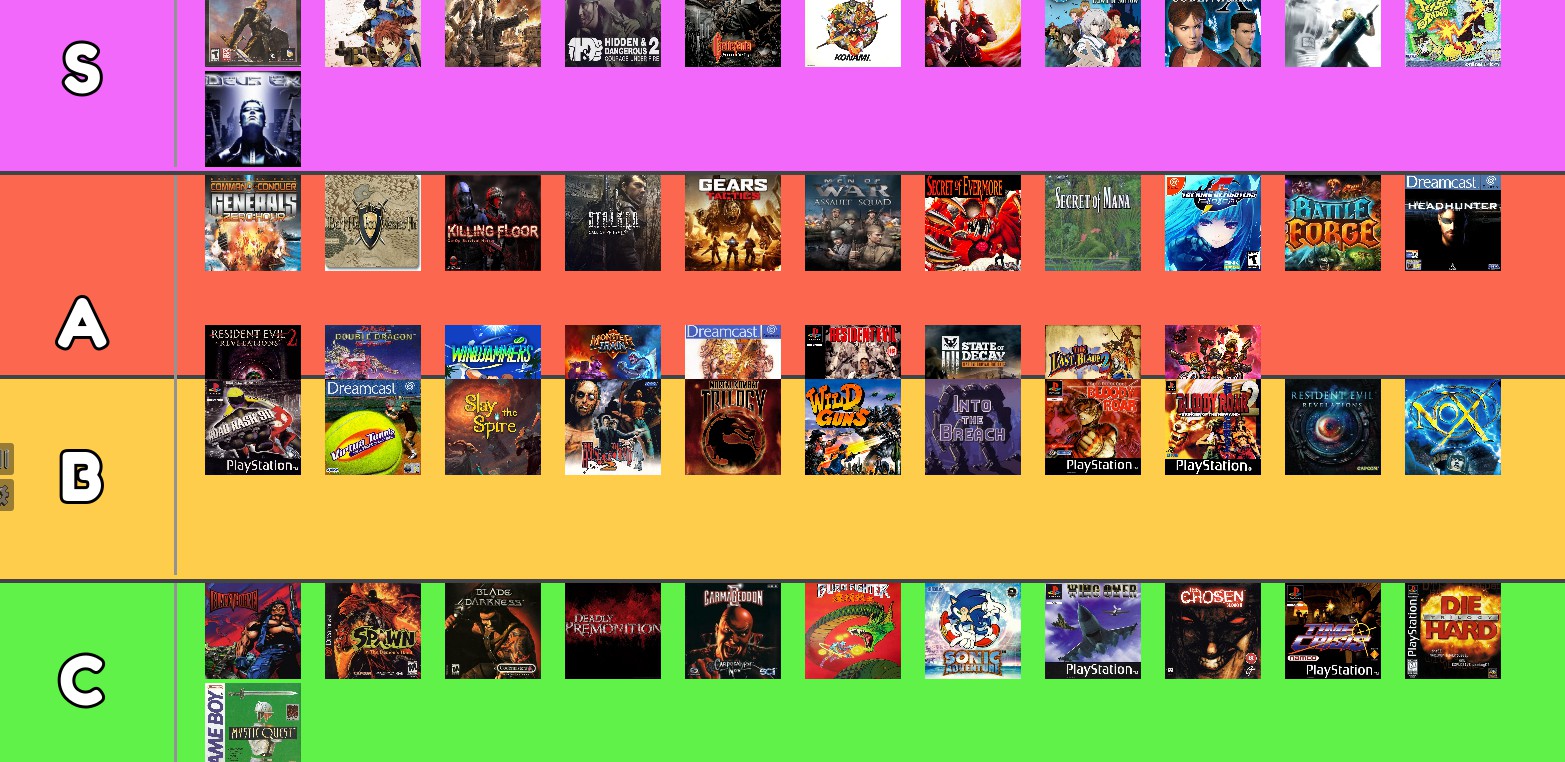
Rank A has the problem and only in fullscreen . on windowed the display is correct
Right, it's going well :) I noticed two issues:
- Upon moving items anywhere, the bottom spacing between rows gets deleted, and the pictures overlap the separator bars.
 -----
-----
- The mouse isn't accurate; upon selecting an item for drag-and-drop, there's a large offset between the mouse position and the item (I couldn't discern a pattern). Maybe it would be more efficient and readable to have the selected item constantly at the mouse position?
1 & 2 are the same problem?: I think I might know a solution, another sizing option should do it hopefully.
3: I've noticed it's a problem too & I'll try to fix it now. I use math to find the horizontal position of the 'placemarker' so it can snap cleanly, but it appears the offset is not taking into account the correct entry size to multiply by or may not be updating it correctly on load.
Hello. I am not quite sure what's going on with the gap disappearing, but I can trigger it. Perhaps when I add the margin gap options it will be effectively resolved though as I'll be adding margins to the top and bottom of each rank. Those along with the separation between each row will be controllable for the vertical margin control and the space between each entry horizontally will also be controllable. I might end up breaking some more stuff though, hence why that's going to be saved for version 0.10 . I'll keep previous stable versions up longer as well from now on.
I released an update (0.9.3) that fixes up the drop placement so now it should be much better in that regard.

